How to Choose the Best Photos for Simple Framed Prints (Resolution, Style & Composition)
Choosing the right photo for a frame shouldn’t be stressful. This guide walks you through resolution, style and composition so your print looks as good on the wall as it does on your screen. It also explains why smooth-matt paper is so flattering for portraits and how to pick images that hold up at different sizes. If you’re planning to order Simple Framed Prints, you’ll find specific, practical tips below—no jargon, no guesswork. Our frames are solid wood (black, white or natural) with shatter-resistant acrylic glazing, and prints are produced on smooth-matt paper using archival inks—details that influence how your photo will look and how best to prepare it.
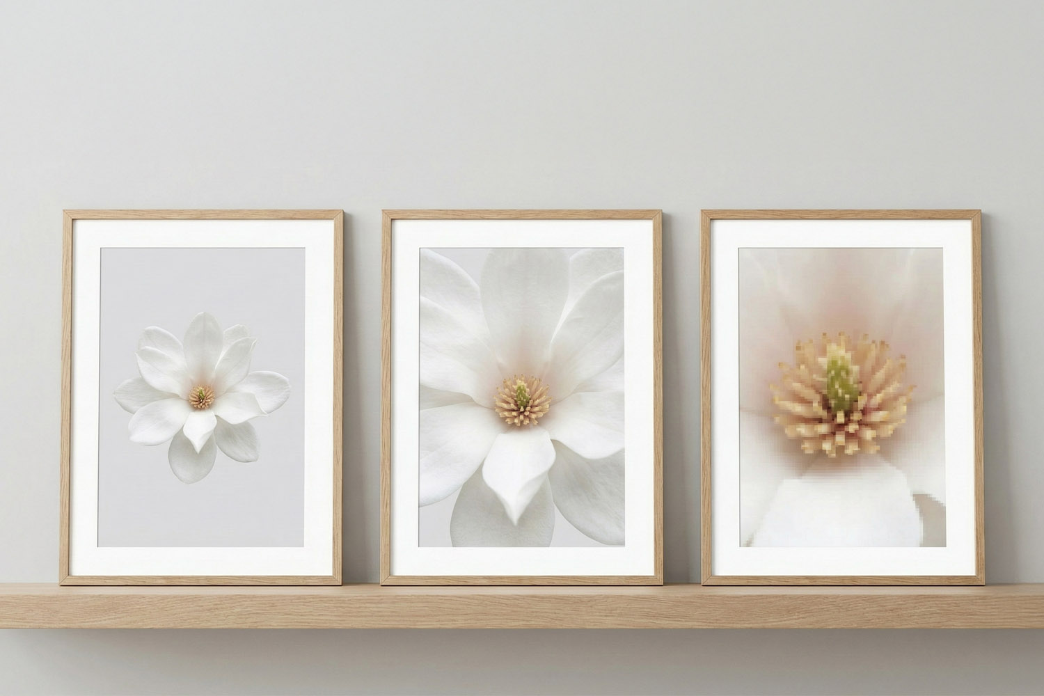
Simple framed prints featuring elegant white floral designs in light wood frames, perfect for adding a modern touch to any room.
1) Resolution & image quality: will your photo print well?
If you remember one thing about resolution, make it this: aim for around 300 ppi at your chosen print size (ppi = pixels per inch). That delivers crisp detail at arm’s-length viewing. Larger wall pieces viewed from farther away can still look excellent at lower ppi, but 300 ppi is a safe starting point.
Ideal (approx.) pixel counts at 300 ppi
- A4 (21 × 29.7 cm) is about 2481 × 3507 px
- A3 (29.7 × 42 cm) is about 3507 × 4962 px
- A2 (42 × 59.4 cm) is about 4962 × 7017 px
- A1 (59.4 × 84.1 cm) is about 7017 × 9933 px
- 30 × 20 cm is about 3543 × 2362 px
- 40 × 30 cm is about 4724 × 3543 px
- 60 × 40 cm is about 7087 × 4724 px
- 70 × 50 cm is about 8268 × 5906 px
What about phone photos?
Modern smartphones (12–48MP) are usually fine for A3 and often A2 if the image is sharp, well-lit and not a heavy crop. For A1, prefer a higher-resolution original, a RAW file, or a photo from a camera with 20MP+.
Quick checks before you upload
- Sharpness: Zoom to 100% on your screen. Textures (hair, fabric, foliage) should look defined, not smeared.
- Noise: Photos taken in dim light can look grainy. If it’s noisy, choose a smaller print size or a black-and-white treatment that embraces the texture.
- Avoid compression: Use the original file from your camera roll/cloud—not a screenshot or a messaging app download.
- Cropping: Leave a little breathing room around faces and horizons; framing and slight trimming can occur during production.
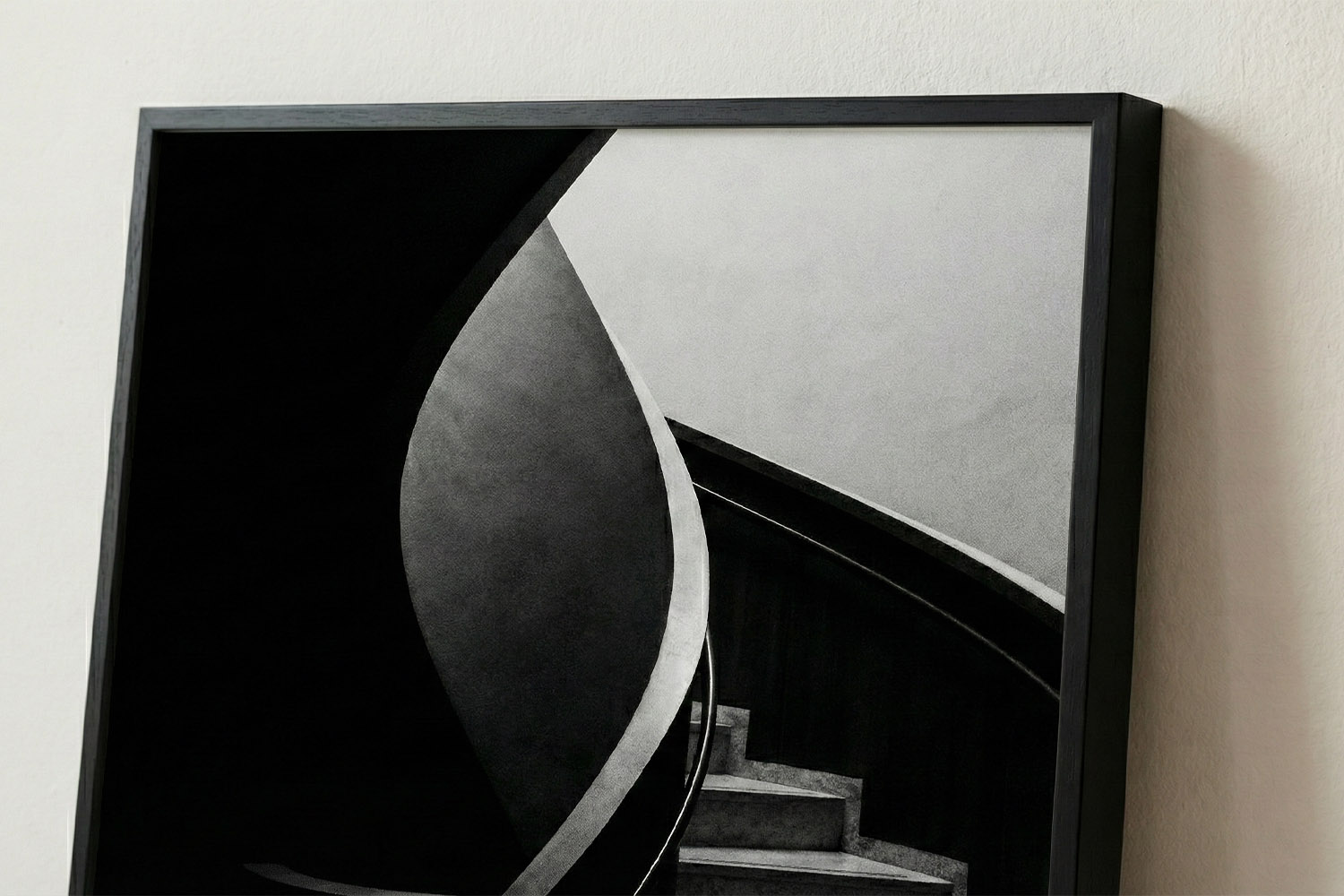
This simple framed print showcases a striking black and white staircase, perfect for adding modern style to any room or office space.
2) Style & subject: what looks best behind a frame?
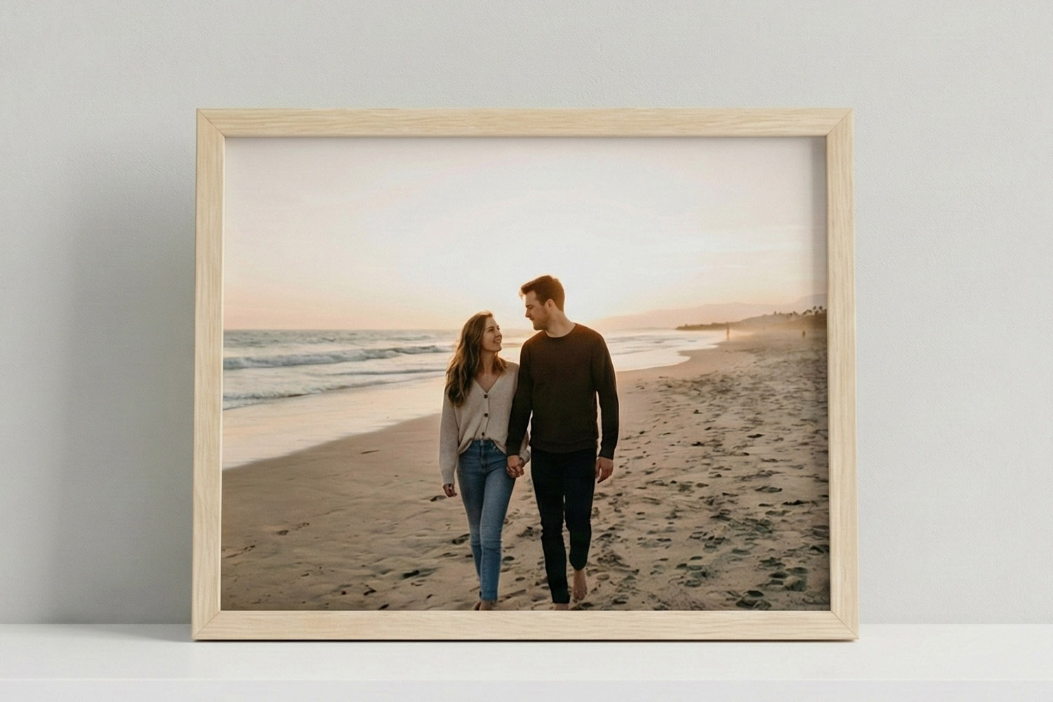
Portraits and people
Smooth matt paper loves skin tones. It diffuses specular highlights and reduces glare, so faces look natural and flattering. Try window light or open shade, keep the background simple, and watch for colour casts from lamps. A slight contrast boost and a subtle warm white balance often help.
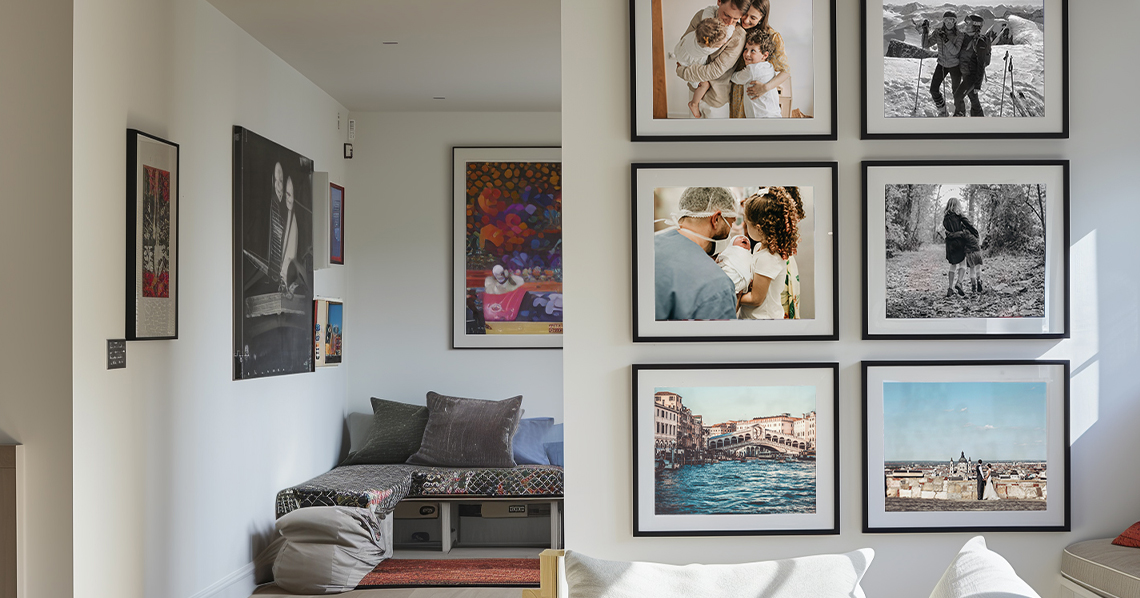
Tip: For small frames (A4 or 30 × 20 cm), tighter crops of faces or hands look stronger than busy group shots. For bigger frames (A2/A1), step back and include context—doorways, trees, or architectural lines create a sense of place.
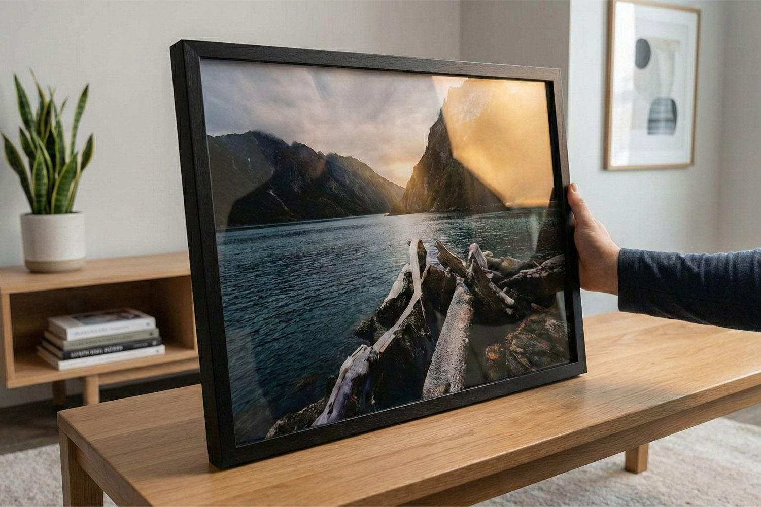
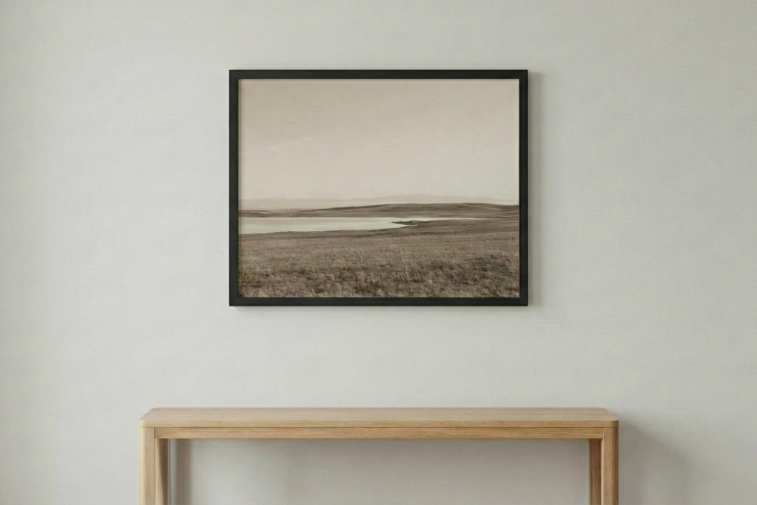
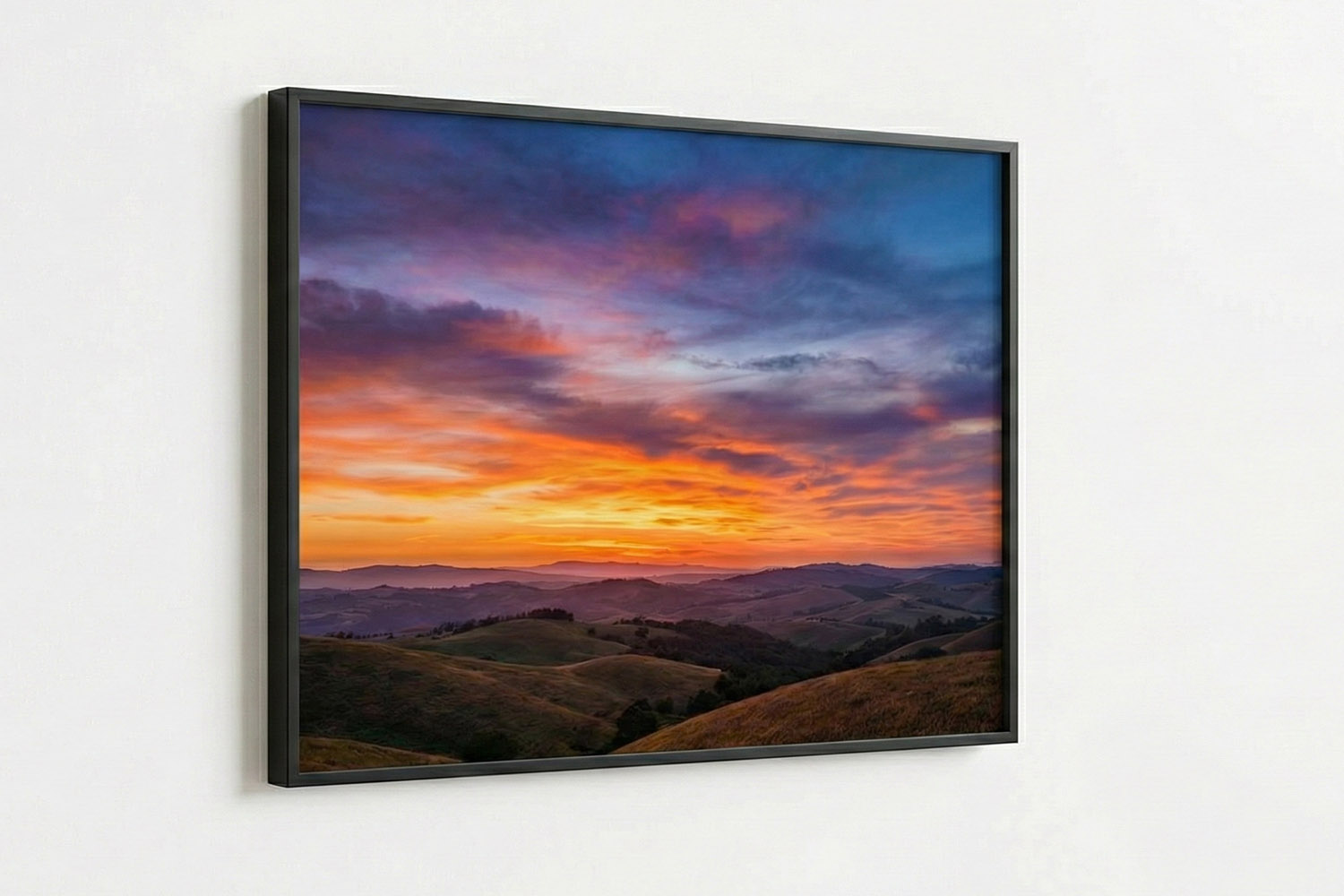
Landscapes and travel
Look for structure: leading lines, a clean horizon, or a strong foreground element. Images with clear tonal separation—deep shadows, mid-tones, and highlights—translate beautifully on matt paper. If the sky dominates, ensure it retains texture; gently pull back highlights so the clouds don’t clip to white.
Black & white
B&W thrives on shape and texture. Raise contrast slightly, deepen the blacks just a touch, and keep mid-tones open so details don’t look muddy. Street scenes, architectural details and portraits with directional light often shine.
Close-ups & details
Smaller frames love simple, graphic subjects: a newborn’s hand, a single flower, the family dog’s eyes, or a favourite record sleeve. Minimalist compositions carry impact without needing huge pixel counts.
Colour choices for matt paper
- Warm neutrals (beiges, browns, soft greens) look elegant and understated.
- High-saturation colours can still sing, but try to avoid heavy filters that push skin to orange or shadows to cyan.
- Monochrome palettes (blues only, or black/white with one accent colour) feel modern and reduce visual clutter.
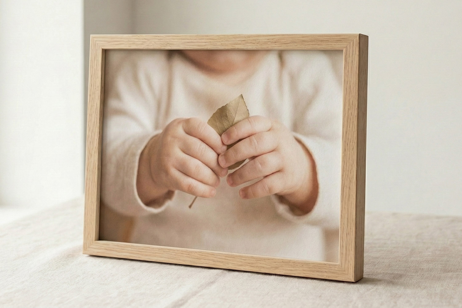
This simple framed print with a light wood frame beautifully displays a tender moment, perfect for adding warmth to any space.
3) Composition, cropping & display choices
Work with the frame’s aspect ratio
Most framed sizes use either A-series proportions (e.g., A4/A3/A2/A1 at 1:1.414) or classic 3:2/5:4 rectangles (e.g., 30 × 20, 40 × 30, 70 × 50 cm). To avoid awkward trims:
- Check aspect ratio before exporting.
- Compose with “safe edges”—keep eyes, hands, and key details 3–5% inside the edge.
- Straighten horizons and door frames; small tilts are magnified in a frame.
Use simple, legible compositions
Framed prints are read at a glance. The rule of thirds, clear subject isolation, and clean backgrounds help. For candid family photos, choose moments with clear expressions and minimal distractions near the frame edges.
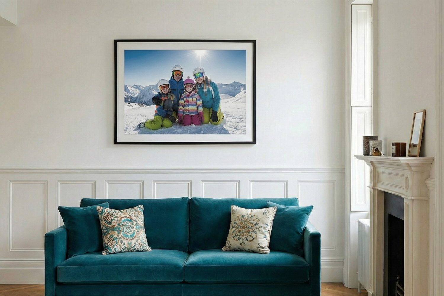
Choosing frame colour
- Black frames add graphic punch—great for B&W, cityscapes, and images with strong contrast.
- White frames feel airy and contemporary—lovely for beach scenes, botanical shots, and soft portraits.
- Natural wood brings warmth to interiors and pairs beautifully with earthy palettes, baby photos and nature imagery.
Consider your wall colour and other frames in the room to keep a coherent look.
Why matt paper helps skin and detail
Matt finishes scatter reflected light, which reduces glare from windows and lamps and keeps tones even across the print. Fine textures (linen, hair, foliage) remain readable because there’s less mirror-like reflection compared with gloss. That’s particularly helpful in bright rooms or gallery walls with mixed lighting.
When to consider other finishes
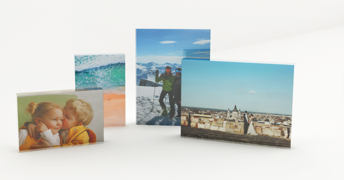
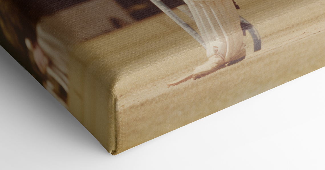
If you want a tactile, painterly surface without glazing, have a look at our stretch canvas photo prints. For images that won’t stretch comfortably to A-sizes (or for a playful treat), turning favourites into personalised mugs is a charming alternative for daily use.
Before you press “Order”
- Export at the largest native size you have (sRGB colour profile is a safe choice).
- View at 50–100% on a laptop/desktop with brightness around 50–60%; screens are brighter than paper.
- Use the online editor to position the photo precisely, then review the PDF proof carefully.
For sizes, framing options and delivery information, see Simple Framed Prints.
FAQs
A few commonly asked questions…
Usually, yes—especially for A4 and A3 . For A2 , a sharp, well-lit 12–48MP shot often works, provided you’re not heavily cropping. For A1 , aim for a higher-resolution original or choose a subject that tolerates a slightly lower ppi when viewed from across the room.
As a rule of thumb at 300 ppi :
Match the mood and colours of the photo and your room: black for punch and contrast, white for light and modern, natural for warmth and organic palettes. If you’re building a gallery wall, consistency across frames keeps the collection cohesive.
Start with a sharp original taken in good light. Use the original file (not a compressed copy), avoid heavy filters, and don’t over-enlarge beyond the rough 300 ppi guidance above.
It might—screens are backlit. Preview at 50–60% brightness and ensure whites and highlights aren’t clipping. Slightly lifting mid-tones often helps.
A4, A3, A2 and A1 framed prints: how to choose the right size
Discover how to choose the perfect framed print size for your space with this practical guide to A4, A3, A2, and A1 prints. Learn about real-world dimensions, ideal placements, and tips for creating a cohesive gallery wall at home.
Acrylic vs Glass for Framed Photos: Why Acrylic is Best for Everyday Homes
Discover why acrylic is the preferred choice over glass for framed photos in everyday homes. Learn about its safety, clarity, and lightweight benefits, making acrylic glazing ideal for family spaces, busy hallways, and thoughtful photo gifts.
How to Hang a Simple Framed Print: Heights, Spacing & Wall Placement Tips
Discover how to hang a simple framed print with confidence using practical tips on ideal height, spacing, and wall placement for any room. Learn how to achieve a balanced, intentional look above sofas, beds, desks, and mantelpieces.
Simple Framed Prints as Gifts: Occasions, Ideas & Photo Suggestions
Discover how simple framed prints make thoughtful gifts for any occasion, with practical photo suggestions, sizing tips, and expert advice on choosing the right finish. Find inspiration for birthdays, weddings, and more, plus guidance for safe, ready-to-hang presentation.
What to Expect from a Simple Framed Print: Materials, Quality & Finish Explained
Explore the appeal of a Simple Framed Print, featuring premium smooth-matt photo paper, archival inks, shatter-resistant acrylic glazing, and a solid-wood frame, all combining to create a timeless, durable, and beautifully finished display.
The Utterly Printable Blog
Simple framed prints are timeless décor pieces. Discover blog ideas for choosing the right photos, matching frames to your style, and creating gallery walls for your home or office.