Photo vs NonPhoto Anniversary Invitations: Which Should You Choose?
Choosing between a photo invitation and a classic non-photo design is one of the first creative decisions you’ll make for an anniversary party. The right choice depends on the atmosphere you want to set, the photos you have to hand, and the practicalities of printing. This guide walks you through when photos shine, when a text-led layout feels more elegant, and how to prepare images for print so everything looks crisp and considered. Throughout, we’ll reference real options available in our range of 25th wedding anniversary invitations so you can put ideas into action.
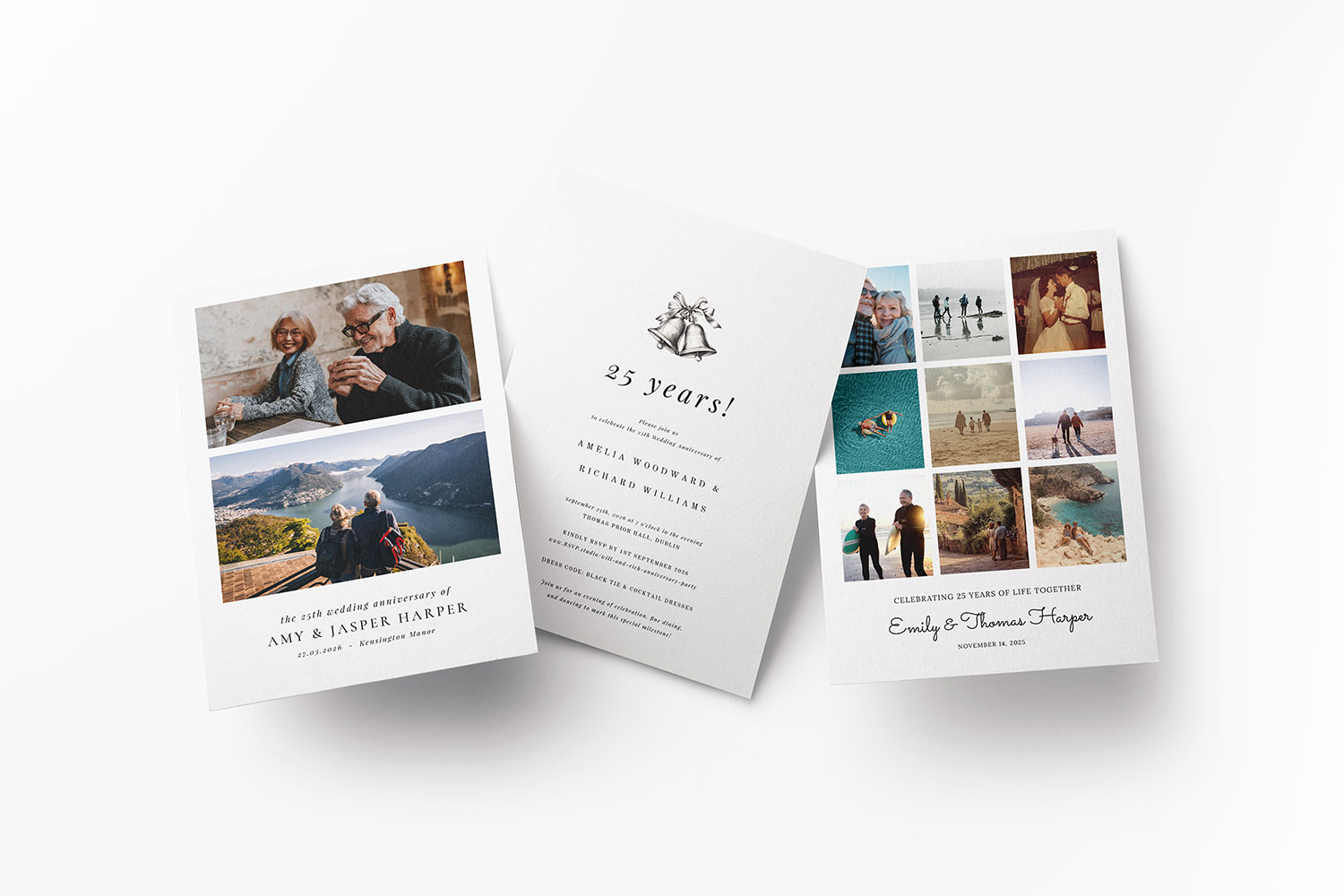
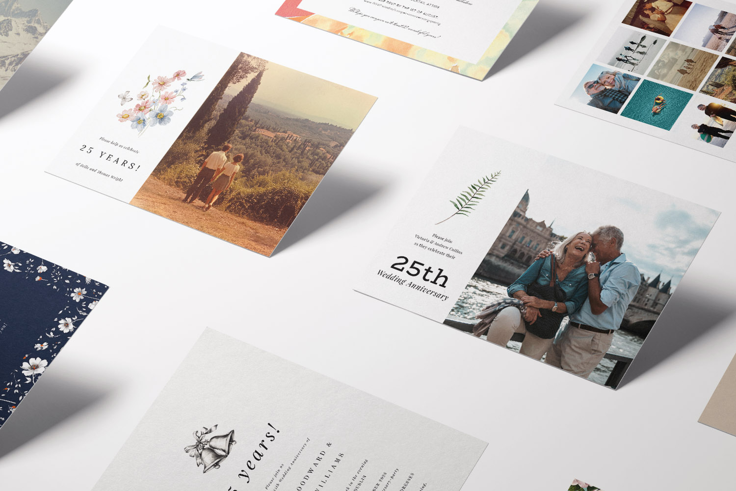
Stylish 25th wedding anniversary invitations with custom photo options and timeless typography, perfect for celebrating a special milestone.
1. When photo invitations are a brilliant idea
For family-centred celebrations, sentimental gatherings, or surprise parties planned by grown-up children, photo invitations tell the story before your guests arrive. A well-chosen image sparks nostalgia, acts as an instant “save the date” in the mind, and sets a warm, personal tone.
Great moments for photo layouts
- Family-focused parties at home or a hall. A smiling recent photo, or a collage, makes the invitation feel inclusive and informal.
- Surprise celebrations organised by children. It’s hard to resist a “look how far they’ve come” moment.
- Vow renewals. A romantic portrait (old, new, or both) adds feeling without extra words.
- Casual dinners or garden gatherings. A relaxed snapshot communicates an easygoing dress code.
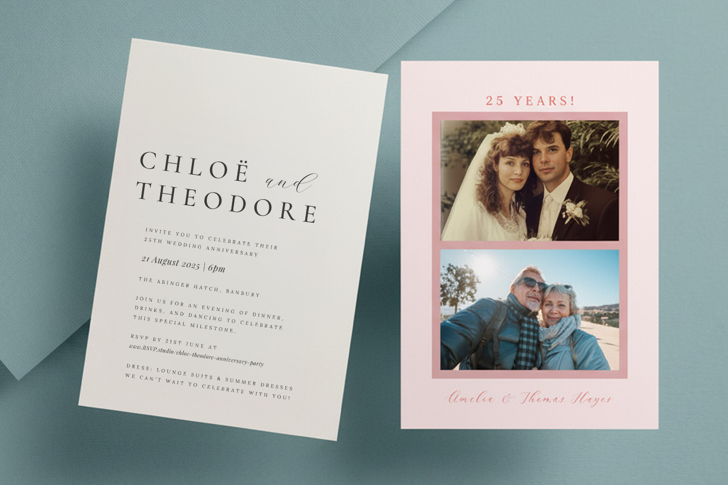
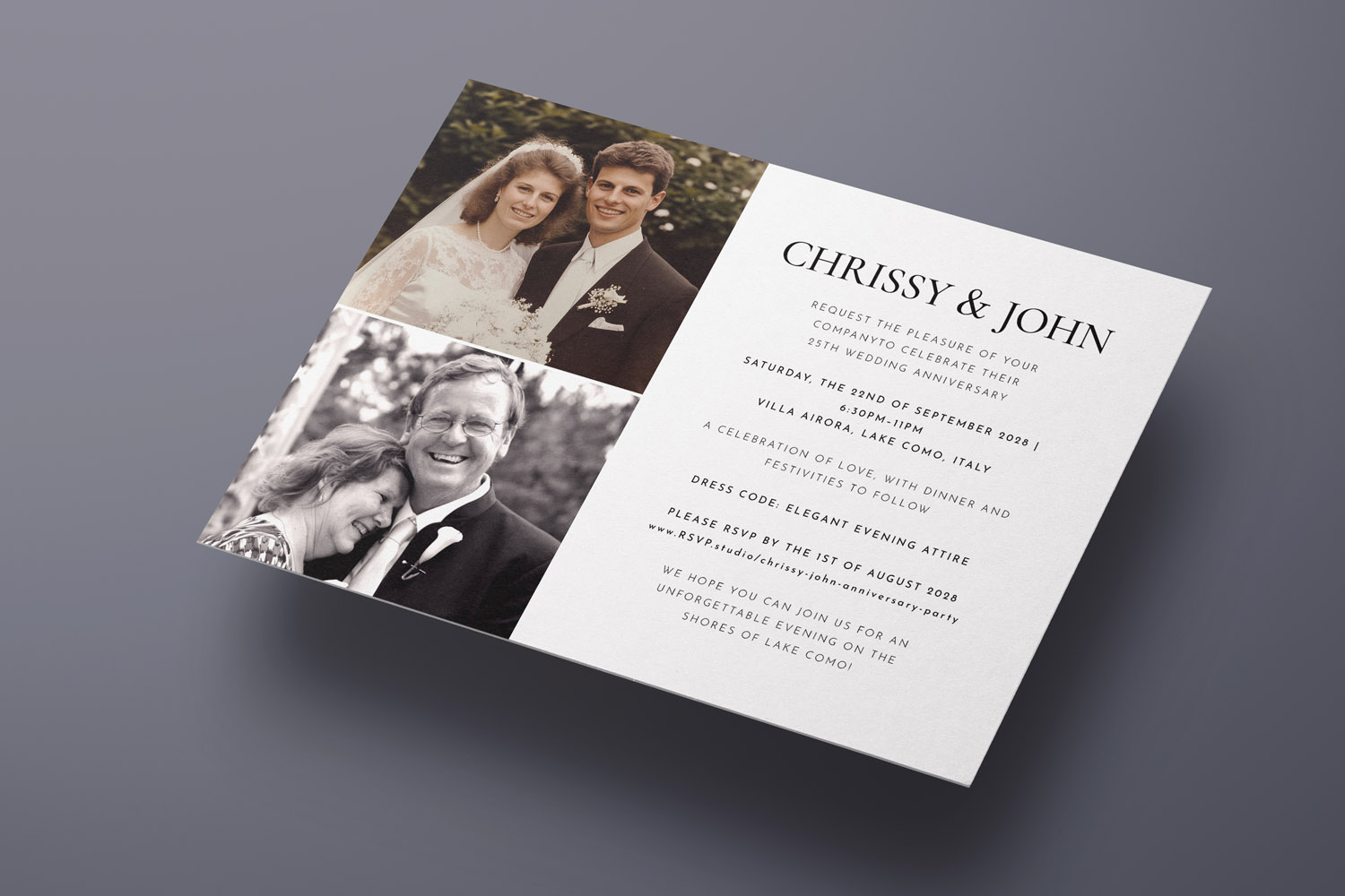
“Then & now” ideas that work
If you have both a wedding-day image and something recent, a then-and-now layout is perfect for a silver celebration. Explore our dedicated templates here: then & now photo invitations.
Try these simple concepts:
- Side-by-side portraits: wedding photo on the left, today’s on the right; keep head sizes similar.
- Black-and-white “then”, colour “now”: a subtle way to show time passing without clashing tones.
- Close-ups rather than busy backgrounds: faces carry emotion; let them lead.
- Children or grandchildren cameo: a small third image in the footer adds a sweet, modern twist.
Choosing the right card for photos
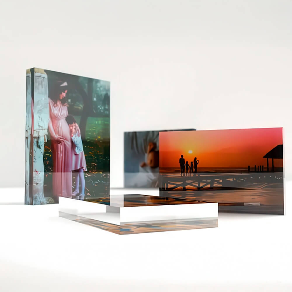
Photo imagery benefits from a smooth, photo-ready surface. Utterly Printable offers a Photo Silk Touch, 400gsm stock—bright-white, silky smooth with a light sheen—designed to reproduce images with clarity. If you prefer a slightly more tactile feel without sacrificing photo quality, consider the House Stock, 350gsm, a crisp matt board that still prints images beautifully. (Full stock options and sizes are noted later.)
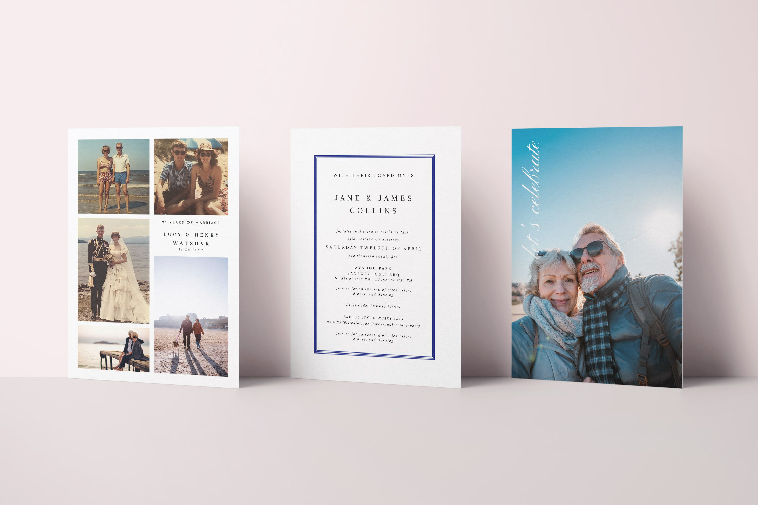
Elegant 25th wedding anniversary invitations in a mix of photo collage, traditional text, and contemporary full-photo designs for your celebration
2. When a non-photo invitation is the better fit
There are many occasions when restraint looks more refined. A non-photo design can feel timeless, formal, and perfectly in keeping with an elegant venue.
Ideal moments for text-led layouts
- Restaurant dinners and black-tie soirées. Typographic invitations deliver sophistication without visual noise.
- Minimalist themes. A quiet palette and confident type makes the design look “grown up”.
- When photos are scarce or low quality. If the only images you have are dim or heavily compressed, typography will look smarter.
Stocks that flatter minimalist designs
Texture and weight become your “visual interest” when you skip photography. Two papers shine here:
- Premium, 324gsm off-white Fedrigoni card with a subtle texture—wonderful for classic type and understated motifs.
- Super Thick, 650gsm board—a satisfyingly weighty, lightly textured matt card that elevates simple layouts and feels luxurious in the hand.
What to include on the page
Non-photo invitations rely on balance. Keep copy succinct (names, date, time, venue, RSVP instructions), use one standout font for names or headings, and let generous spacing do the heavy lifting. If you’d like guests to respond digitally, our online editor lets you add a QR code or link to RSVP.studio so replies are effortless—ideal when you’re keeping the front visually clean.
Elegant 25th wedding anniversary invitations with space for two personal photos, perfect for celebrating a memorable milestone together.
3. How to get pro-looking results: photos, crops & paper
Whether you choose a photo or not, a little preparation goes a long way. These tips keep your design tidy and print-ready.
Pick images that print beautifully
- Aim for high-resolution. As a rule of thumb, select images that look sharp at the final print size; avoid screenshots and heavily compressed social media downloads.
- Favour good light and natural colour. Soft daylight is flattering; avoid harsh flash or strong colour casts unless you’re deliberately going for a retro feel.
- Scanning old prints? Scan at a high-resolution and clean dust before uploading. A quick brightness and contrast tweak (nothing heavy-handed) can revive vintage photos.
- Match the orientation. Portrait photo for portrait card; landscape for landscape. This avoids awkward cropping.
Crop with breathing room
- Respect safe areas. Keep faces and important details well away from the edges. Your online template shows guides—stay inside them.
- Mind the horizon and verticals. A slight straighten makes an instant difference.
- For then-and-now pairs, align eye level. Matching scale across the two images creates a calm, harmonious feel.
- Keep filters subtle. Strong filters can posterise skin tones—gentle edits print better.
Choose a format and size that suits the story
Utterly Printable offers multiple sizes and orientations—A5, A6, 148 × 148 mm square, and 5″ × 7″, in landscape, portrait, and square formats—so you can match your image and layout naturally. If your favourite photo is square, the 148 × 148 mm format avoids awkward trim. If you love a panoramic landscape, 5″ × 7″ in landscape gives it room to breathe.
Match paper to design (quick guide)
- Photo-heavy: Photo Silk Touch 400gsm for crisp detail and gentle sheen.
- Type-driven or minimalist: Premium 324gsm for subtle texture; Super Thick 650gsm when you want presence.
- All-rounder: House 350gsm bright-white matt for versatile, modern results.
All invitations are printed on FSC-certified papers using Canon iX presses for sharp type and rich colour. Prefer going digital? You can also download a high-resolution, print-ready PDF for email, WhatsApp or DIY printing—useful for late invites or eco-minded hosts. If timing’s tight, fast production and UK mainland delivery options are available, and envelopes can be added to print orders for a tidy finish. If you’d like to check colour and feel first, order a printed sample before committing to the full run.
Keep the layout clean
- One focal point. On photo invites, let the image lead—keep copy concise.
- Two fonts, max. Pair a characterful heading with a legible body type.
- Space is design. Generous margins and line spacing make everything look more expensive.
- Modern RSVP. Add a QR code to your invitation linking to your online RSVP—no cluttered email addresses on the front.
Thoughtful extras
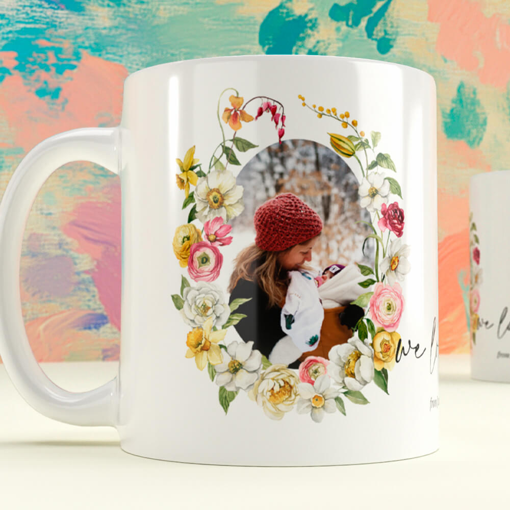
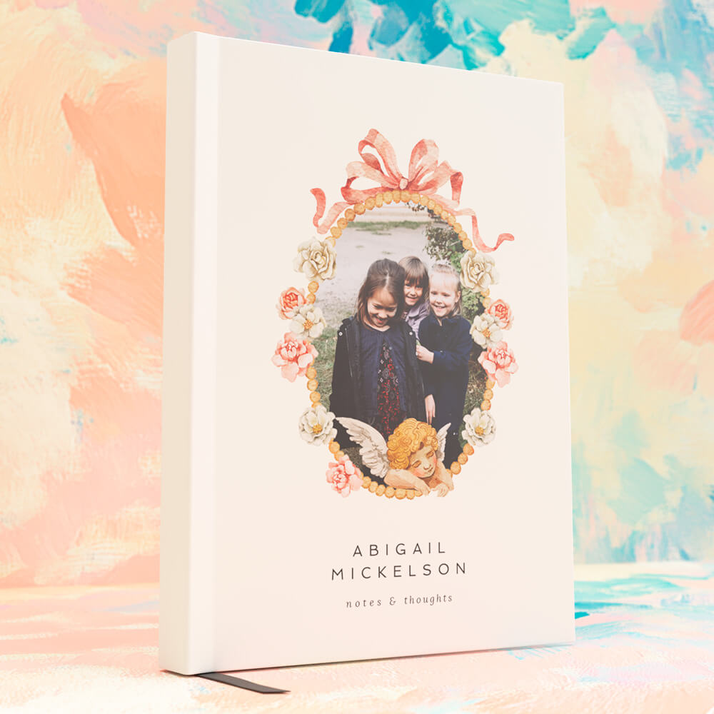
If you’re digitising those wedding-day photos anyway, consider turning a favourite into a keepsake for the couple—our wedding present mugs are a charming add-on. Or keep a little book at the party for messages, toasts and memories; wedding notebooks work beautifully for this.
Ready to explore styles? Browse our range of 25th wedding anniversary invitations—including dedicated then & now photo designs—and customise fonts, colours, wording and photos in minutes.
Anniversary Invitation FAQs
Below are short, practical answers to the questions we’re most often asked about photos, papers and layouts for anniversary invitations—especially for silver (25 year) celebrations.
If your event is family-centred or sentimental in tone, a photo adds warmth and immediately tells the story. For formal dinners or minimalist themes, a non-photo design can feel more refined.
Use a high-resolution file that looks sharp at the chosen card size. Avoid screenshots and heavily filtered images. Natural light, simple backgrounds and relaxed smiles work best.
You’ll typically place a wedding day image alongside a recent portrait, keeping head sizes similar. Explore ready-made layouts here: then & now photo invitations.
For crisp image reproduction, Photo Silk Touch 400gsm gives a bright, gently sheened finish. For typographic designs, Premium 324gsm (textured) or Super Thick 650gsm (luxurious heft) look superb.
Yes. In the online designer you can generate a QR that links to your RSVP page (RSVP.studio), keeping the layout clean while making replies quick and modern.
Tip: explore and customise your design now in our range of 25th wedding anniversary invitations, or try a dedicated then & now photo layout for instant sentiment.
Adding a QR Code RSVP to Your Anniversary Invitations
Discover how to add a QR code RSVP to your anniversary invitations for a seamless guest reply experience. This guide covers setup steps, design tips, and privacy considerations, helping you blend modern convenience with the elegance of printed anniversary cards.
Formal vs informal wedding anniversary invitation wording: how to choose the right tone
Discover how to choose between formal and informal wedding anniversary invitation wording with this helpful guide. Learn the key differences, get practical structure tips, and find ready-to-use templates to set the perfect tone for your celebration.