How to personalise your wedding order of service (photos, icons, QR codes & more)
Your order of service does more than list hymns and readings—it sets the tone for the ceremony and becomes a keepsake. This guide walks you through tasteful, practical ways to personalise your booklet using Utterly Printable’s online editor: photos, small motifs and icons, QR codes to playlists or running orders, bridal party lists and meaningful thank-you messages—without crowding the page or losing readability. If you’re still choosing a layout, you can browse all our wedding order of service templates and tailor any design to your day.
The user selects a size option on the product page to choose the correct format before purchase.
1) First, plan the structure (then add personality)
Before dropping in photos and motifs, map the flow of your ceremony and the information guests need at a glance. A simple plan makes personal touches feel intentional.
A clear content plan
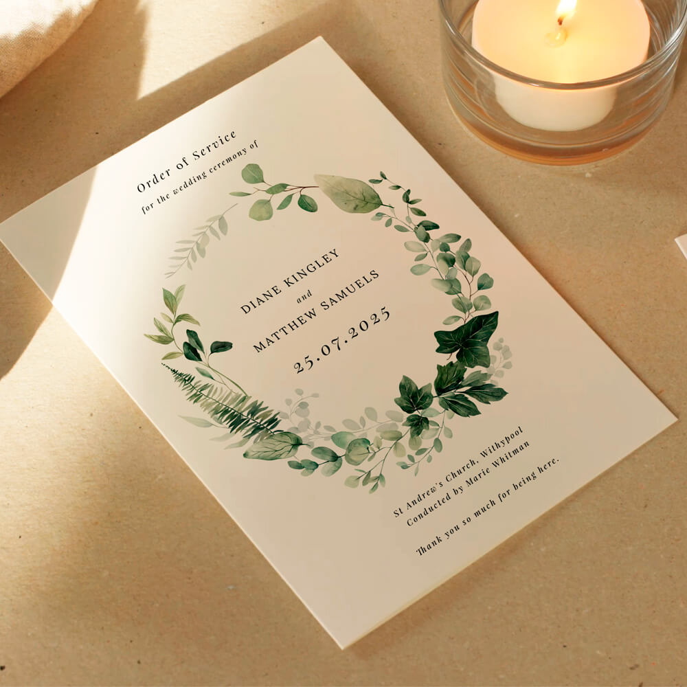
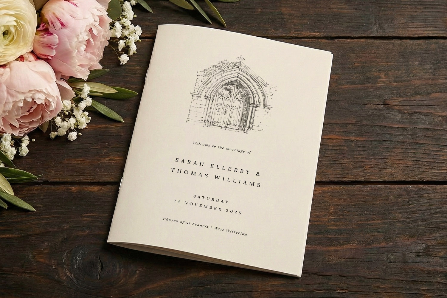
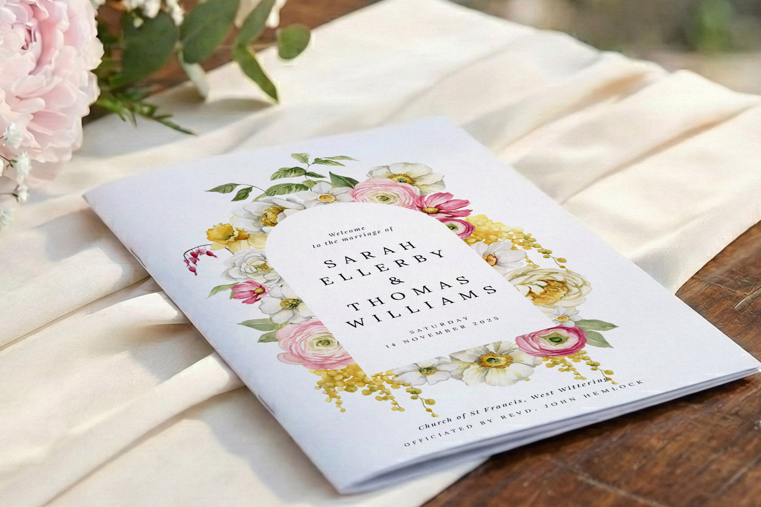
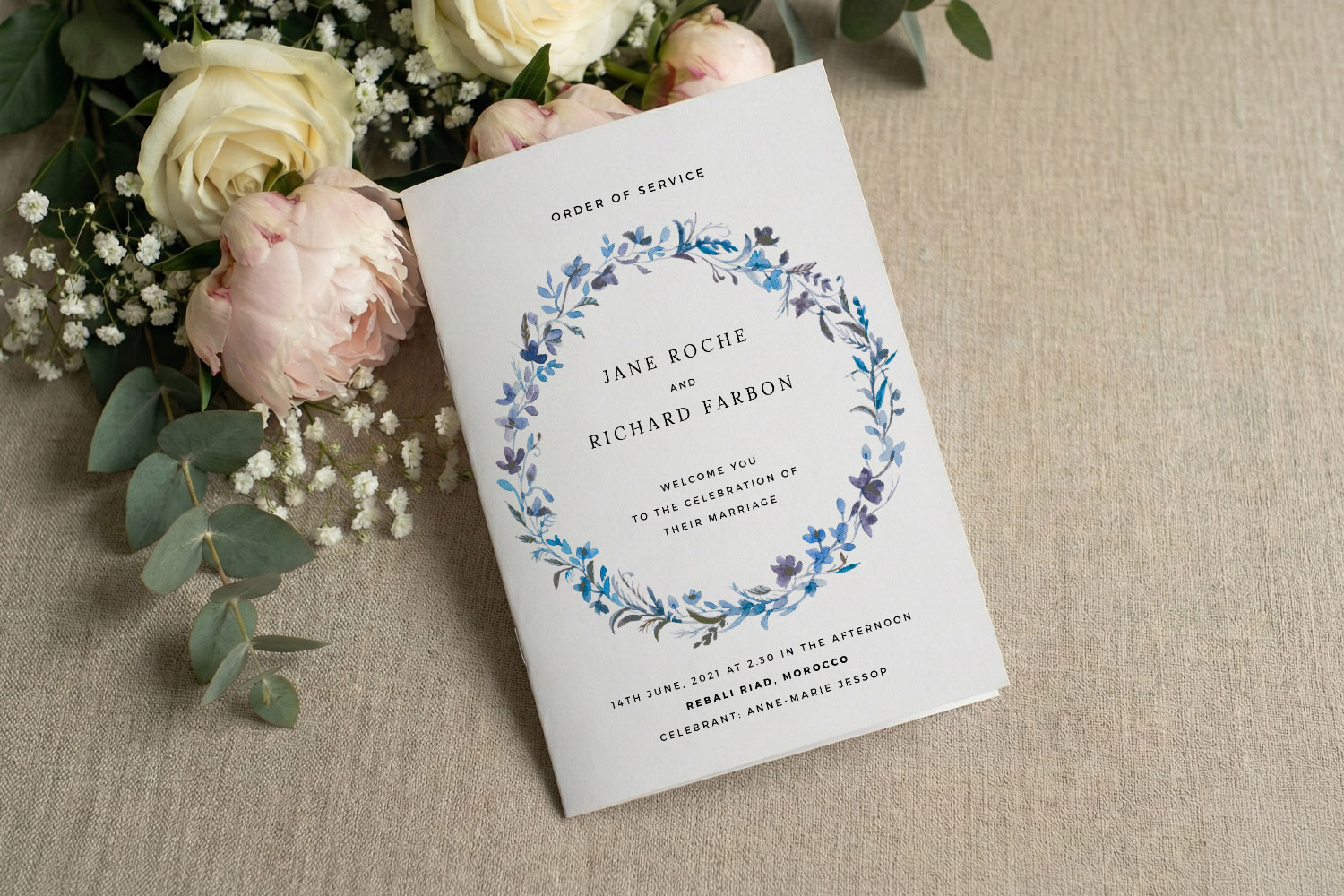
- Cover: Couple’s names, date, venue. Add a small emblem or monogram for a subtle personal touch.
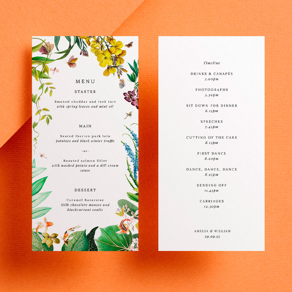
- Welcome & running order: An officiant’s welcome, the sequence of the service, and time cues if helpful.
- Hymns or readings: Keep lyrics and texts grouped cleanly. Avoid splitting verses awkwardly across pages.
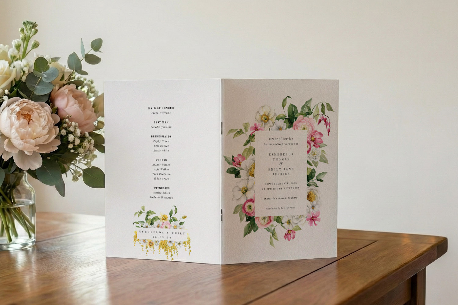
- Bridal party list: Titles on one side, names on the other (e.g., “Best Man — Alex Reed”).
- QR code (optional): Link to a playlist of ceremony music, digital programme or readings.
- Back cover: A short thank-you message and any reception details.
Choose a visual direction early
Pick a design language that matches your day:
- For delicate botanicals, explore our floral wedding order of service styles.
- For clean, pared-back layouts, try the minimal order of service templates.
- For timeless typography and monograms, see our classic order of service templates.
Or browse the full range of wedding order of service styles to find a look that suits you.
The user selects a text box and updates names to personalise the design in real time.
2) Personalisation ideas that stay elegant (and legible)
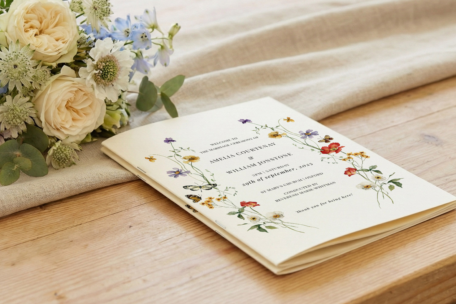
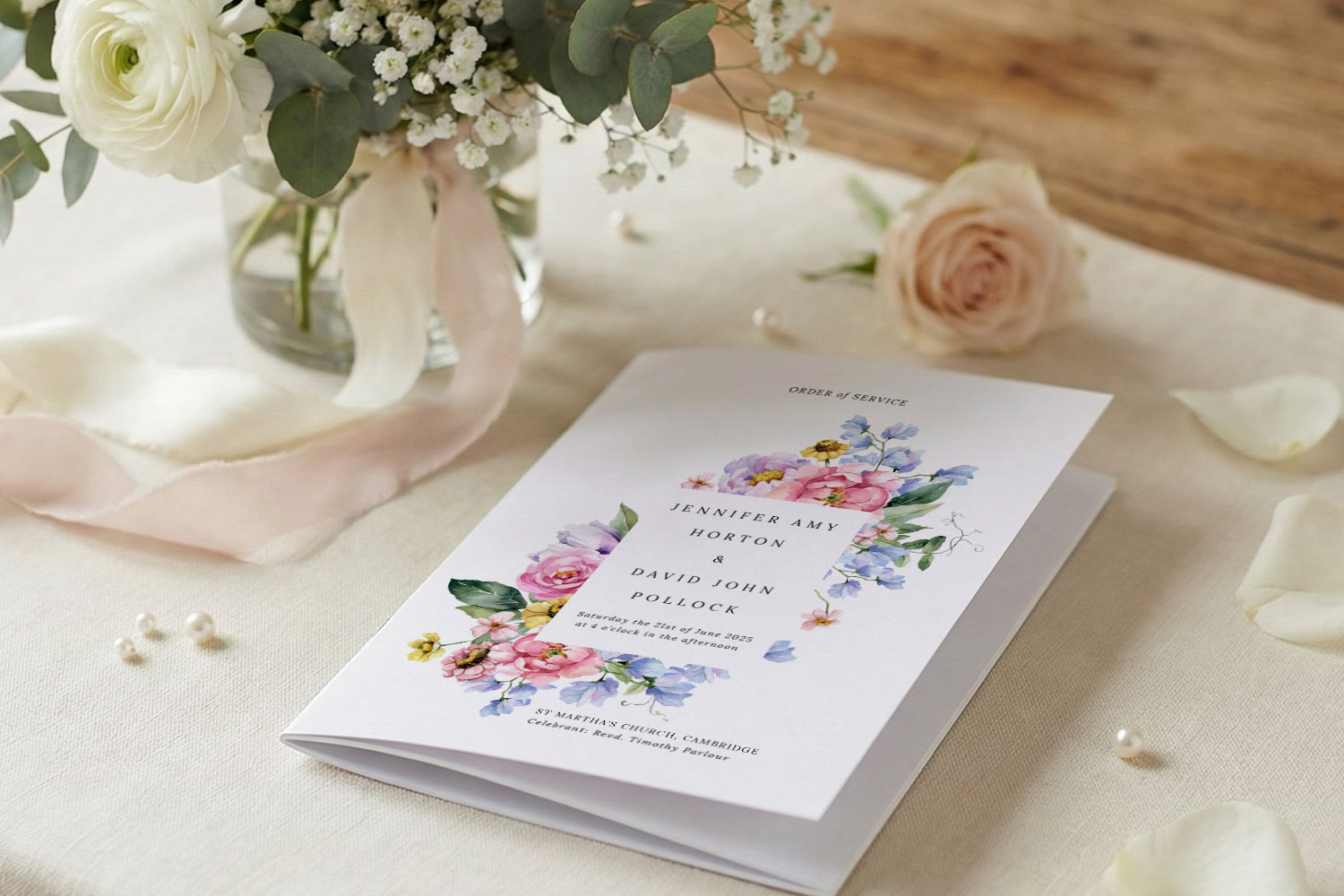
Photos: from statement covers to subtle cameos
- One hero cover photo: Works well for modern, documentary-style couples. Keep text away from busy areas of the image; choose high contrast so names remain readable.
- Framed portrait inside: Use a neat border or circle cameo for a classic feel; add a small caption such as “Taken at St Ives, 2018”.
- A gentle story spread: A pair of smaller photos opposite the running order gives warmth without overwhelming the page.
- Black & white for harmony: Converting a secondary image to mono helps it sit quietly behind typographic content.
Tip: Fewer, larger images usually look more considered than many small ones. Prioritise clarity over collage.
Icons & motifs: quiet signposts, not centre stage
- Dividers & section marks: A tiny leaf, ring, or star can separate hymns and readings tidily.
- Consistent scale: Keep icons around the same size throughout; don’t mix line-drawn with filled symbols.
- Match the template: Botanical motifs pair naturally with our floral styles, while simple geometric marks suit minimal designs.
- One motif, many roles: Reuse the same sprig or monogram on the cover, headers and back cover for cohesion.
QR codes: small, useful and clearly labelled
- Good uses:
– A playlist of your ceremony music or hymns
– A digital programme for guests who prefer to read on phone
– Accessibility notes or translations for readings - Placement & size: Bottom-right of the back cover or inside back page keeps things tidy. Pair with a short label: “Scan for today’s hymns”. Keep it compact and leave clear white space so it scans instantly.
- Test early: Print a draft and check it scans from arm’s length in average light.
- Privacy: Link to public pages or playlists that don’t require sign-in on the day.
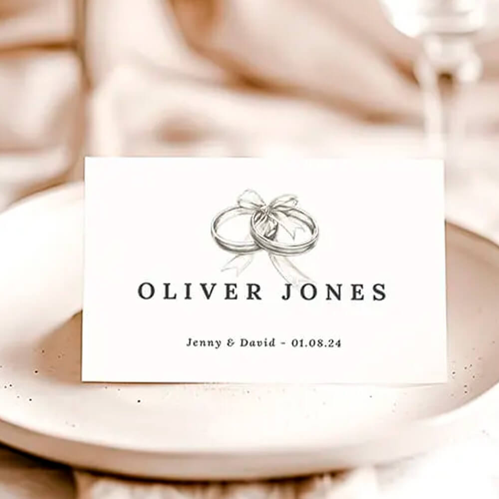
Bridal party lists: clear, fair and stylish
- Consistent titles: Use one style—“Maid of Honour” or “Chief Bridesmaid”—and stick with it.
- Two-column layout: Titles left, names right; this is faster to scan than centred lists.
- Order with care: Group roles, then list names alphabetically within each group to avoid any perceived hierarchy.
- Accents & hyphens: Doublecheck spellings, accents and hyphenated surnames.
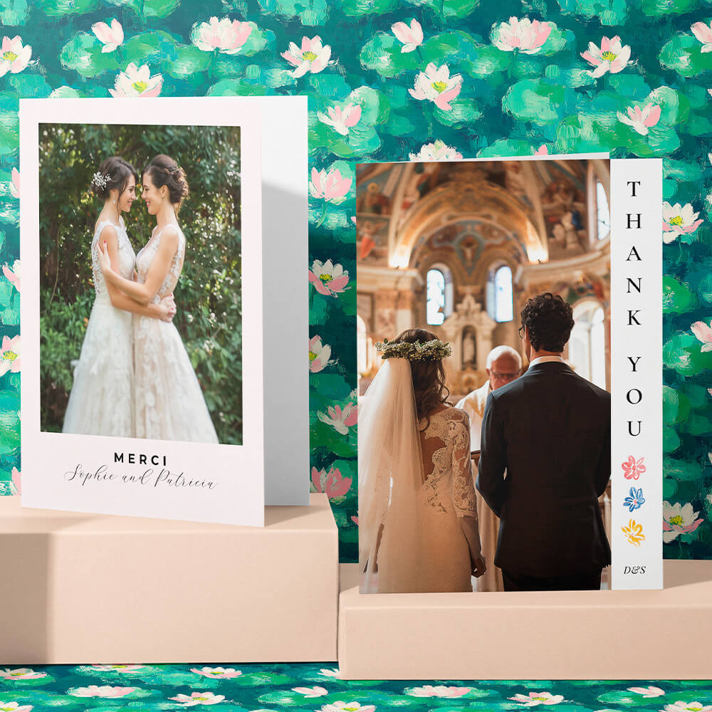
A thank-you that lands
Keep it short, sincere and specific. 40–60 words is usually perfect. For example:
“Thank you for travelling, singing and celebrating with us today. We’re especially grateful to our families, our wedding party and everyone who helped from near and far. Your love and support mean the world.”
You can add a small heart icon or your initials beneath for a gentle sign-off that matches your chosen template from our wedding order of service templates.
The screen shows a QR code being added to a wedding order of service design to let guests access online RSVPs easily.
3) Design for readability: keep it calm, clear and polished
Type that people can actually read
- Aim for a comfortable body size (roughly 10–11.5pt is a sensible starting point).
- Use one primary typeface and one accent at most. Reserve caps or italics for brief headings.
- Maintain strong contrast: deep text colours against pale backgrounds. If text must sit over a photo, add a pale box or soften the image.
Hierarchy & spacing
- Give each section a clear heading and breathing room above and below.
- Keep line spacing generous (about 120–140% of the font size) so lyrics and responses are easy to follow.
- Align most text left; reserve centred text for the cover or short lines like readings titles.
Layouts that flow
- Keep related items on the same page. For hymns, avoid orphaned lines or a lone chorus on the next page.
- Use consistent margins. If one page has a photo, counterbalance with extra white space on the facing page.
- If you’re adding several personal elements (photos, icons, a QR code), space them out across the booklet so no single page feels crowded.
Proof like a pro
- Read aloud to catch missing words.
- Ask a friend to proof names, roles and titles.
- Print one copy and check: is the type large enough? Are verses complete? Does the QR code scan instantly?
How many to print?
As a rule of thumb, plan one per guest plus a few spares for keepsakes and the registrar or officiant.
Choosing the right template
Still exploring looks? Have a browse through our classic order of service templates if you’d like serif type and tradition; try the minimal collection for contemporary simplicity; or lean into foliage and blooms with the floral range. For the full spectrum, the styles overview is a great starting point.
FAQs
Some simple questions and answers to get you on the right track.
Limit yourself to one or two considered images. Use a hero cover photo or a framed portrait inside. Keep generous margins and avoid placing long text directly on top of busy imagery.
Pop it on the back cover or inside back page with a clear label (e.g., “Scan for today’s hymns”). Keep it compact and surrounded by white space; then test a printed draft.
Use a two-column layout with roles on the left and names on the right. Keep job titles consistent and group roles first, then list names alphabetically in each group.
40–60 words is perfect—enough to sound heartfelt, not so long it pushes other content around. Place it on the back cover beneath your names and date.
Absolutely. Choose one of our minimal order of service templates, then personalise with a single portrait, a tiny motif, and a short thank you. The restraint will feel elegant.
Helpful links in context:
Explore the full range of wedding order of service templates and browse by style: wedding order of service styles, floral designs, minimal layouts, and classic templates.
A5 Wedding Order of Service Size Guide (with print, folding & layout tips)
Discover everything you need to know about A5 wedding order of service size, from print and folding options to layout tips and word counts, so your ceremony programme looks polished, feels comfortable to hold, and reads beautifully for every guest.
Choosing the Right Page Count for Your Wedding Order of Service
Explore tips for selecting the ideal page count for your wedding order of service. Get clear guidance on 4, 8, 12, and 16-page formats, plus helpful advice for designing a ceremony booklet that matches your special day.
Printing options for your wedding order of service: professional vs DIY explained
Explore your wedding order of service printing options with this practical guide, comparing professional printing and DIY at home. Learn when each approach works best, key pitfalls, and how Utterly Printable’s templates and services can fit your ceremony plans.
Religious vs Civil Ceremony Orders of Service: What Changes in the Booklet?
Explore the main differences between religious and civil ceremony orders of service, including content options, typical page counts, and helpful design tips to create a clear, elegant wedding order of service tailored for your special day.
What to include in a Wedding Order of Service (with page-by-page layouts)
Learn how to create a clear and beautifully organised wedding order of service, including essential ceremony details and page-by-page layouts for any booklet size, ensuring your guests appreciate every thoughtful touch on your special day.
When to Order Your Wedding Order of Service (Timelines, Proofing & Last-Minute Options)
Discover the ideal timeline for ordering your wedding order of service, with practical tips on drafting, proofing, and choosing between 4-page cards or multi-page booklets. Learn how to avoid delays and handle last-minute changes with confidence.
Products related to wedding order of service booklets:


Thoughts & Updates
Wedding order of service templates help guide your guests through the ceremony. Explore the blog for tips on content ideas, design layouts, and including meaningful personal touches.