Common mistakes to avoid when designing wedding invitations online
Designing your wedding invitations online is wonderfully convenient, but print is unforgiving. Once an order goes to press, the design is final. This guide walks you through the common pitfalls—text, layout, imagery, spacing, and proofing—so you can create beautifully readable invitations with confidence on Utterly Printable’s wedding invitation templates.
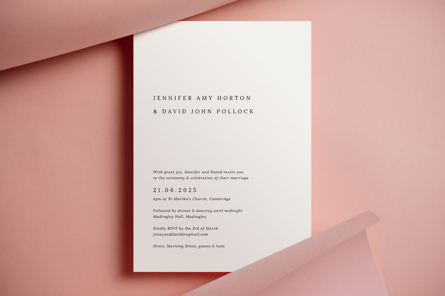
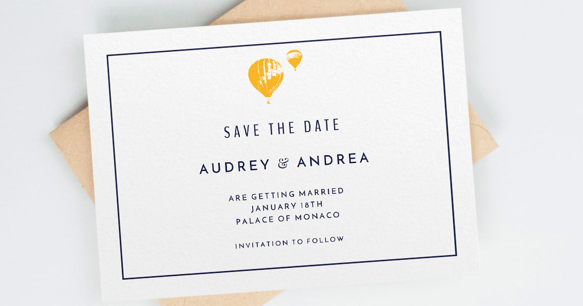
Elegant wedding invitations featuring a simple black font on white card, perfect for couples seeking a modern and understated design.
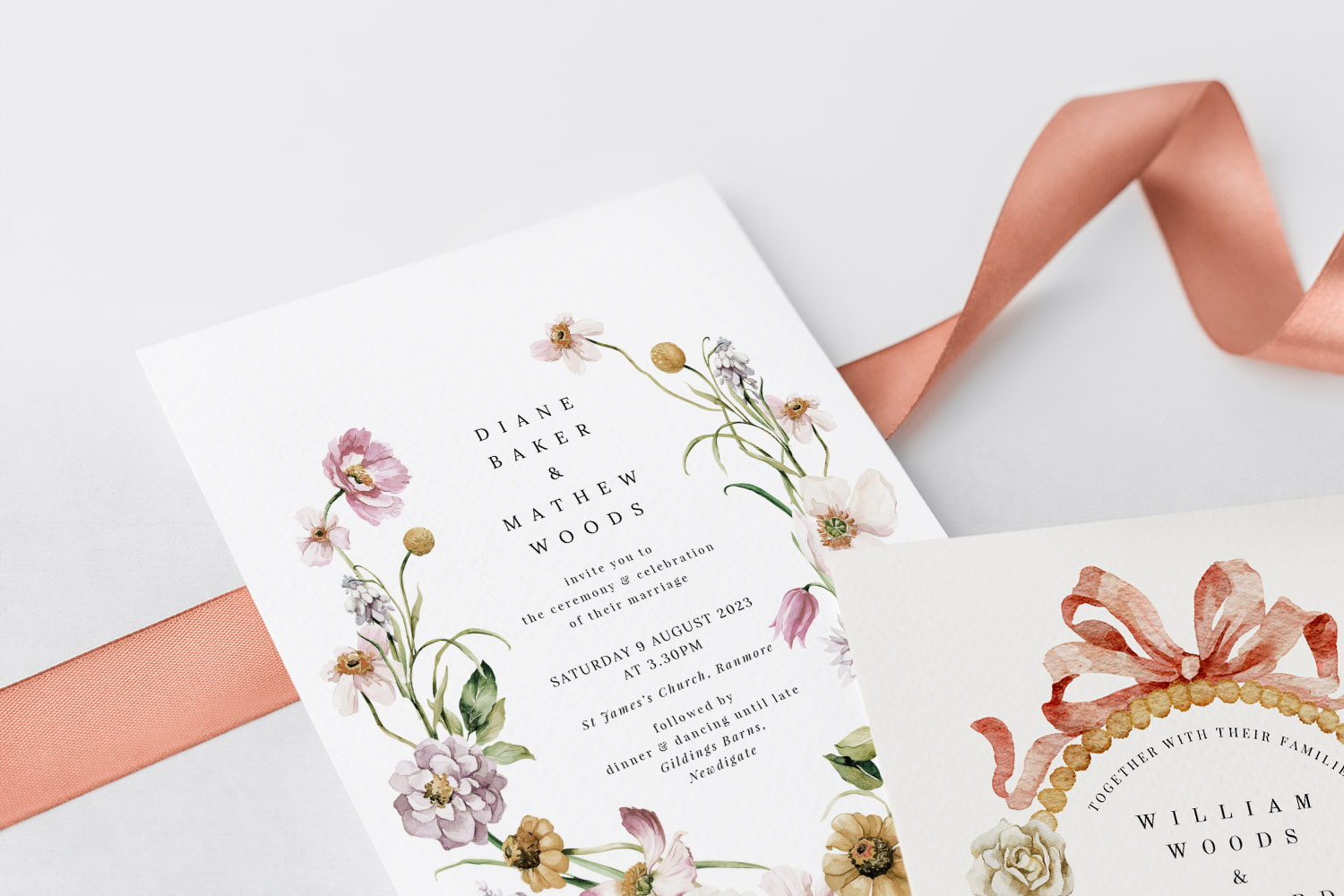
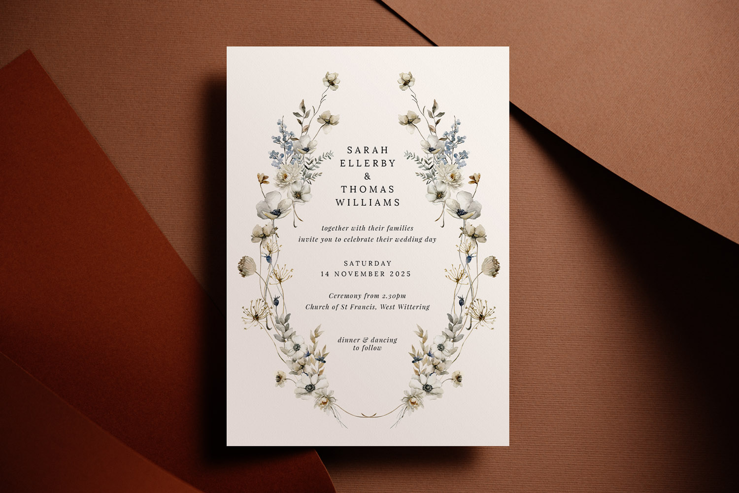
1) Text & layout: small choices with big impact
Clear, readable wording is the heart of any invitation. The following checks will prevent the classic text mishaps:
- Font size you can actually read
For most serif or sans-serif body text, aim for around 9–10 pt minimum. Delicate scripts generally need larger sizes—think 10–12 pt—to avoid broken or spidery strokes. If you’re setting white text on a dark background, go a touch larger and avoid very thin weights. - Line spacing and letter spacing
Tight lines look crowded in print. Add a little leading (line spacing) so names and key details breathe. If you use ALL CAPS for names or venues, slightly increase letter spacing for better legibility. - Alignment that looks intentional
Left-aligned typography is the easiest to read; centred layouts can look elegant but need careful balance. Avoid mixing multiple alignments on one card unless you’re deliberately creating contrast. - Hierarchy that guides the eye
Give the couple’s names or event title the largest style, followed by date/time and venue. Keep less critical details (dress code, gifts, directions) smaller or move them to an insert. - Margins and the “quiet zone”
Keep all crucial text well inside the safe area of the card so nothing drifts near the trim edge. Avoid filling every corner—white space is not wasted space; it’s what makes the design look composed. - Wording that fits
If your copy feels cramped, trim the text. Consider moving travel tips, menus, or accommodation info to a separate insert. The template library makes it easy to co-ordinate pieces across your suite when you’re ready to print more items.
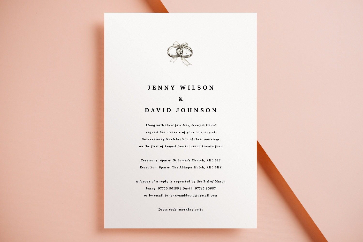
Elegant wedding invitations with a simple black and white design, perfect for couples seeking a classic and timeless announcement.
2) Images & colour: what screens hide, print reveals
Photographs and artwork need a little extra care before print:
- Use high-quality images
Upload original files rather than screenshots or images saved from messaging apps. As a rule of thumb, photos should be high-resolution at the size you’re placing them. Zoom right in on your proof to ensure details remain crisp. - Crop with breathing room
Keep faces, borders and important details away from the very edge so they don’t risk trimming. Avoid ultra-thin decorative borders that can look uneven once trimmed. - Mind fine textures and faint colours
Very pale pastel text or wispy line art can fade in print. Darken slightly or increase weight for dependable results. - Choose a card stock that supports your visuals
If your design is photo-heavy, a smooth card with a subtle sheen can enhance contrast. For a tactile, traditional feel, a warm textured stock adds depth to typographic designs. Utterly Printable offers a curated range—House 350gsm, Premium 324gsm, Photo Silk Touch 400gsm, and Super Thick 650gsm—so you can match print feel to design intent while keeping everything FSC-certified and UK-printed.
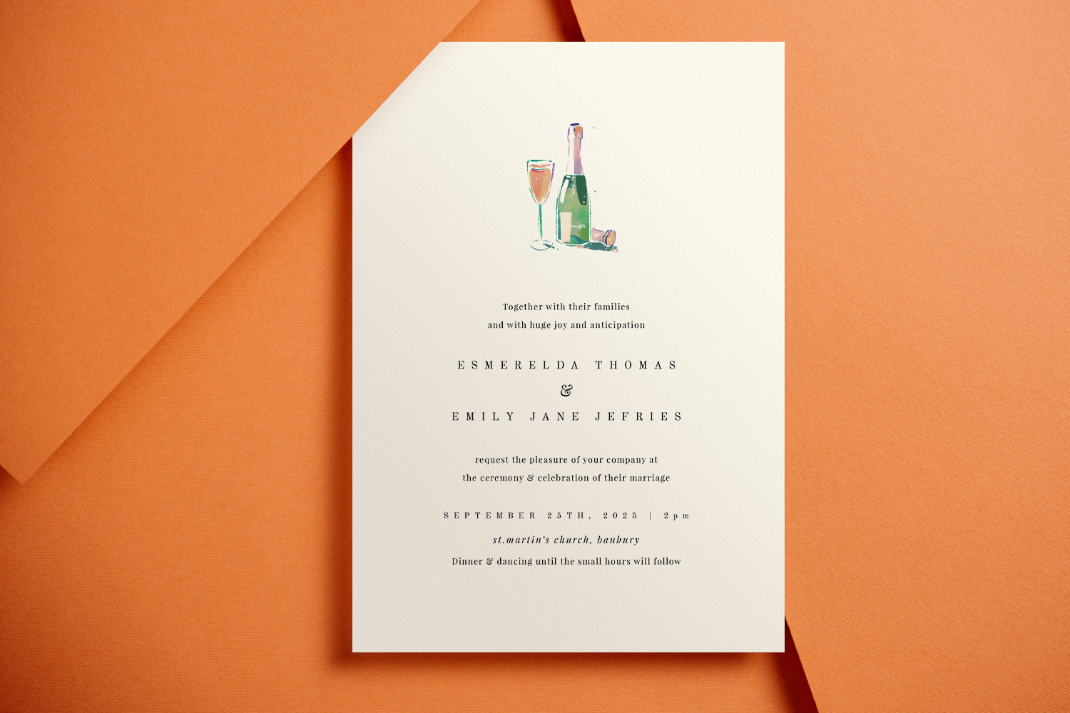
Celebrate your special day with these stylish wedding invitations, featuring a charming champagne bottle and glass illustration on quality card.
3) Proofing & ordering: catch issues before you print
Print-ready orders are final, so build in a calm, methodical review:
- Download the free watermarked digital proof
Use the built-in option to generate a high-resolution proof. Open it at 100% (or larger) and check every detail: spelling, date formats, times, titles, diacritics, postcodes, URLs, QR codes, and telephone numbers. - Do the paper test
Print your proof at home on plain A4 and cut it to size. Holding a physical mockup makes tiny spacing issues, alignment quirks, and crowded paragraphs far easier to spot. - Read it aloud (twice), then have someone else read it
Reading aloud catches repeated words, missing prepositions, and American spellings that can creep in. - Check the edges intentionally
Scan the outer 10–12 mm of your proof. Is any text or essential element too close to the trim? If in doubt, nudge it inward. - Confirm your format and stock
Doublecheck you’ve selected the intended size—A5, A6, 148 × 148 mm square, or 5 × 7 inch—and the stock that suits your layout and imagery. White envelopes are supplied with printed orders. - Order a printed sample if you’re unsure
A single sample is the best way to evaluate colour, paper feel, and type size under real lighting. It’s a small step that can prevent costly reprints. - Know what can and can’t be changed
You can usually keep editing until the job enters production. Once printing starts, edits and cancellations aren’t possible, and typos or layout mistakes can’t be refunded or reprinted—another reason to proof carefully.
Smart ways to streamline your suite
- If you’re inviting guests to RSVP online, add a scannable code and set up your wedding RSVP website before you finalise your invite text. That way, the link and deadline are accurate on the printed card.
- Keep your final wording, timelines and guest-name spellings in one place—many couples like using a tidy wedding notebook for this.
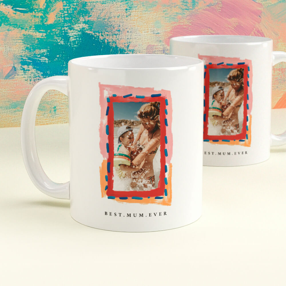
- Planning thank-you gifts for helpers? Consider a simple, photo-based keepsake such as personalised mugs, or choose a design tailored as wedding present mugs to match your stationery colours.
- When you’re ready to create your cards, browse and personalise the full range of wedding invitation templates—each design sits within a co-ordinated suite for inserts and on-the-day stationery.
FAQs: designing online, printing beautifully
Below are straightforward answers to the questions we’re asked most often about online wedding invitation design, proofing and print.
For most body text, 9–10 pt is a practical minimum. Script fonts usually need 10–12 pt to avoid fine strokes breaking up. If text is reversed out (white on colour), consider a slightly larger size or heavier weight.
Use the original file and check your watermarked proof at 100–200% zoom. If edges look jagged or faces appear smudgy when zoomed, the image is likely too small or too compressed for that placement.
Centred layouts can be elegant, but they’re harder to balance. Many couples prefer left alignment for readability, using size and weight changes to create clear hierarchy.
It previews exactly how your artwork will print—use it to verify spelling, spacing, image clarity, and positioning near the trim edge. Print it at home and hold it at arm’s length: if it reads well there, you’re in good shape.
You can usually edit until the order moves into production. Once printing starts, your design is locked and cancellations aren’t possible. Damaged or faulty prints are of course put right, but typos and layout errors aren’t eligible for reprints.
How and why to add a QR code to your wedding invitations
Enhance your wedding invitations by adding a QR code to easily share RSVP links, maps, and gift lists. Learn practical tips for QR code placement, sizing, and how to use Utterly Printable’s editor for a seamless experience.
How to co-ordinate your wedding invitation with the rest of your stationery suite
Learn how to coordinate your wedding invitation with your entire stationery suite by selecting matching fonts, colors, motifs, and materials, ensuring every detail-from RSVP cards to menus-looks beautifully unified and thoughtfully designed for your special day.
Wedding Invitation Paper Explained: Silk, Uncoated & Textured Compared
Discover the differences between silk, uncoated, and textured wedding invitation paper with this helpful guide. Learn how each card stock-smooth, textured, silk, and super-thick-impacts print quality, design style, and the overall feel of your wedding invitations.
Wedding Invitations with RSVP Cards: Do You Need Both?
Choosing between RSVP cards and digital replies for wedding invitations can be challenging. This article explains when to use each RSVP method, how to combine them effectively, and offers tips for ensuring clear, stress-free guest responses.
Wedding invitation wording: what information to include (UK)
Learn how to word UK wedding invitations with confidence, covering key details, layout tips, family considerations, and RSVP options. This guide helps ensure your invitation wording is clear, elegant, and tailored to your special day.
Products related to wedding invitations:


Our Creative Journal
Classic wedding invitations set the tone for timeless celebrations. Get inspired with design tips, customisation ideas, and advice on choosing the perfect style for your big day.