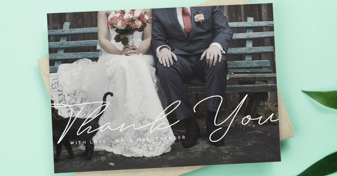
Best Paper for Wedding Thank You Cards: Matte vs Silk, Textured vs Smooth
Once your photos are in and your messages are ready, the last big choice is the paper. The feel of the card under the thumb, the way ink soaks in (or sits on top), and the crispness of a printed photo all come down to stock. This guide compares Utterly Printable’s four premium options—350gsm smooth uncoated, 324gsm lightly textured, 400gsm Silk Touch, and the 650gsm Super Thick postcard board—so you can match paper to priorities. If you’re still choosing a design, you’ll find hundreds of editable wedding thank you card templates to personalise in minutes.
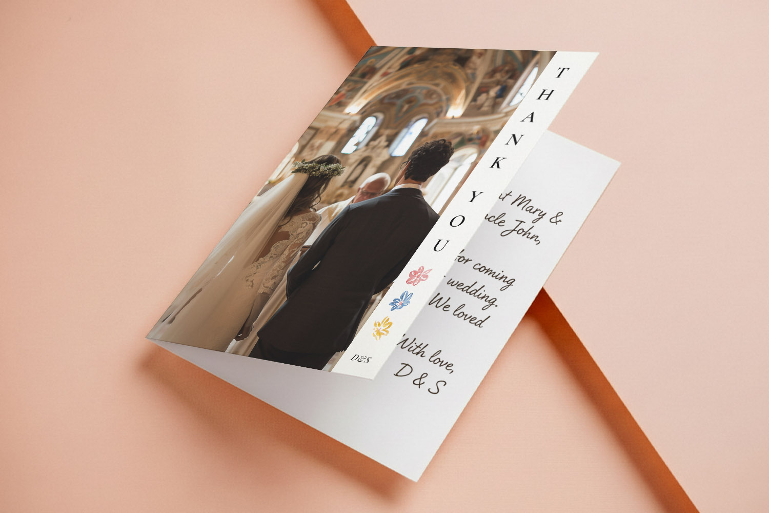
The user reviews a personalised design, checks details, and confirms options before adding the product to the basket.
How to choose in 30 seconds (priorities-first)
If photo clarity comes first: first: pick 400gsm Silk Touch. The silky, bright-white surface keeps colours punchy and lines crisp—great for single-image fronts and multi-photo collages.
If you’ll handwrite longer notes: notes: go 350gsm House (uncoated) or 324gsm Premium Textured. Both are easy to write on with ballpoint or rollerball; the textured option adds a tactile, traditional feel.
If you want a luxurious, postcard-style card: e card: choose the 650gsm Super Thick for a satisfyingly weighty, double-thickness board—perfect for flat cards that feel special the moment they’re picked up.
If you prefer a soft, natural tone: l tone: the 324gsm Premium Textured has a warm off-white shade and gentle grain that reads classic and elegant.
Tip: Designing something minimal? Smooth, bright-white stocks emphasise clean type and negative space. For understated aesthetics, browse our curated minimal wedding thank you cards or keep things timeless with our simple wedding thank you cards.
The screen shows a user scrolling through a printing information page to review materials finishes and print quality details
Paper stocks, compared (feel, finish, best use)
350gsm House – smooth, bright-white, matt
- Look & feel: Clean, modern and smooth with a matt finish. Bright-white shade keeps type sharp and colours true.
- Best for: Handwritten messages (especially longer notes), typography-led designs, minimal layouts where ink absorption avoids glare.
- Why choose it: Reliable, versatile and forgiving for pen work; a great all-rounder if you want a contemporary, matt look without texture.
- Considerations: Photos print well with a soft, matt character; if you want extra “pop” and sheen, Silk Touch will out-punch it.
324gsm Premium Textured – warm off-white, lightly textured
- Look & feel: Subtle texture you can feel; a warm, natural undertone that flatters soft palettes and classic typography.
- Best for: Traditional thank-you notes, calligraphy-style fonts, botanical and rustic designs; couples who want a tactile, keepsake quality.
- Why choose it: Adds quiet sophistication. Handwriting sits beautifully; short messages look especially elegant.
- Considerations: Photography looks refined but slightly less razor-sharp than on a silk/satin surface—great for lifestyle images, less so for ultra-crisp high-contrast photos.
400gsm Photo Silk Touch – bright-white, silky smooth with a light sheen
- Look & feel: Smooth, premium “silk” surface with a gentle sheen that lifts contrast and colour depth.
- Best for: Photo-led cards—single hero shots, photo mosaics, or images with darker tones where clarity matters.
- Why choose it: The most photo-friendly stock for sharpness and punch without moving to a glossy finish.
- Considerations: Because the surface is less absorbent than uncoated papers, gel inks may take a moment longer to dry; ballpoint is the safest choice for quick addressing.
650gsm Super Thick – double-weight, lightly textured matt (flat cards only)
- Look & feel: Impressively rigid board with a refined, light texture; feels luxurious and substantial in the hand.
- Best for: Flat postcard thank you cards when you want immediate “wow” factor—ideal with minimal designs or bold type.
- Why choose it: The most premium handling experience; perfect for couples who want their card to feel as special as the day.
- Considerations: For folded formats, choose one of the other three stocks; this thickness is reserved for flat cards.
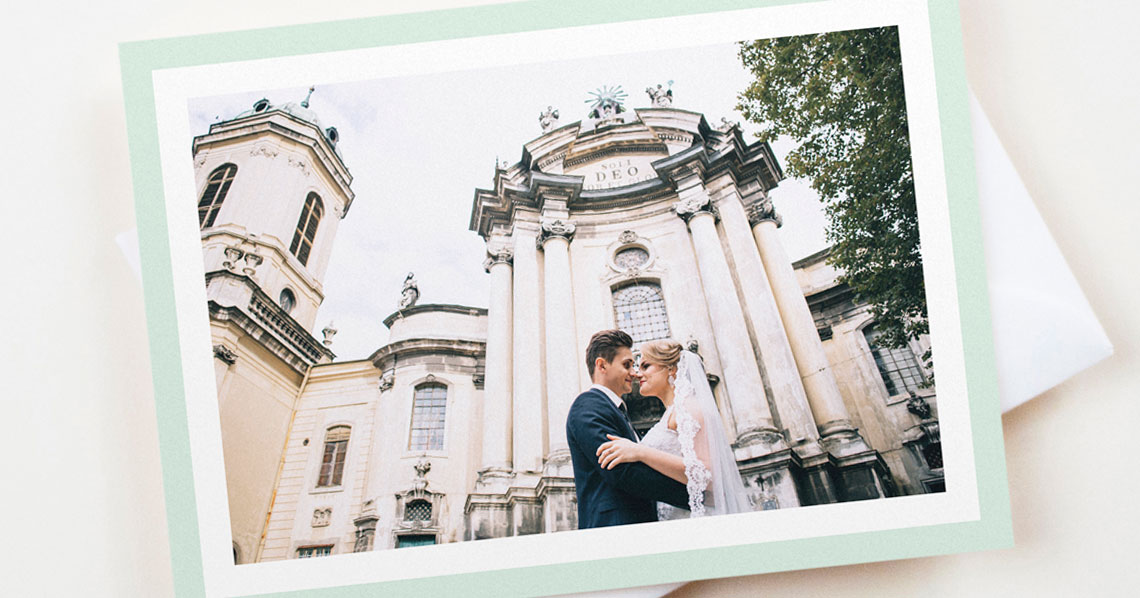
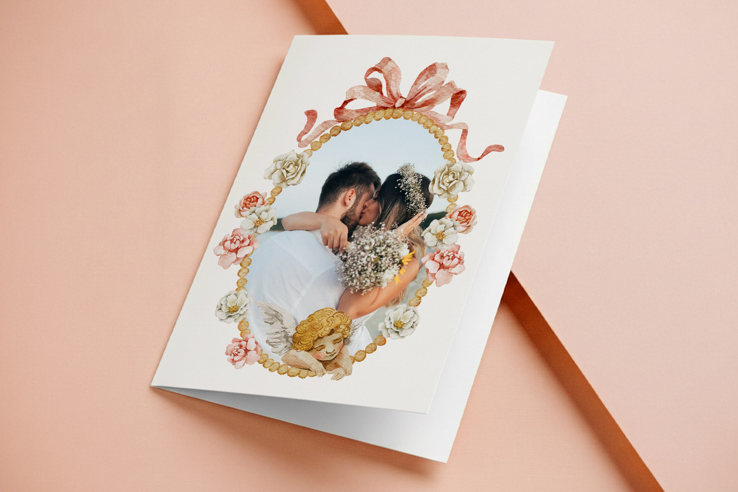
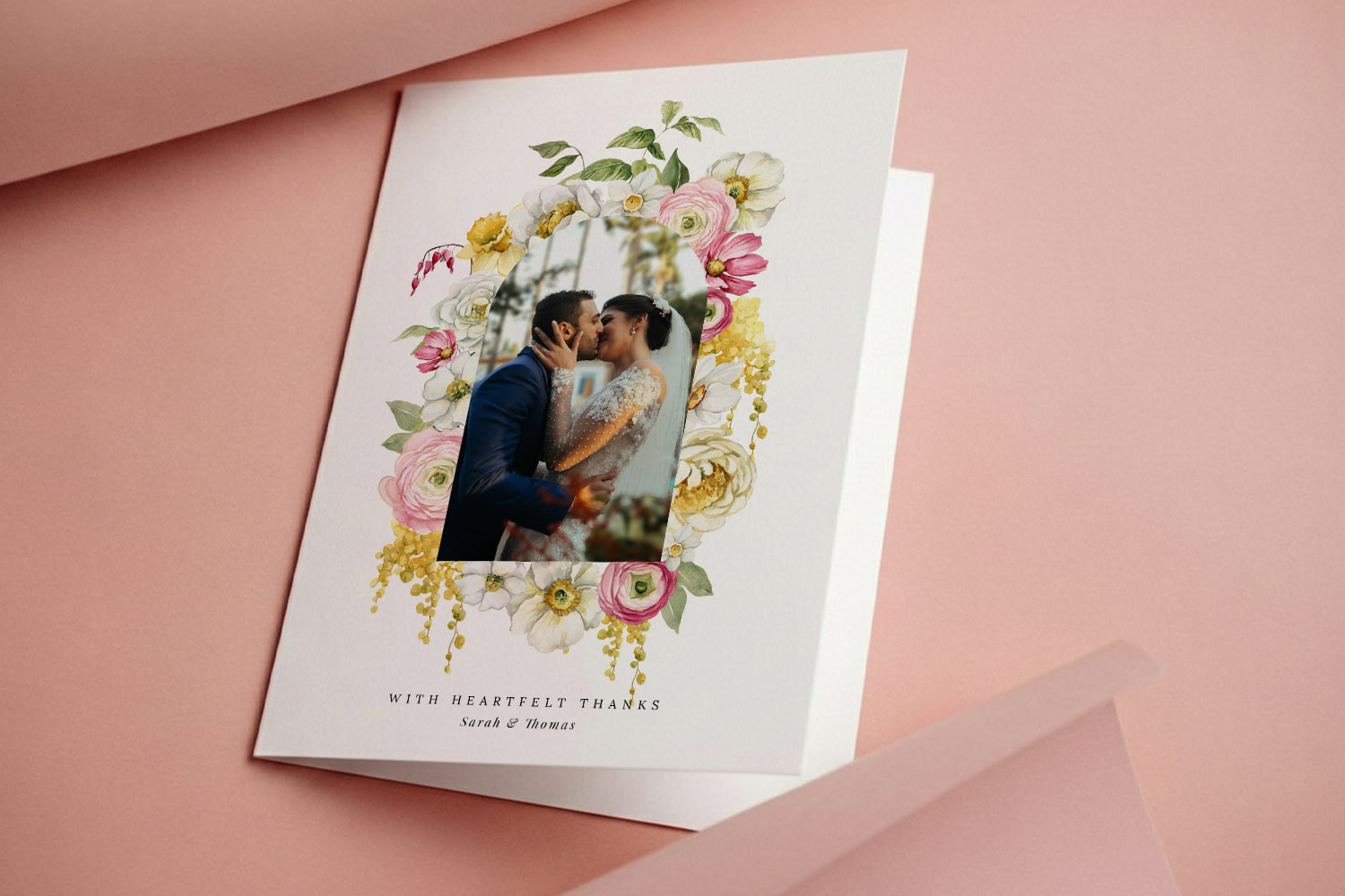
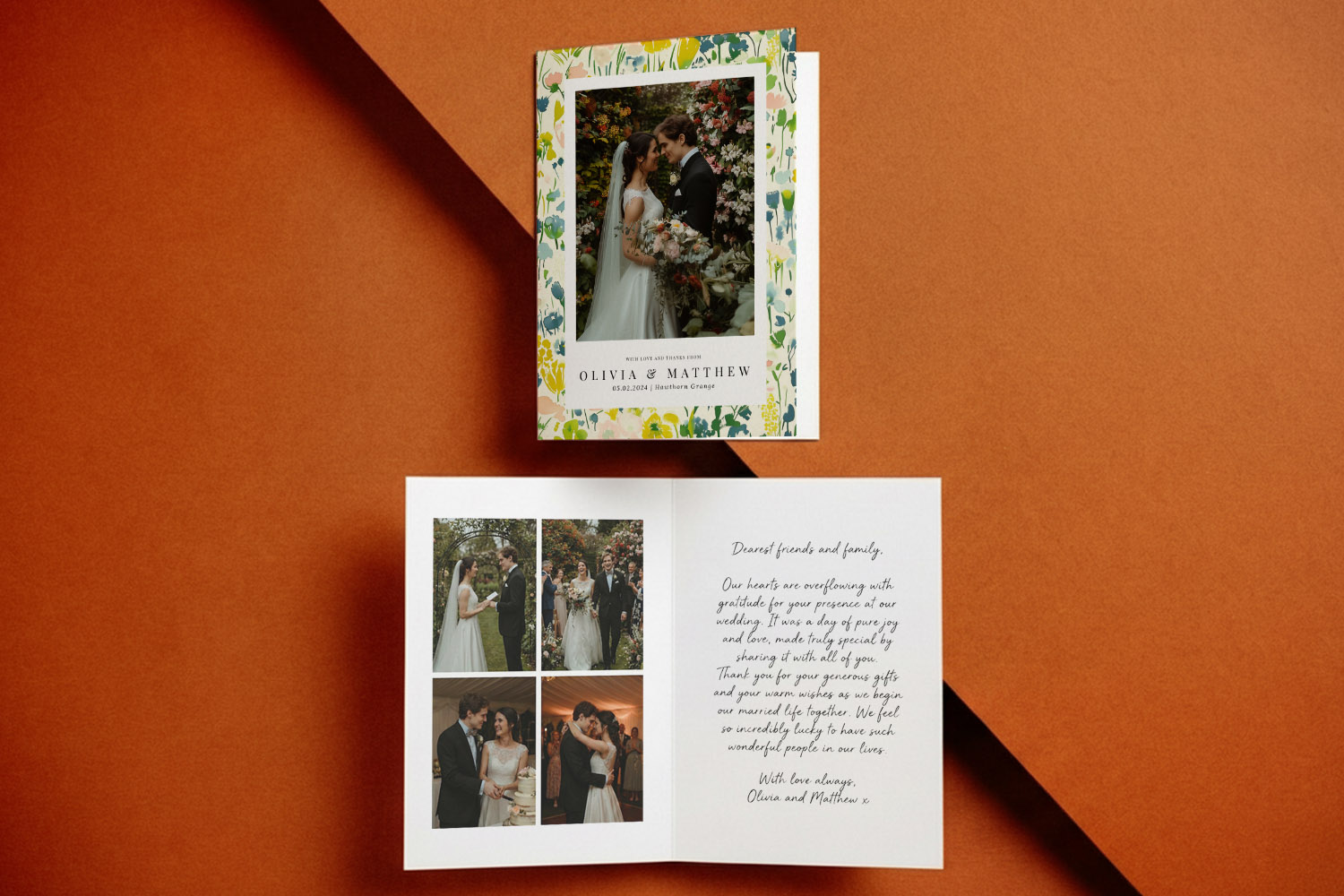
Elegant wedding thank you cards with a personalised message and floral accents, perfect for expressing gratitude after your special day
Recommendations by scenario (with design pairing tips)
1) Photo-front cards:
If you’re showcasing a favourite portrait or a collage, pick 400gsm Silk Touch. It gives photos clarity and colour depth that reads beautifully in print. Pair with a clean layout—think generous margins and a simple “thank you” set in a modern serif or sans—to let the image lead. Explore photo-friendly layouts in our main collection of wedding thank you card templates.
2) Handwritten, personal notes:
For longer messages, you’ll appreciate paper that “drinks” ink evenly. 350gsm House is smooth, neat and practical; 324gsm Premium Textured adds a tactile flourish that feels premium without glare. If you prefer very fine nibs or fountain pens, these two uncoated options are the most forgiving.
3) Minimalist typography and clean monochrome:
Use 350gsm House or 400gsm Silk Touch. Bright-white stock makes black or deep navy text look crisp. If you love pared-back layouts, try designs from our minimal wedding thank you cards—the smooth surface keeps letterforms razor-clean.
4) Rustic or botanical themes:
The gentle grain and warm tone of 324gsm Premium Textured complements foliage motifs, watercolour accents and hand-drawn illustrations. It feels naturally elegant—perfect if your wedding styling leaned country, garden or heritage.
5) “Statement feel” with a flat postcard:
Choose 650gsm Super Thick. It’s reassuringly weighty and makes a strong first impression when the envelope opens. Pair with restrained typography or a small, centred photo for balance.
6) Want everything to co-ordinate?
If you’re building a matching suite—from invites to thank-yous—browse our range of wedding invitation templates. Many designs carry through to thank you cards in both folded and flat formats, so paper and aesthetic align across your stationery.
Ink & pen tips (quick guide):
- Ballpoint/rollerball: Work well on all stocks; on Silk Touch, give written areas a brief moment to dry.
- Gel pens: Fine on uncoated and textured; may need a touch more drying time on Silk Touch.
- Fountain pens: Best on the 350gsm House and 324gsm Premium Textured where the matt surface welcomes wet inks.
Sustainability note: All four card options are produced on responsibly sourced, FSC-certified boards, so you don’t have to trade eco-credentials for print quality.
FAQ: Paper for Wedding Thank You Cards
Here are straightforward answers to the questions couples most often ask when choosing paper for their wedding thank yous.
For maximum image sharpness and colour depth, 400gsm Silk Touch usually wins. If you prefer a softer, glare-free look, the 350gsm House matt stock prints photos beautifully with a subtler finish.
350gsm House (smooth-matt) and 324gsm Premium Textured (lightly textured) are the most handwriting-friendly—ideal for ballpoint or rollerball pens.
Slightly, yes. The texture diffuses micro detail a touch. It’s lovely for lifestyle imagery and botanicals; for pin-sharp portraits, Silk Touch is better.
The 650gsm Super Thick board. It’s used for flat postcard thank you cards and delivers a seriously premium feel straight out of the envelope.
You can, but you’ll get the neatest results on House or Premium Textured . With any wet ink, allow a brief pause for drying—especially on Silk Touch.
Adding QR codes to wedding thank you cards: share photo galleries & videos
Learn how QR codes on wedding thank you cards let guests revisit your celebration through photo galleries, videos, or updates. This guide shares what to link, design tips, and simple steps using Utterly Printable for a memorable touch.
Choosing Photos for Your Wedding Thank You Cards
Selecting the right photos for wedding thank you cards creates a meaningful keepsake. This guide offers tips on choosing hero portraits, collages, candid shots, and group photos, plus practical advice for print-ready images and card design.
How to personalise wedding thank you cards online (step-by-step guide)
Discover how to personalise wedding thank you cards online with this step-by-step guide, covering everything from choosing templates and uploading photos to customising fonts, adding QR codes, and ordering professionally printed or downloadable cards for your special day.
Wedding thank you card etiquette (UK): who to send, what to write & how to get it right
Discover the essentials of UK wedding thank you card etiquette, including who to send cards to, what to write for every situation, and how to choose designs that reflect your style, ensuring your gratitude is heartfelt and beautifully expressed.
Wedding thank you card sizes explained: A6, A5, square & postcard formats
Discover the best wedding thank you card sizes with this easy guide to A6, A5, square, postcard, and 5 √ó 7 formats. Learn which options suit your photos, messages, and postage needs, plus tips for layouts and paper choices.
What to Write in a Wedding Thank You Card (with Ready-to-copy Examples)
Discover what to write in a wedding thank you card with this friendly guide, featuring ready-to-copy examples, wording tips for every situation, advice on card sizes, and design ideas to help your gratitude feel personal, polished, and heartfelt.
When to Send Wedding Thank You Cards (UK Guide)
Discover the best time to send wedding thank you cards in the UK with this guide, covering modern etiquette, recommended timelines for different gifts, and helpful organisation tips to ensure expressing your gratitude is simple and stress-free.
Products related to wedding thank you cards:


Inspiration Hub
Wedding thank you cards let you show your appreciation with style. Discover blog posts on choosing the perfect design, writing heartfelt messages, and incorporating photos from your special day.