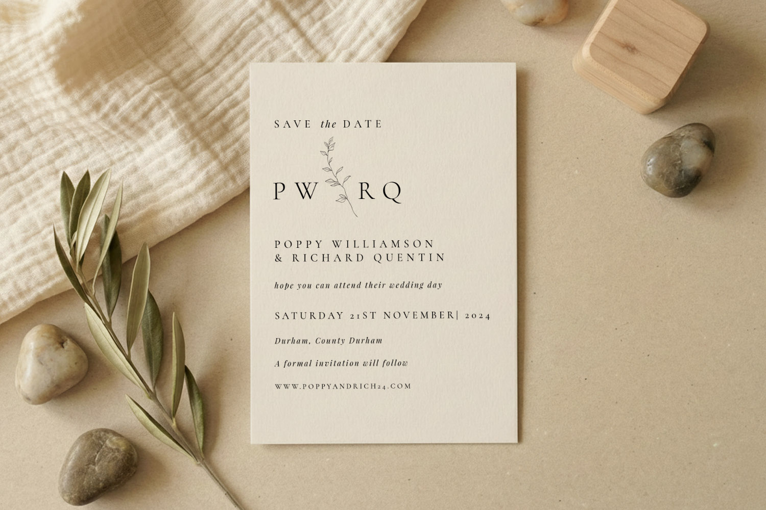
Matching your save the date to the rest of your wedding stationery: a practical guide
Choosing a save the date is one of the first creative decisions you’ll make for your wedding. It does more than announce a date—it sets the tone for everything that follows. This guide shows you how to pick (and adapt) a save the date that flows naturally into invitations, information cards, RSVP cards, menus, place cards, orders of service and table plans, using colour, typography, motifs and layout to create a cohesive suite. Where helpful, we’ve added practical workarounds for real-life scenarios.
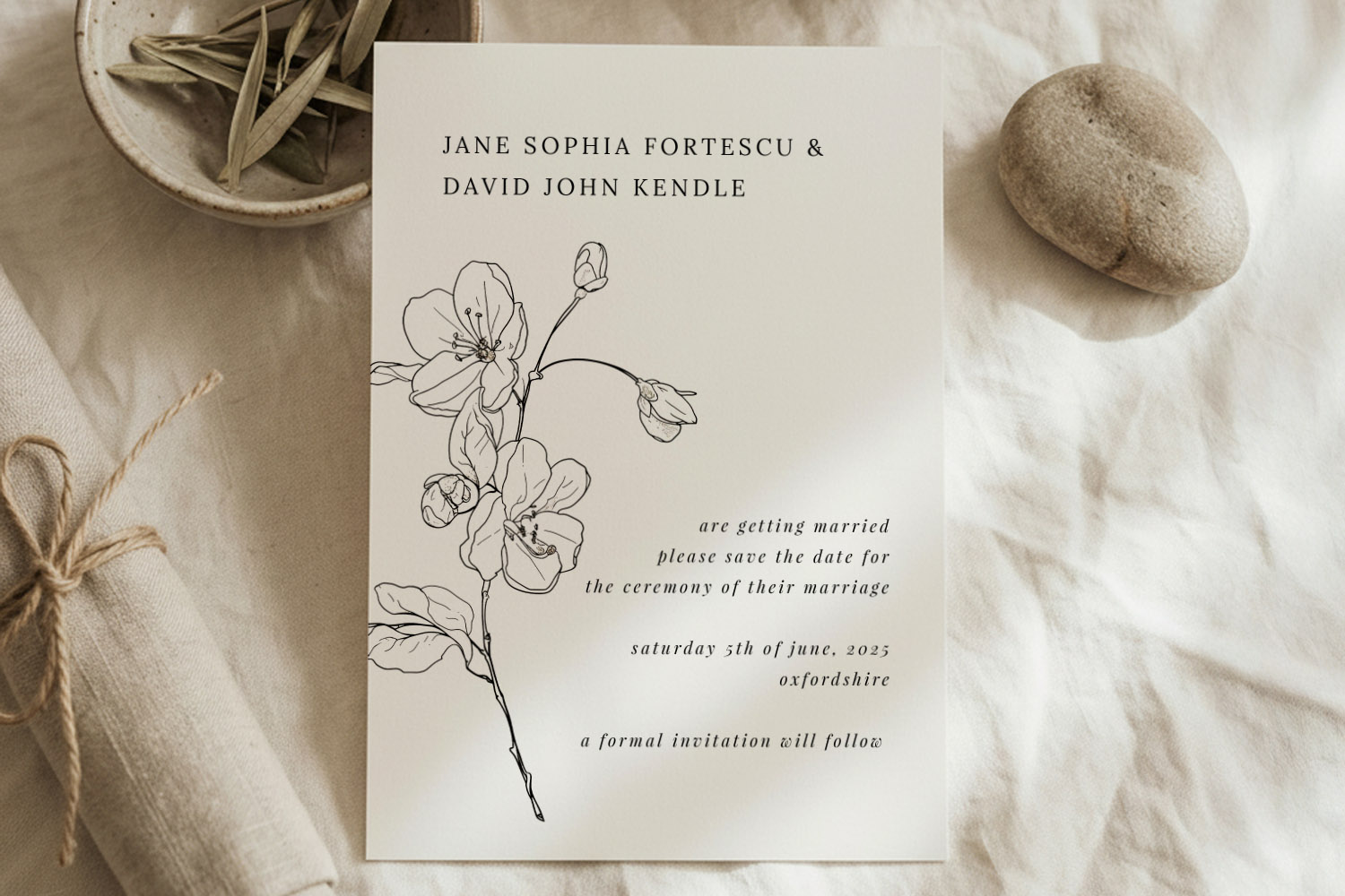
Elegant wedding save the dates card featuring a simple botanical motif, perfect for couples seeking a modern, natural stationery style.
Start with the save the date: set the tone with purpose
Your save the date is the “headline” for your wedding brand. Before you fall for a pretty design, decide what you want it to say about your day:
- Formality: relaxed garden party or black-tie?
- Aesthetic: botanical, classic, modern minimalist, rustic, photo-led—what best matches your venue and season?
- Practical need: destination details, website link, or RSVP QR code?
On Utterly Printable’s wedding save the date templates, you customise designs online in minutes and can choose professional printing or an instant digital download. Many styles are part of a larger, matching suite that extends to invitations and on-the-day pieces. If you already know you’ll want a co-ordinated look, start by shortlisting save the dates that sit within a broader collection you like.
Quick way to align style from the outset
- Pick a design family you could happily repeat across your suite. For timeless ceremony venues, browse classic wedding invitation templates and then choose a save the date that shares that formal typographic look.
- Lock in your colour direction. Two to three tones are plenty: a hero colour, a secondary shade, and a neutral.
- Set a typography pairing. One display face (names) plus a highly legible body face (details) will carry across every item.
- Choose a motif or graphic idea (floral sprig, monogram, line border, venue sketch) you can repeat at smaller scales later.
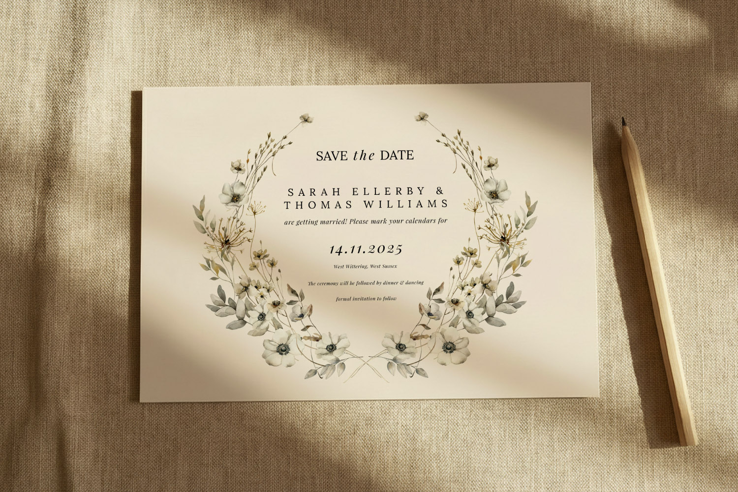
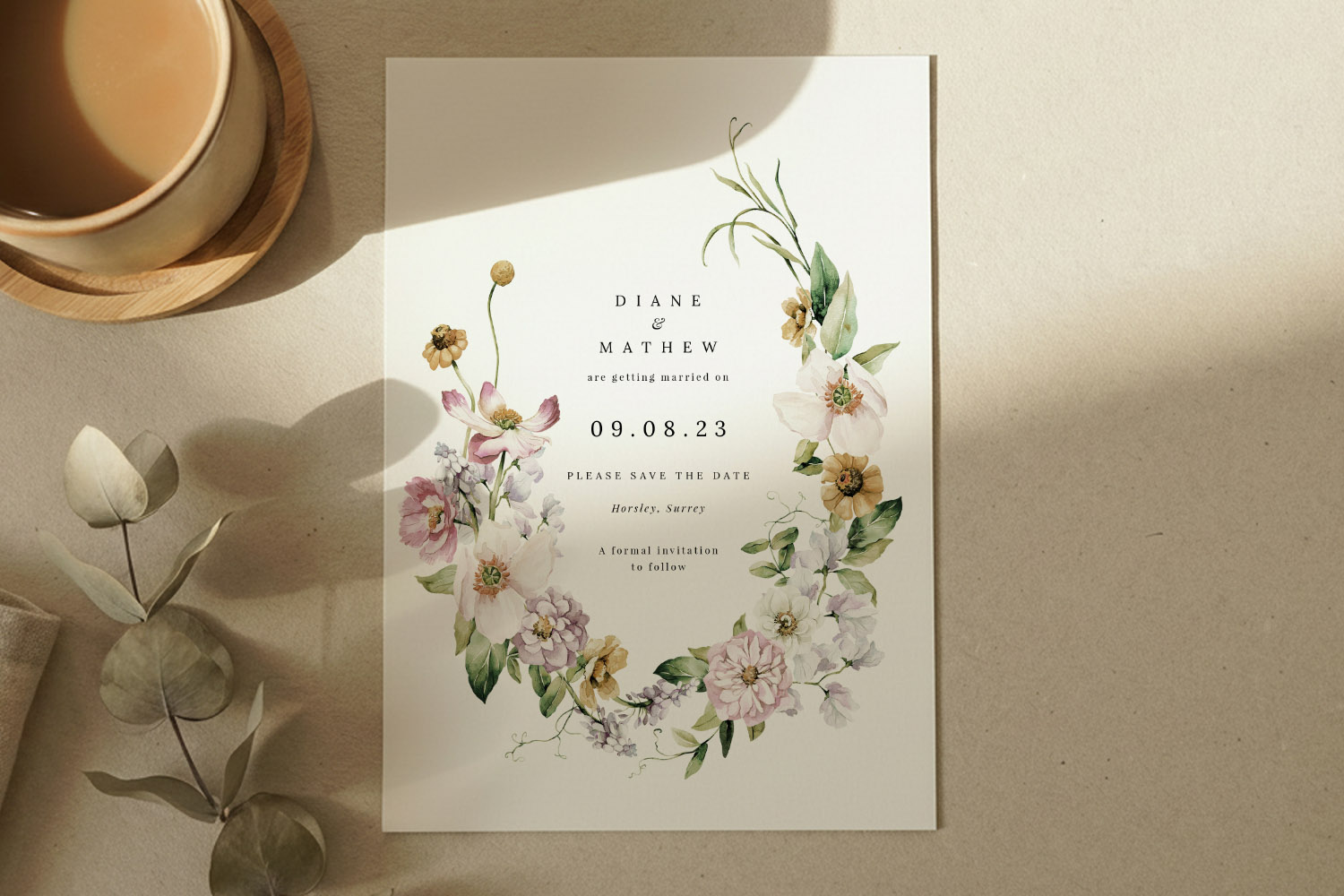
This wedding save the dates card features a delicate floral wreath and minimalist style, perfect for announcing your special day in style.
Build a cohesive suite: colour, type, motifs and layout
Once you’ve chosen your save the date, use it as the blueprint for the rest of your stationery. The aim isn’t identical matching; it’s recognisable continuity.
1) Colour that carries
- Palette discipline: Keep to the same 2–3 colours across the suite. Nudge tones warmer or cooler for seasonal pieces (e.g. deeper napkin menus), but keep hex values close if you’re going digital.
- Paper as a colour: If you’re printing, remember the card stock adds a background tone. A warm, lightly textured stock will subtly soften colours; a bright white stock keeps palettes crisp—use whichever supports your chosen aesthetic.
- Botanical harmony: If you’ve started with leaves or flowers, pick one illustration style and stick to it. Watercolour botanicals, for example, pair beautifully with the designs in botanical save the date designs.
2) Typographic consistency
- Name styling: Set the couple’s names the same way throughout (case, weight, spacing).
- Hierarchy: Guests should always see names, date, place first. Apply the same font sizes and hierarchy rules to invitations, info inserts and orders of service.
- Numbers and symbols: Decide early how you’ll style numerals (e.g., old-style vs lining), ampersands and ordinal markers; keep them consistent.
3) Motifs that repeat with restraint
- One graphic idea, many uses: A leaf sprig can sit large on the save the date, small on a place card, and as a watermark on an order of service.
- Borders and lines: If your save the date uses a thin keyline or double border, repeat that framing on menus or table numbers so everything feels related.
- Monograms: If you’re using initials, keep their placement consistent—top-centre or bottom-right—so they become a subtle “signature”.
4) Layout habits that help
- Margins and breathing room: Copy the same edge margins and spacing rhythm; it’s the quickest way to make mixed formats look like a set.
- Alignment: If your save the date is centred, keep centred layouts on other pieces. If it’s left-aligned modern type, maintain that line across the suite.
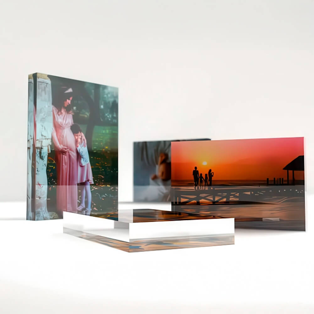
- Photo style: For photo-led designs, standardise the crop ratio and treatment (full-bleed vs framed, colour vs black-and-white), across thank-you cards or info cards to avoid a patchwork effect.
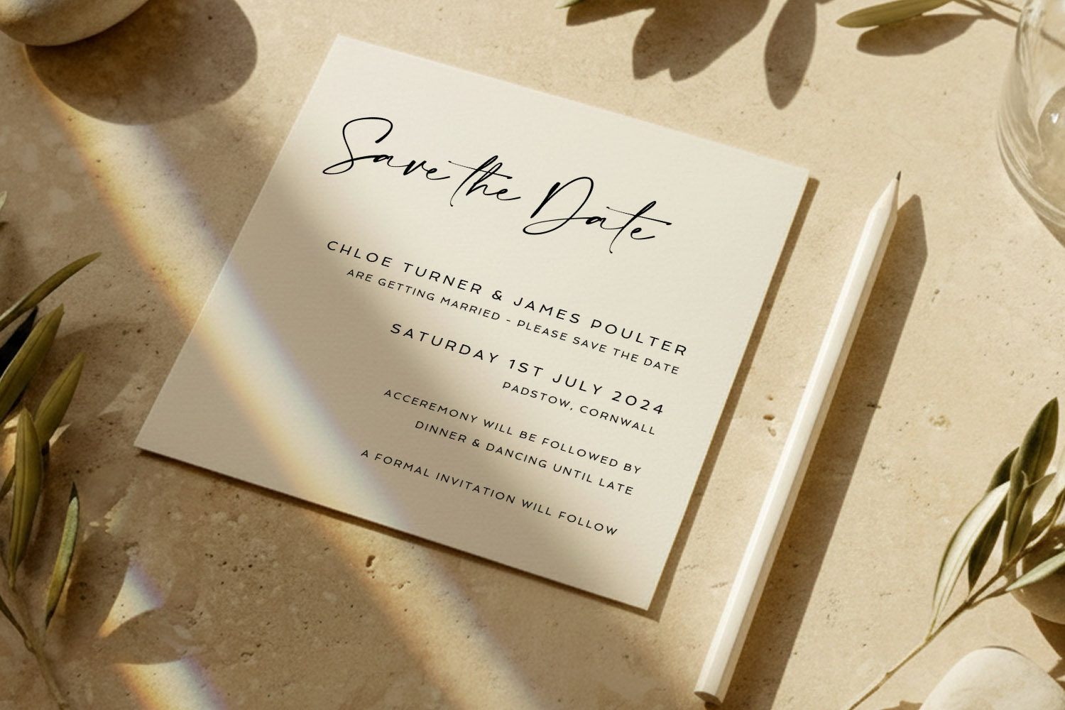
This wedding save the dates card features minimalist black lettering on cream card, perfect for announcing your special day in timeless style.
Practical scenarios & smart workarounds
Real weddings evolve. Here’s how to keep your stationery cohesive when plans change.
Scenario A: Your favourite save the date has no matching invitation
- Recreate the recipe: Use the same fonts, colours and motif from the save the date within a compatible invitation layout—Utterly Printable’s online editor lets you adjust typography and colours to align designs from different families.
- Bridge with “classic neutrals”: Choose a simple invitation with plenty of white space and let your established font and colour do the heavy lifting. Pair it with coordinating on-the-day pieces to reinforce the look.
- Lean on a related style category: If you began botanical, look for a compatible invitation in a traditional or modern collection that shares the same mood, such as the formal looks in classic wedding invitation templates. Maintain your palette and leaf motif to tie them together.
Scenario B: You change your colour palette after sending save the dates
- Keep one constant: Retain either your type pairing or motif. Change the colours gradually—e.g., move from sage to olive while keeping the floral line art identical.
- Use accessories to transition: Menus, place cards and table plans are perfect for bringing in the updated colours without making the invitation feel like an outlier.
- Update digital touch-points: If you used a QR code or website link on your save the date, ensure the site reflects the new palette so the digital experience aligns with your printed items.
Scenario C: You need to adapt designs across formats and sizes
Utterly Printable offers a range of card sizes, and many designs come as flat, single-sided or double-sided layouts. When moving a concept from a small save the date to an A5 invitation, for example:
- Scale with intent: Increase white space rather than scaling graphics proportionally; it keeps designs elegant at larger sizes.
- Rethink hierarchy: Add a subheading line (time, reception details) and keep your primary name/date styling from the save the date.
- Reuse the back: On double-sided pieces, park practical details (maps, accommodation, dress code) on the reverse to preserve the clean front you established on your save the date.
Scenario D: You want photo continuity without clutter
- Choose one pose type: Either portrait-style (faces) or environmental (wide venue shot).
- Repeat the framing device: If your save the date uses a slim frame around the image, keep that device on thank-you cards and info inserts.
- Mind print realism: Photo-heavy pieces look best on a smooth, photo-friendly card stock; keep that substrate consistent wherever you feature images for colour and contrast consistency.
Scenario E: You’re going digital or mixing formats
If you plan to print invitations but email reminders later, keep template styling consistent across both. With Utterly Printable, you can opt for professional printing or a high-resolution digital download. Use the same colour codes and typefaces on your website and digital PDF so the look remains unified from inbox to place setting.
FAQs about matching your save the date to your wedding stationery
Below are short, practical answers to the questions couples most often ask when coordinating their save the dates with the rest of their stationery.
No. It should co-ordinate , not clone. Keep the same type pairing, colour palette and one motif or layout cue. That gives you freedom to adapt for seasonality or formality without losing the thread.
Pick one illustration style (e.g., watercolour leaves) and repeat it at different scales. Use it large on the save the date, smaller on menus, and as a delicate accent on place cards. For inspiration, browse Utterly Printable’s botanical save the date designs and carry the same illustration approach across your suite.
Begin with typography. A refined serif for names with clear, readable body text sets a formal tone you can repeat everywhere. Explore coordinating invitations in Utterly Printable’s classic wedding invitation templates and match your save the date to that typographic style.
Keep your existing fonts and motif. Restyle future pieces (invitation, order of service, menus) in the new palette so the overall look still feels intentional. Use accessories—ribbons, envelopes, or on-the-day signage—to bridge the colours across the suite.
Absolutely. Place the QR discreetly on the back or bottom-right of the front, and style the label in your body font. The key is scale: small enough not to dominate, large enough to scan. It’s a tidy way to connect guests to your RSVP page.
Save the Date Etiquette in the UK: Rules, Modern Trends & Common Mistakes
Discover the essentials of save the date etiquette in the UK, including who to send them to, what details matter, and how to avoid common mistakes. Explore modern trends, digital options, and wording tips for every type of wedding celebration.
Save the Dates with QR Codes — What They Are and How to Use Them
Explore how QR codes on wedding save the dates make sharing RSVP forms, travel info, and your website easy. Get practical tips for QR code placement, styling, and testing to keep invitations modern, elegant, and guest-friendly.
What to Write on a Wedding Save the Date (Complete Wording Guide)
Learn what to write on a wedding save the date with this comprehensive wording guide, including essential details, optional extras, and ready-to-use examples for every style to help you create clear, stylish, and stress-free save the dates.
Which Paper Stock Is Best for Wedding Save the Dates? (324gsm vs 350gsm vs Silk vs 650gsm)
Discover which paper stock is best for wedding save the dates as we compare 324gsm, 350gsm, silk, and 650gsm options. Learn how finish, colour, and texture influence your card’s look, feel, and practicality for your special announcement.
Products related to wedding save the date cards:


Trends & Tips
Save the dates are the perfect way to announce your big day. Check out the blog for inspiration on personalisation, timing, and coordinating them with the rest of your wedding stationery.