Paper Types for Engagement Party Invitations: Smooth, Textured or Silk?
Choosing the right card stock for your engagement invitations can be the difference between “nice” and “nailed it”. This practical guide explains how each Utterly Printable stock handles colour, typography and photography—so you can match paper to design, not guesswork. We’ll cover 350gsm smooth uncoated, 324gsm lightly textured premium, 400gsm photo silk, and the ultra-luxurious 650gsm super-thick upgrade.
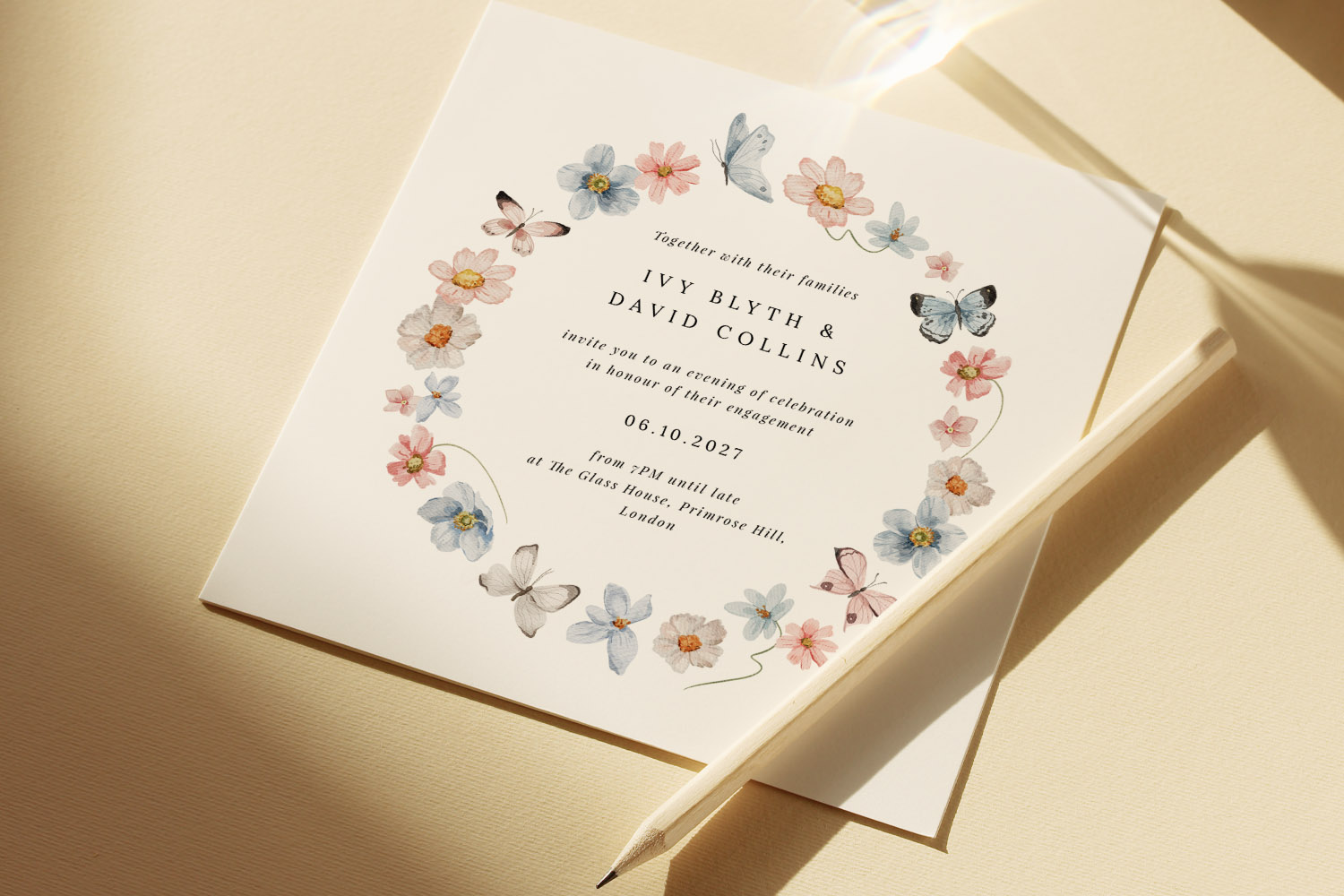
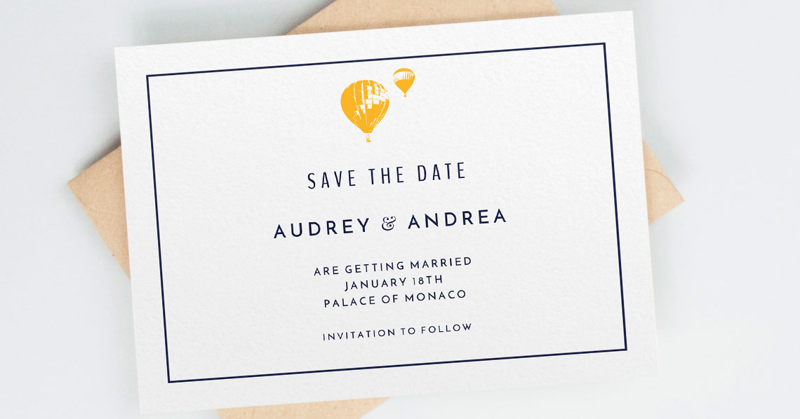
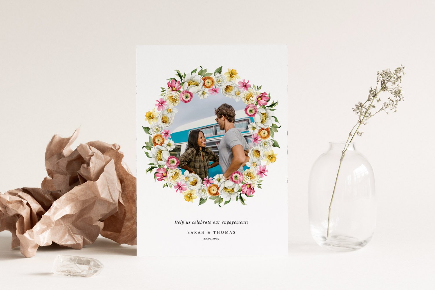
Elegant engagement party invitations featuring a delicate floral and butterfly wreath, perfect for announcing your special celebration in style.
1) How paper changes what you see (and feel)
Paper isn’t just a carrier for ink; it actively shapes the look of your design.
- Colour: Coated papers tend to deliver higher contrast and more saturated colours. Uncoated papers give a gentler, more natural finish.
- Typography: Smooth, flat surfaces preserve fine details in small type. A little texture adds character but can soften extremely thin strokes.
- Photography: Gloss or silk surfaces emphasise crispness and depth; uncoated stocks give photos a soft, matte, editorial feel.
- Tactility: Thickness and surface texture carry meaning—weight signals formality; texture suggests craft; silky sheens say modern and photographic.
If you’re still browsing layouts, it’s worth skimming the full range of Engagement Party Invitations to see how your preferred style might pair with each stock.
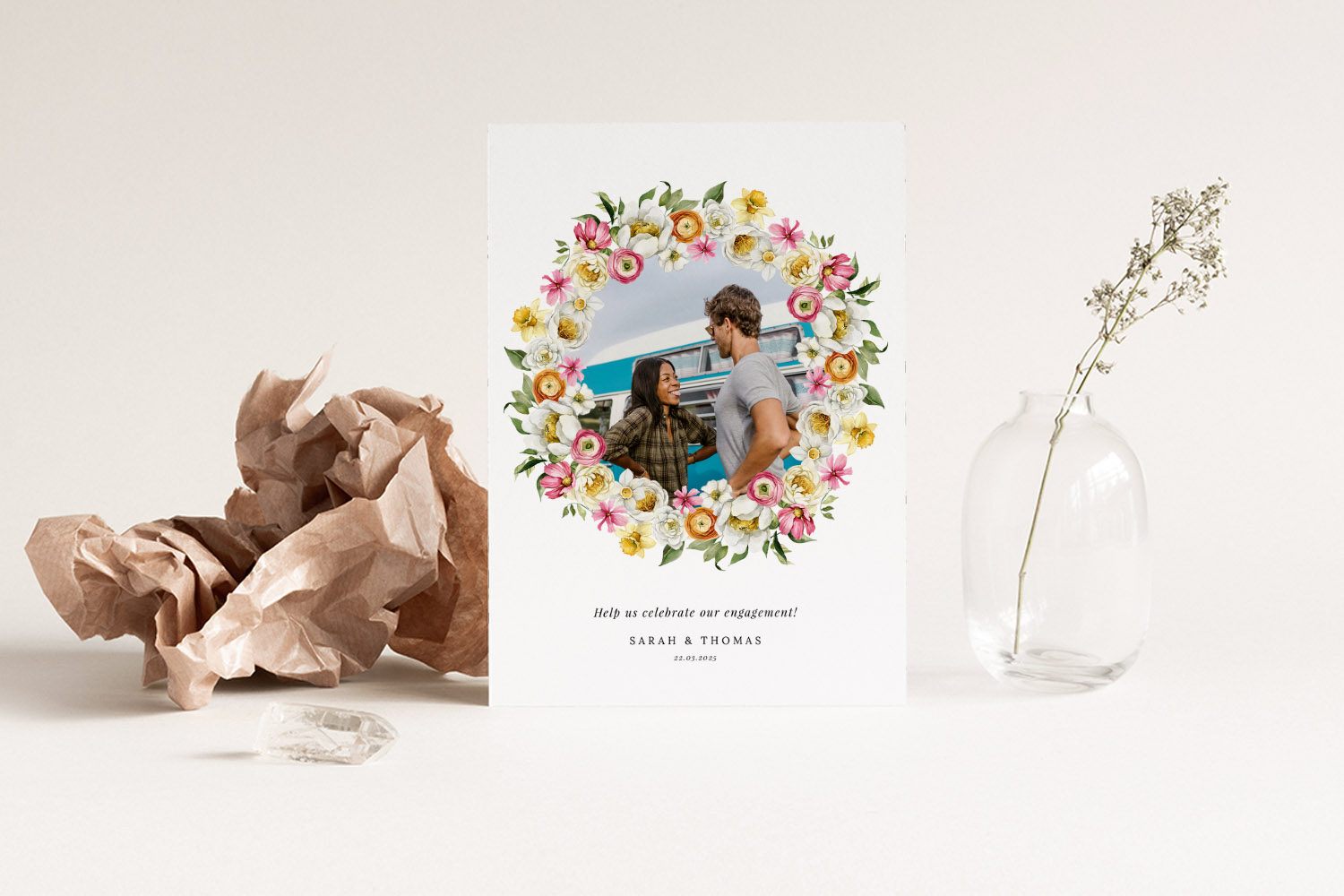
Elegant engagement party invitations with a colourful floral wreath and photo, perfect for announcing your special celebration in style.
2) The four Utterly Printable stocks, explained
Below is a plain-English breakdown of how each card behaves, with notes for colours, type and photos, and the kinds of designs they flatter.
350gsm Smooth Uncoated (house stock)
Look & feel: Clean, matte and smooth in the hand—no surface sheen.
Colour: Colour: Slightly softer, more “paper-first” colour; great for muted palettes and contemporary neutrals.
Typography: Very reliable legibility for most font sizes thanks to the smooth surface; fine hairlines remain tidy.
Photography: Delivers a tasteful, matte result. Expect a touch less punch than coated silk, which many people prefer for an understated, editorial vibe.
Best for: Minimal layouts, modern sans-serif typography, line illustrations, or designs where the paper should feel calm and unobtrusive.
324gsm Lightly Textured Premium
Look & feel: Subtle, premium tooth under the fingertips; elegant and tactile.
Colour: A touch more muted because the micro-texture scatters light—pastels, botanical greens and watercolour tones look especially natural.
Typography: Characterful for serif faces and calligraphic scripts; extremely fine micro-details may soften a fraction.
Photography: Soft-focus effect compared with silk; beautiful for romantic portraits, botanicals and painterly backgrounds rather than high-contrast collage.
Best for: Nature-led layouts and soft palettes—think floral engagement invitations or hand-painted motifs.
400gsm Photo Silk
Look & feel: Substantial card weight with a silky, light-reflective surface.
Colour: High contrast and richer saturation; deep blacks feel “inkier”.
Typography: Super crisp edges—even at small sizes—thanks to the coated surface.
Photography: This is the punchy option. Photo detail, skin tones and shadow depth hold brilliantly, making it the natural choice for image-led layouts.
Best for: Clean, photographic designs, modern grids and bold typographic statements. If you’re leaning toward black & white invitations or high-contrast editorial looks, start here.
650gsm Super-Thick (luxury upgrade)
Look & feel: Impressively rigid, double-thickness feel; a premium statement before a word is read.
Colour: Similar print character to uncoated—elegant and slightly softer rather than glossy.
Typography: Shines with confident, minimalist type and generous white space.
Photography: Suits softer photographs or photo accents; if you want maximum photographic impact, the 400gsm photo silk still wins.
Best for: Understated luxury—pared-back layouts that rely on weight, balance and negative space rather than heavy colour coverage.
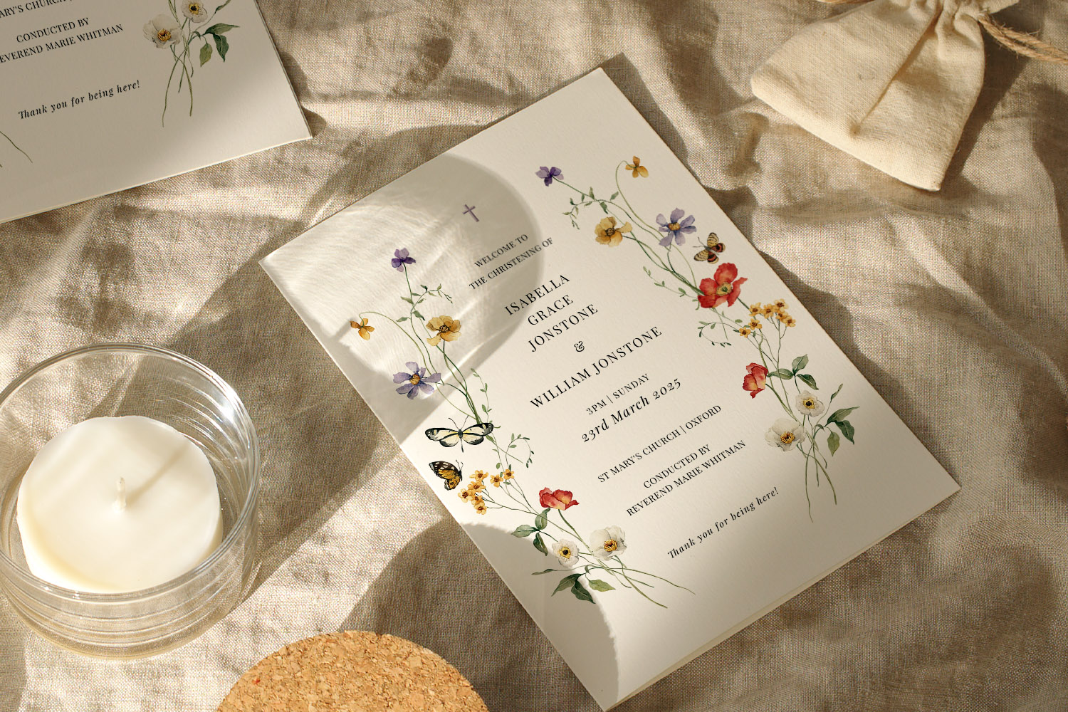
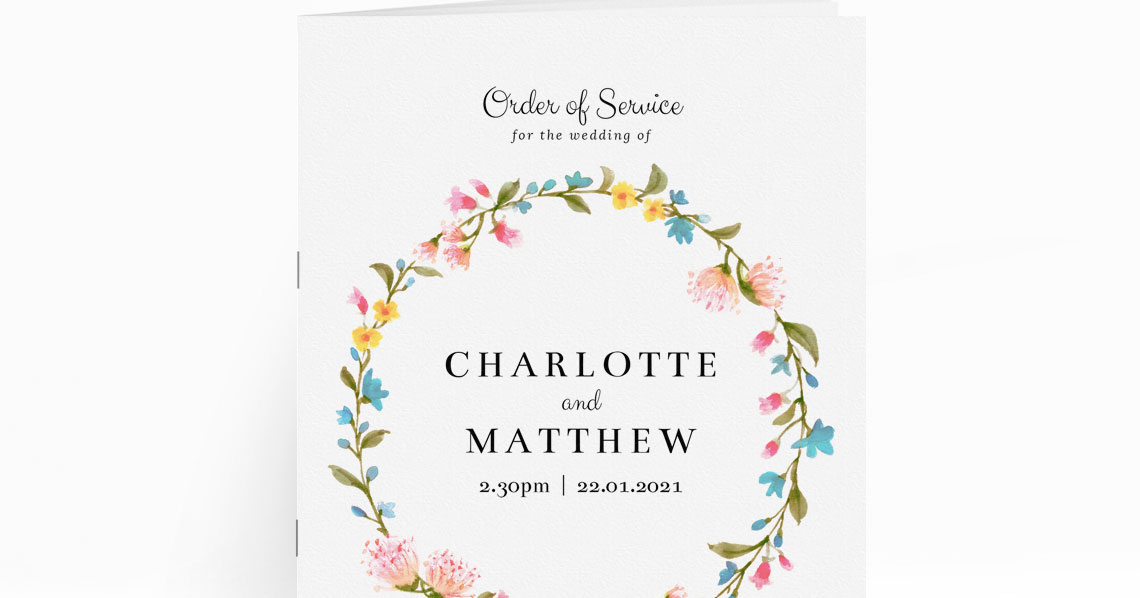
Elegant engagement party invitations featuring colourful wildflowers, perfect for a spring celebration and beautifully presented on linen.
3) Match your design to the right stock (with examples)
You don’t have to be a print expert; just decide what you want your invite to say at first touch.
If you want vivid photos and crisp detail
Choose 400gsm Photo Silk. It’s ideal for photo-front cards and graphic contrasts. Browse image-forward layouts across our engagement invitation styles, then filter down to a photographic template that suits.
If you want a natural, tactile finish
Choose 324gsm Lightly Textured Premium. It complements organic palettes and painterly artwork. It’s a perfect partner for floral and botanical designs and soft greens—such as the on-trend sage-green invitations you’ll find in our collection.
If you want clean, modern minimalism
Choose 350gsm Smooth Uncoated. Typographic layouts and simple iconography look sharp and sophisticated on a matte surface. For a classic monochrome look, pair a minimal template from our black & white range with this stock for a refined, glare-free finish.
If you want the “wow” factor in the hand
Choose 650gsm Super-Thick. It’s the right call when weight and presence matter—think intimate dinners or black-tie cocktail evenings. Keep the design restrained so the heft does the talking.
Colour, type and photo tips (quick wins)
- Deep backgrounds: On uncoated stocks (350gsm and 650gsm), very dark, solid areas print with a softer, more paper-like depth. On silk, they appear richer.
- Pastels & sage: Soft colour-ways—sage, dusty pink, stone—feel beautifully authentic on textured or uncoated stocks. Explore our curated sage-green engagement invitations for inspiration.
- Delicate serifs: Tiny serifs and hairlines are crispest on smooth or silk surfaces. If your design uses very small caption text, favour 350gsm Smooth Uncoated or 400gsm Photo Silk.
- Photography: For maximal sharpness and contrast, 400gsm Photo Silk is the safest choice. For a softer, romantic photograph, 324gsm Lightly Textured Premium gives a gentle, art-print style.
“What paper is best for photo engagement invitations?” In short: 400gsm Photo Silk for crispness and pop; uncoated or lightly textured for a softer, matte character. If you’re weighing photo realism versus tactile elegance, decide which quality matters more in the hand.
FAQs: Choosing paper for engagement invitations
Still undecided? These quick answers distil the differences so you can pick with confidence and get back to party planning.
A. 400gsm Photo Silk . Its silky coating preserves fine detail and boosts contrast, so portraits and scenery look vivid and sharp. If you prefer a matte, editorial look, 350gsm Smooth Uncoated is a tasteful alternative, while 324gsm Lightly Textured Premium brings a soft, romantic feel to images.
A. 350gsm Smooth Uncoated keeps type crisp without glare. For a luxury twist, the 650gsm Super-Thick upgrade emphasises weight and white space beautifully.
A. The 324gsm Lightly Textured Premium stock complements organic artwork and gentle palettes. It pairs naturally with our floral engagement invitation designs .
A. For maximum contrast and solid, inky blacks, 400gsm Photo Silk is ideal. For a quieter, gallery-style monochrome, 350gsm Smooth Uncoated is excellent. Explore templates in our black & white category to compare looks.
A. Not at all if “premium in the hand” is the priority. 650gsm Super-Thick feels wonderfully rigid. Keep your design restrained to let the paper do the work.
Engagement invitation wording etiquette for different types of celebrations
Discover modern UK etiquette for engagement invitation wording across cocktail parties, garden BBQs, intimate dinners, surprise celebrations, and more. This guide covers tone, structure, hosts, dress codes, and RSVP tips to help you craft clear, welcoming invitations.
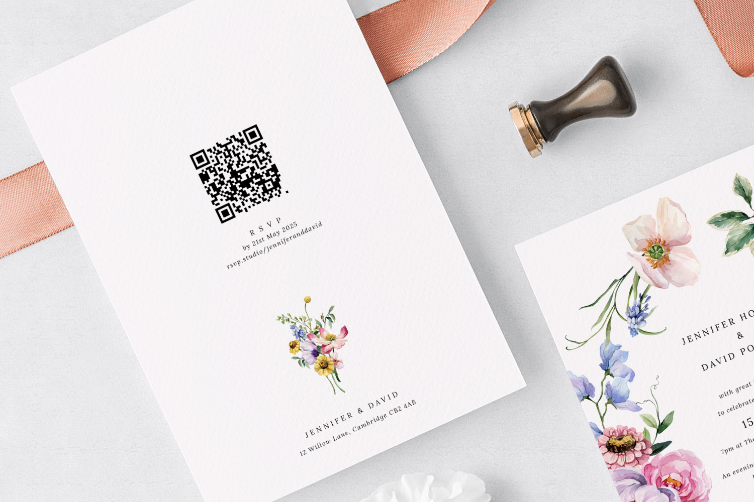
RSVP Options for Engagement Party Invitations: Email, QR Code or Website?
Discover the best RSVP options for engagement party invitations, from email and QR codes to website forms and printed inserts. This guide helps you choose the right method for your guest list, making responses easy to collect and manage.
What to include on an engagement party invitation (UK examples)
Learn what to include on a UK engagement party invitation, covering key details, RSVP options, wording ideas, and design tips. This guide ensures your invitations are clear, inviting, and set the perfect tone for your celebration.
Products related to engagement party invitations:


Trends & Tips
Engagement party invitations are an exciting part of wedding planning. Check out our blog for tips on timing, RSVP management, and how to personalise your invitations for the big celebration.