How to lay out a wedding menu for clarity and style
Your wedding menu does two jobs: it sets expectations for the meal and it quietly supports the look of your day. The most polished menus share a few traits—clear hierarchy, comfortable spacing, consistent typography and a tight content flow. This guide walks you through each step, with practical layout tips you can apply in minutes. If you’d like a head start, explore Utterly Printable’s wedding menu templates—they come in popular sizes and coordinate with the rest of your on-the-day stationery.
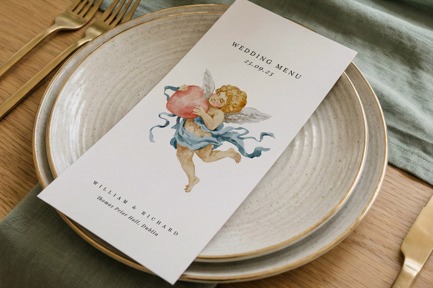
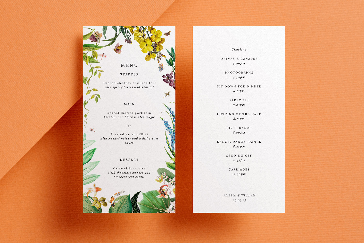
Elegant wedding menus featuring a cherub design, perfect for adding a romantic touch to your table setting and celebration.
1) Start with the structure: content, order and tone
Before you open a design, decide what must go on the page. A clean layout starts with a clean list.
What to include (in this order works well):
- Couple’s names and wedding date (optional).
- Menu heading (“Menu”, “Wedding Breakfast” or similar).
- Course headings (Starter, Main, Dessert; add Sides or Petit Fours if relevant).
- Dish name on one line; short description on the next.
- Dietary markers (e.g., V/VE/GF) or allergen icons and/or a discreet note.
- Drinks pairings (optional).
- A closing line—“Bon appétit!” or a short thank-you.
Line-break logic that reads beautifully
- Put the dish name on its own line. Add the description underneath. This creates a reliable rhythm (name detail) that guests absorb instantly.
- Keep descriptions to 6–14 words; trim flourishes that don’t add clarity.
- Use en dashes (–) to separate elements within a line, and keep full stops off list items unless they are full sentences.
- If one dish has a long description, balance the set by breaking the longest into two short, stacked lines rather than bloating line length.
Choose the right size for your content
- DL (210 × 99 mm) suits concise menus and looks elegant at each place setting.
- 5”×7” (127 × 178 mm) or A5 are comfortable for multi-course menus with short descriptions.
- 148 mm square offers a generous canvas for pairings, icons and a small motif.
Utterly Printable offers all four sizes, so you can fit the content without cramping it—browse the full range of wedding meal menu templates to find a layout that suits your text length.
Set a consistent tone
- Pick title case (Most Words Capitalised) or sentence case (only the first word and proper nouns) and keep it consistent across headings and dishes.
- Use British spellings and kitchen terms your guests will recognise; italicise foreign words sparingly.
Keep a safety margin
- Leave at least 5–7 mm clear from every edge. It prevents the design feeling cramped and protects against trimming tolerance.
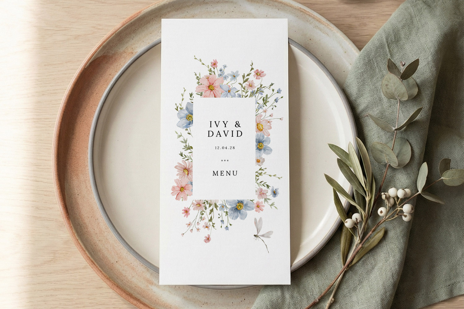
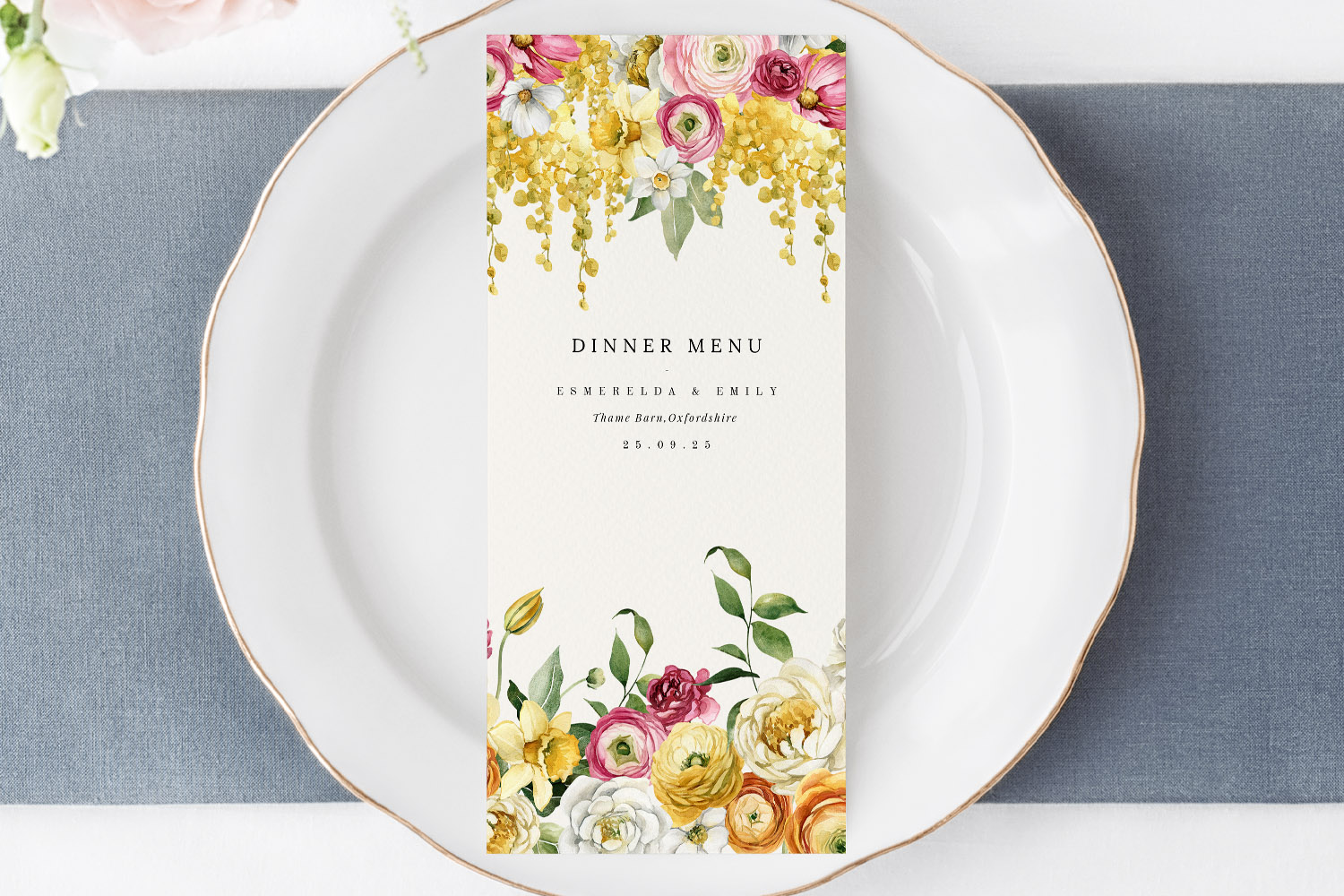
Elegant wedding menus featuring delicate pastel flowers, perfect for adding a personalised touch to your reception table setting.
2) Typography and hierarchy that guide the eye
A tidy menu is 50% type choices. You don’t need rare fonts—just good hierarchy and comfortable spacing.
Create a simple type system
- Headings: 125–160% of body size; consider small caps for course titles.
- Dish names: 110–120% of body size or the same size but bold/semibold.
- Descriptions: your body size in regular weight.
- Notes & legends: 85–90% of body size.
As a starting point, try body 10–11 pt for DL; 11–12 pt for 5”×7”, A5 and square. Set line spacing at 120–140% of the font size for calm, breathable text.
Pick one or two complementary fonts
- Pair a classic serif for headings with a clean sans-serif for details; or run a single family with weights (Regular/Bold) to reduce visual noise.
- Keep scripts (if you use them at all) for the couple’s names or a short title—avoid script body text.
Alignment and readability
- Left align for descriptions and lists: it’s the easiest to scan.
- Centred layouts can look formal on short lines (DL), but avoid centring long paragraphs—it’s tiring to read.
- Keep line length to 45–75 characters; if lines get too long, add hard line breaks for balance.
Consistency across the suite
For a cohesive look, echo the same fonts and heading styling in other items—orders of service, place cards and table signage. Utterly Printable’s matching ranges make this easy; explore wedding order of service templates and co-ordinate with your menu design without fuss.
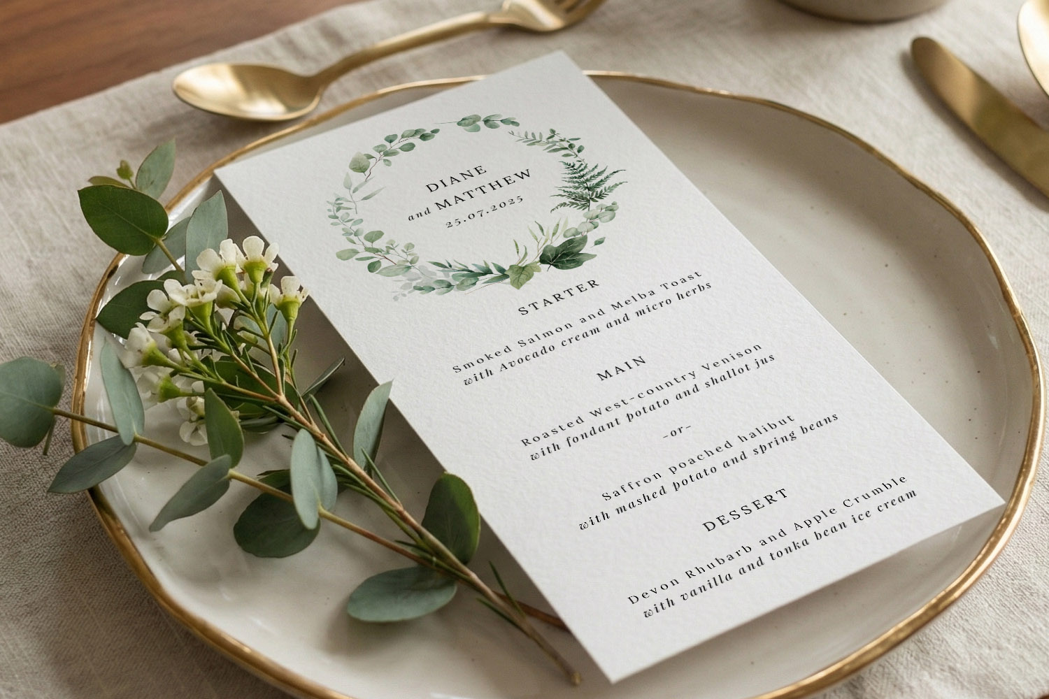
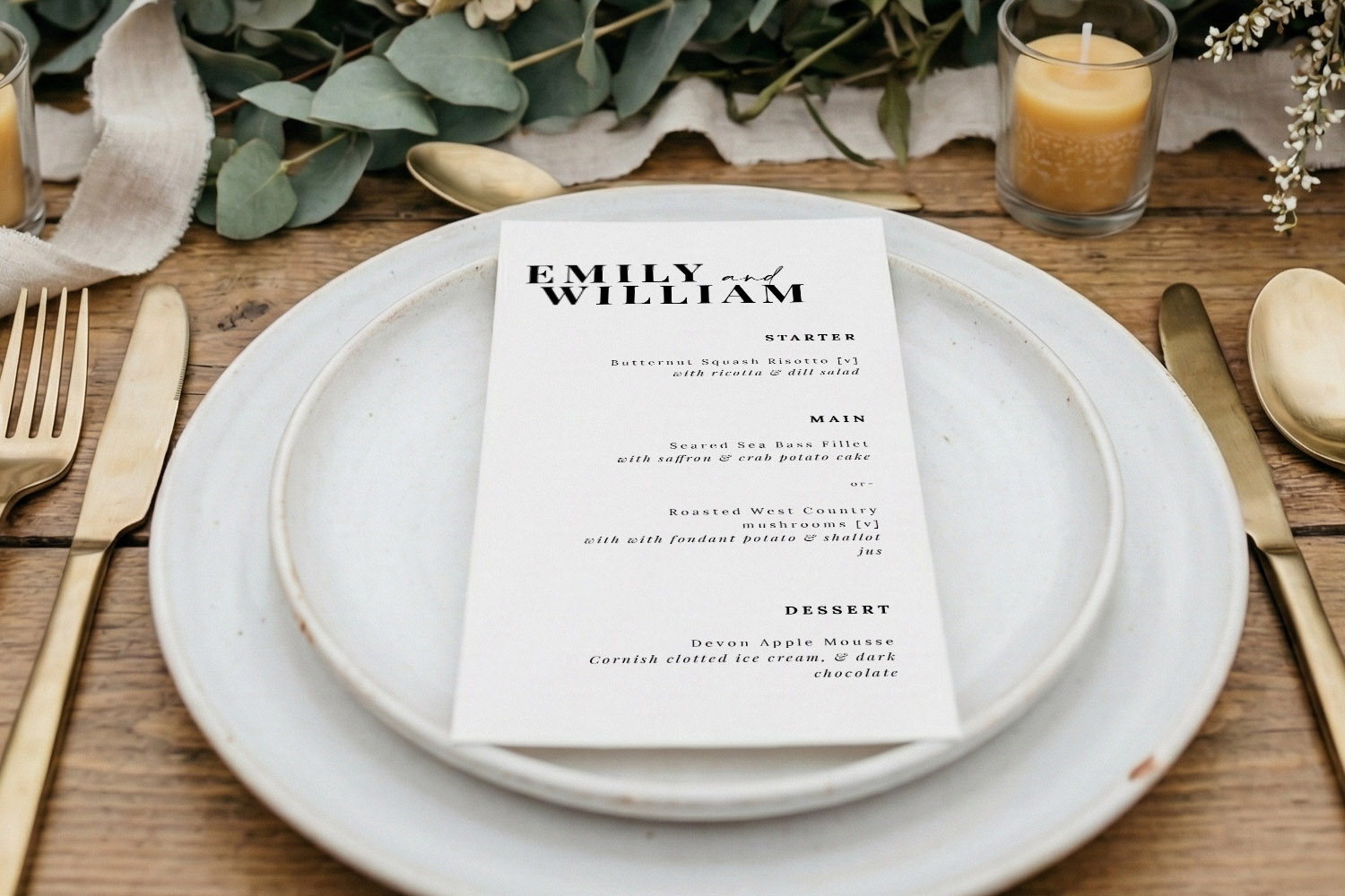
Elegant wedding menus featuring a botanical wreath design, beautifully presented on a plate with gold cutlery and fresh greenery.
3) Layout techniques: spacing, dividers, motifs and icons
With content and type in place, refine the page using spacing and supportive design details.
Work with a simple grid
- Add generous top/bottom breathing space and keep course blocks evenly spaced (think in units—e.g., 8–10 mm between blocks, 4–6 mm between dish name and description).
- If you include pairings, a two-column layout for “Dish / Wine” keeps scanning effortless.
Borders, rules and motifs—less is more
- Use thin dividers (0.3–0.5 pt) to separate courses; avoid heavy lines that dominate the page.
- A single motif (monogram, sprig, or icon) at the top or bottom is plenty. Repeat it small rather than scattering multiple decorative elements.
- If your stationery suite is floral or rustic, echo just one style cue on the menu—a leaf, a stroke, a watercolour wash—so the text remains the star.
Allergens and dietary information
- Choose either short text markers (V, VE, GF) or small, consistent icons. Don’t rely on icons alone—include a legend or footnote for clarity.
- Keep icons on the same baseline and size as the text they accompany; this stops the line from jumping.
- For fuller information or chef’s notes, consider adding a QR code that links to a detailed allergen page—Utterly Printable’s online designer lets you add one directly to your layout.
- Add a courteous note such as “Please speak to our team about allergies”; it’s helpful and unobtrusive.
Avoiding a cramped look
- Resist the urge to fit everything on one side. If space is tight, shorten descriptions or choose a larger format (A5 or square).
- Keep one visual idea per menu—if you have a border, you probably don’t need dividers; if you run a wash of colour, lighten or remove the border.
- Maintain colour contrast: dark ink on light stock is the easiest to read at dinner light levels.
Per-place vs per-table menus
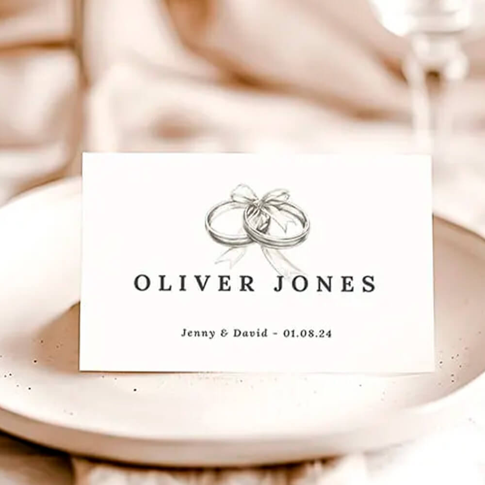
- Per-place menus (one at each setting) look refined and make lovely keepsakes. Pair them with personalised seating using Utterly Printable’s individual place card generator for a joined-up look.
- Per-table menus work well on thicker stock as centrepieces; the 650gsm option adds presence without frames. If you’re placing one menu per table, increase text size by a point or two for mid-table readability.
Keep the wider guest experience in view
- Ensure your menu aligns with the table plan typography so guests see a consistent style from entrance to seat—browse coordinating personalised wedding table plans.
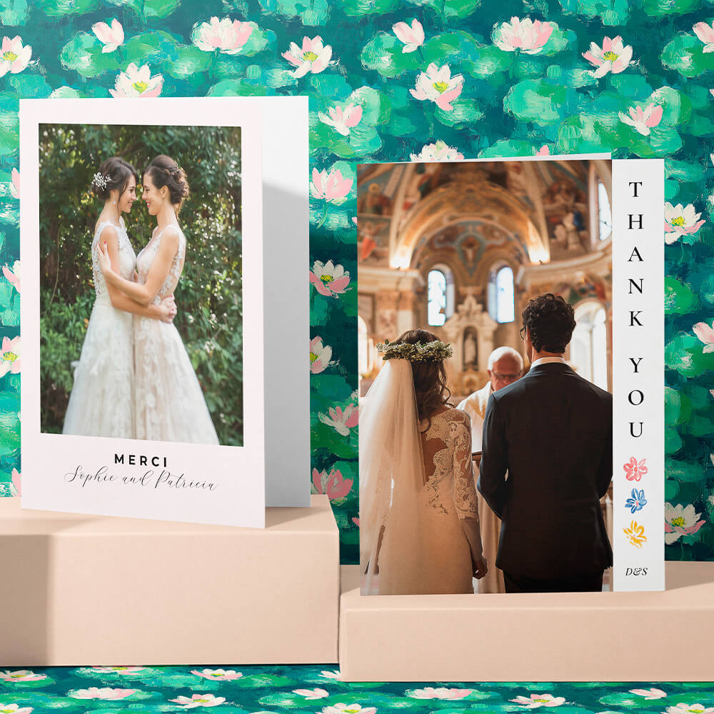
- Tie everything off post-wedding with matching stationery like wedding thank you card templates so the look carries from “I do” to the last note of gratitude.
When you’re happy on screen, print a true-size paper proof at home, lay it on a plate and read it at arm’s length under warm light. Small spacing tweaks often show up only at real scale. If you’re using Utterly Printable’s print service, ordering a low-cost physical sample first is a smart final check; their templates and stocks are designed for crisp, readable, eco-friendly menus on FSC-certified card.
Frequently asked questions about wedding menu layout
These are the questions we hear most when couples format menus. The answers are practical and easy to apply, whether you’re using a template or starting from scratch.
Use DL for short, elegant lists or when you’re placing a menu at every setting. Choose 5”×7” or A5 for multiple courses and longer descriptions. Pick 148 mm square if you want more breathing room for icons, pairings or a motif. You can browse all four formats in our wedding menu templates.
Left align for maximum readability, especially for descriptions. Centred headings and short dish lines can look formal, but avoid centring long paragraphs.
As a rule of thumb: 10–11 pt body for DL; 11–12 pt for larger sizes. Line spacing around 120–140% of the font size prevents crowding.
Use short markers (V/VE/GF) or small icons plus a legend. Keep everything on one baseline. For details, add a QR code linking to an allergen page.
Yes—either add a name line at the top of each menu or pair your menus with named place cards via the place card generator.
Collecting Menu Choices Through Your Digital Wedding RSVP
Collecting menu choices through your digital wedding RSVP makes planning easier for couples and caterers alike. Discover how RSVP.studio streamlines guest meal selections, dietary requirements, and event attendance, all in one secure, mobile-friendly platform designed for modern weddings.
Dietary icons & allergen labelling for wedding menus (UK guide)
Discover practical tips for using dietary icons and allergen labelling on UK wedding menus. This guide explains how to create clear, stylish menu cards with symbols, legends, and QR codes, helping guests easily navigate dietary requirements.
Wedding Menu Size Guide: DL vs A5 vs 5×7 vs Square
Explore the differences between DL, A5, 5√ó7, and square wedding menu sizes in this helpful guide. Learn which menu card format best suits your table layout, menu length, and design style for a beautifully coordinated wedding reception.
What to Include on a Wedding Menu Card: A Practical UK Guide
Learn how to design the perfect wedding menu card with this UK guide, featuring essential details to include, formatting tips for clarity and style, and advice on accommodating dietary needs while maintaining an elegant, inviting wedding table.
Products related to wedding menu cards:


Read & Be Inspired
Wedding menu templates let you showcase your carefully curated meal. Discover tips on designing beautiful menus, incorporating themes, and making them a standout part of your reception décor.