How to co-ordinate your wedding invitation with the rest of your stationery suite
Your wedding invitation does more than announce a date: it sets the design language for everything that follows. This guide walks you through making your invitation the calm, confident foundation of a stationery suite—covering typography, colour, motifs and materials—so every item, from RSVP to menus, feels part of one considered whole. Along the way, you’ll find practical tips tailored to Utterly Printable’s range of wedding invitation templates and matching pieces.
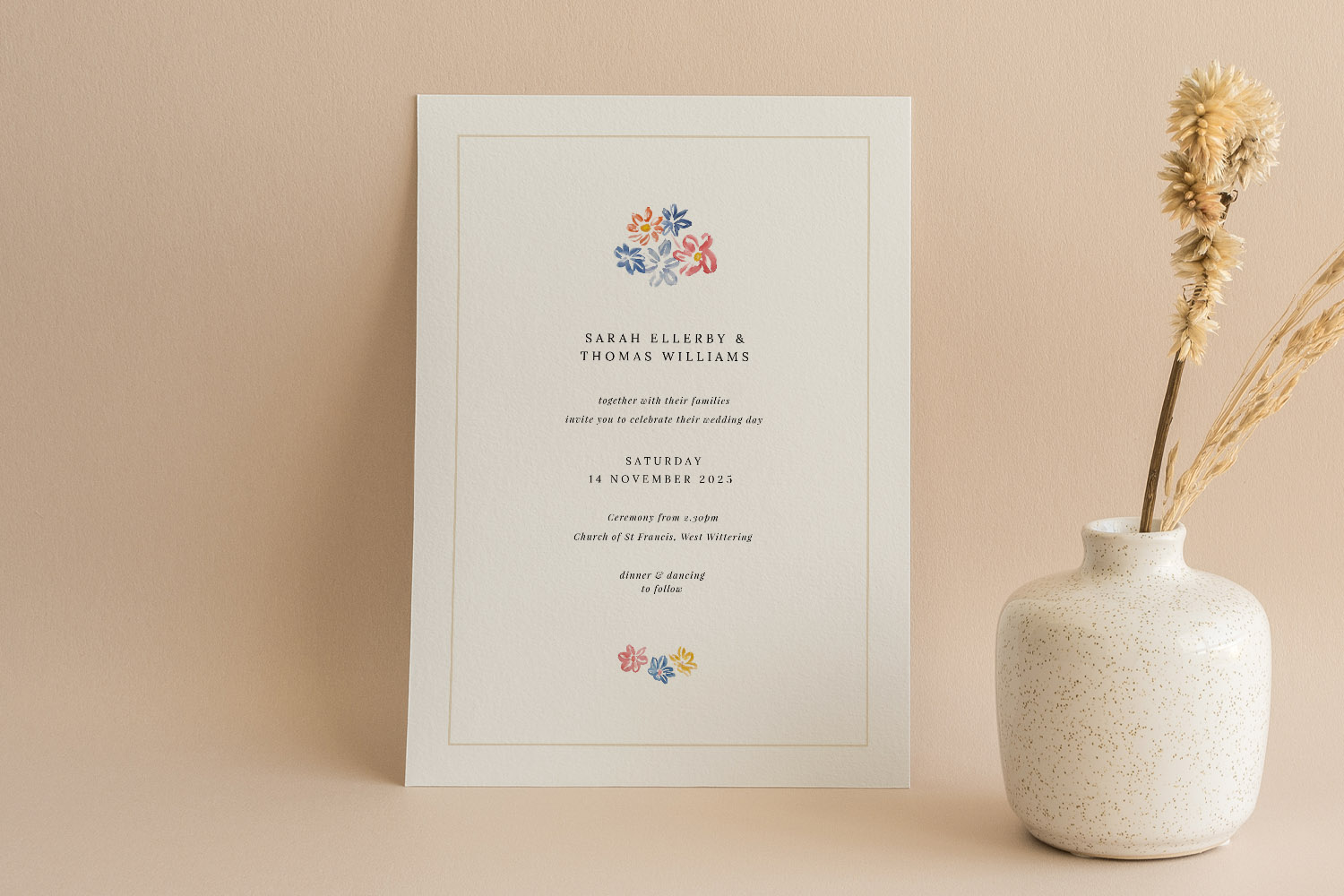
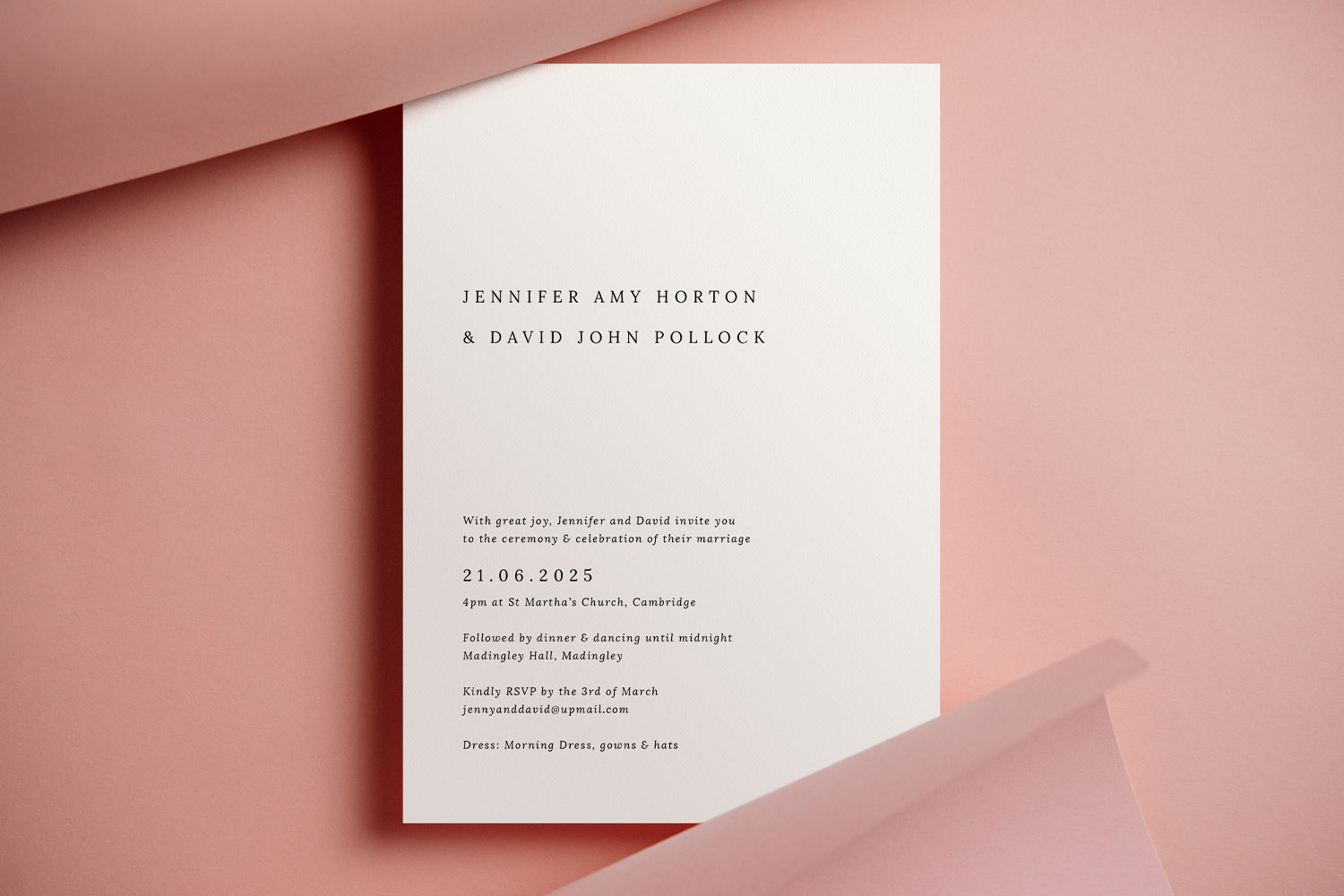
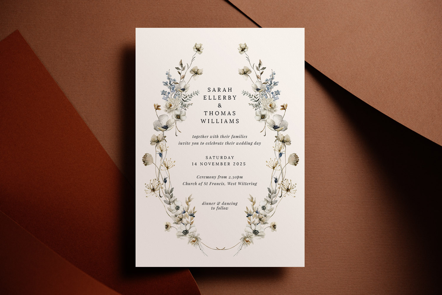
Elegant wedding invitations featuring simple floral details and classic typography, perfect for a refined and timeless celebration.
1) Begin with the invitation: the design anchor
Think of the invitation as your “brand book” in miniature. It defines the tone (formal, modern, rustic, minimalist), introduces the palette and typography, and often debuts a motif—florals, monogram, venue sketch or a simple geometric device—that will echo across the suite.
Decisions to settle at invitation stage
- Format & orientation. Choose a size you can comfortably carry through other pieces: A5, A6, 148 × 148 mm square, or 5 × 7 inch (portrait or landscape) all work well across a suite.
- Typography hierarchy. Pick a primary typeface for names/headlines and a secondary for body copy. Establish sizes and letter-spacing rules now so they’re easy to repeat on RSVPs, menus and signage.
- Colour palette. Define 1–2 lead colours and 1–2 supporting neutrals. This keeps everything cohesive while giving you flexibility for on-the-day items.
- Motif or graphic system. A floral spray, a hand-painted wash, or a crisp rule can be reused subtly—on corners, as a divider, or as a background tint.
- Paper & print finish. Keep stock consistent (or at least complementary) across pieces. Utterly Printable offers smooth bright-white and warm textured FSC-certified cards from 324–650gsm, with high-definition digital printing in the UK and envelopes supplied with printed orders.
- Functionality. If you plan digital responses, introduce a discreet QR code on the invitation that links guests to your online RSVP via RSVP.studio; repeat the same method on your RSVP card to reinforce the behaviour.
You can set all of this in the online editor while customising one of the hundreds of designs in our wedding invitation templates collection—then carry the decisions forward to the rest of your suite.
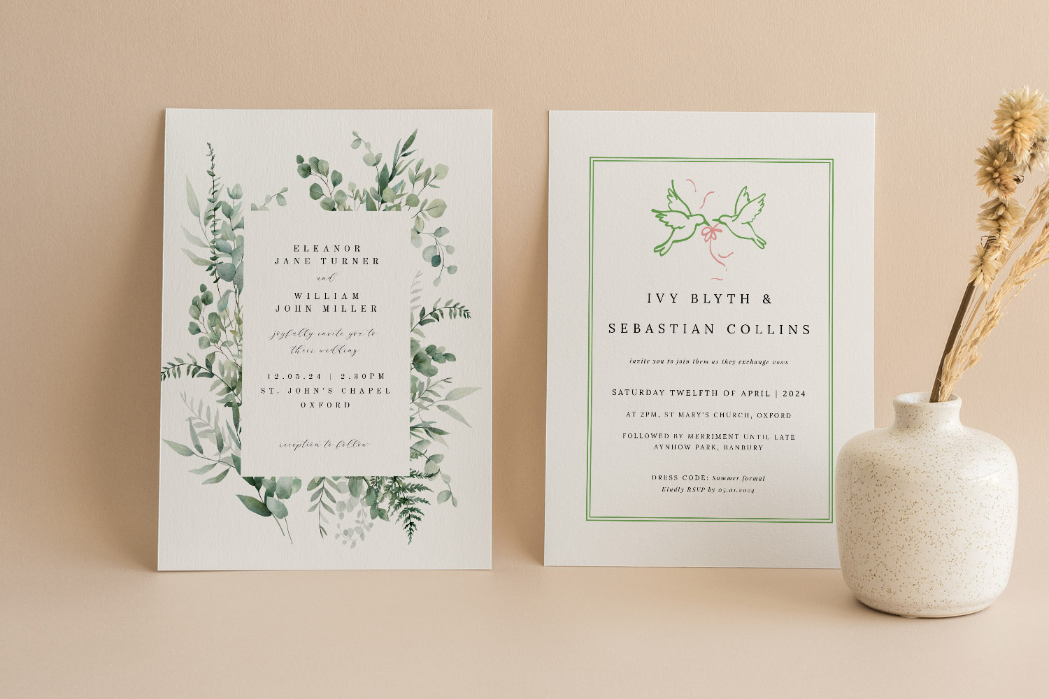
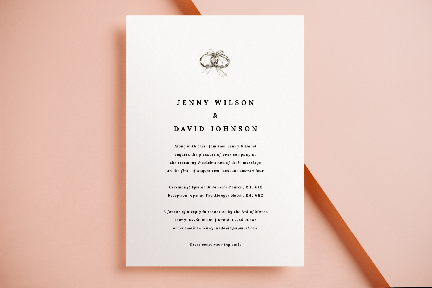
These wedding invitations feature botanical and minimalist styles, perfect for couples seeking elegant stationery for their special day.
2) The three pillars of cohesion: type, colour and design elements
1. Typography: one voice, many pieces
Aim for one primary font (names/headings) and one supporting font (details). Keep line spacing generous for legibility, and mirror the same styles across all items. A simple rule of thumb: if it’s a heading on the invitation, it’s a heading on the menu.
2. Colour: controlled, not crowded
Pick a core duo (e.g., sage and stone) and limit accents. On early pieces (save the date), use lighter tints; on the invitation, dial up saturation for impact; on on-the-day stationery, return to restrained tones so the table setting shines. If you’ve chosen botanicals, explore our floral wedding invitation templates and repeat a key leaf or petal tone through the suite.
3. Design elements: repeat with restraint
A motif becomes sophisticated when it is echoed—not pasted—everywhere. Reuse it as a corner marker on the RSVP, a faint watermark on the information card, or a single line on place cards. Consider alternating orientations (portrait invitations, landscape menus) while keeping margins, rules and icon styles consistent.
Material choices that make a difference
Paper contributes as much to cohesion as colour. A warm, lightly textured stock (e.g., 324gsm) suits classic typography; a bright, smooth stock (e.g., 400gsm silk touch) flatters photo-centric designs; super-thick boards (650gsm) bring gravitas to the invitation while thinner companions keep costs balanced. All Utterly Printable stocks are responsibly sourced and printed domestically for quick, reliable turnaround, and you can also opt for a print-ready digital file if you’re coordinating international guests or additional signage later.
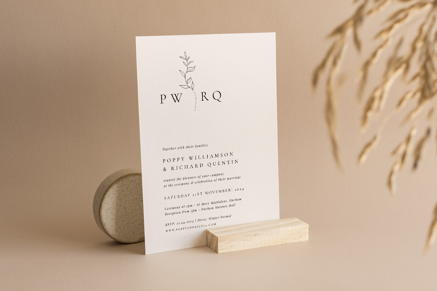
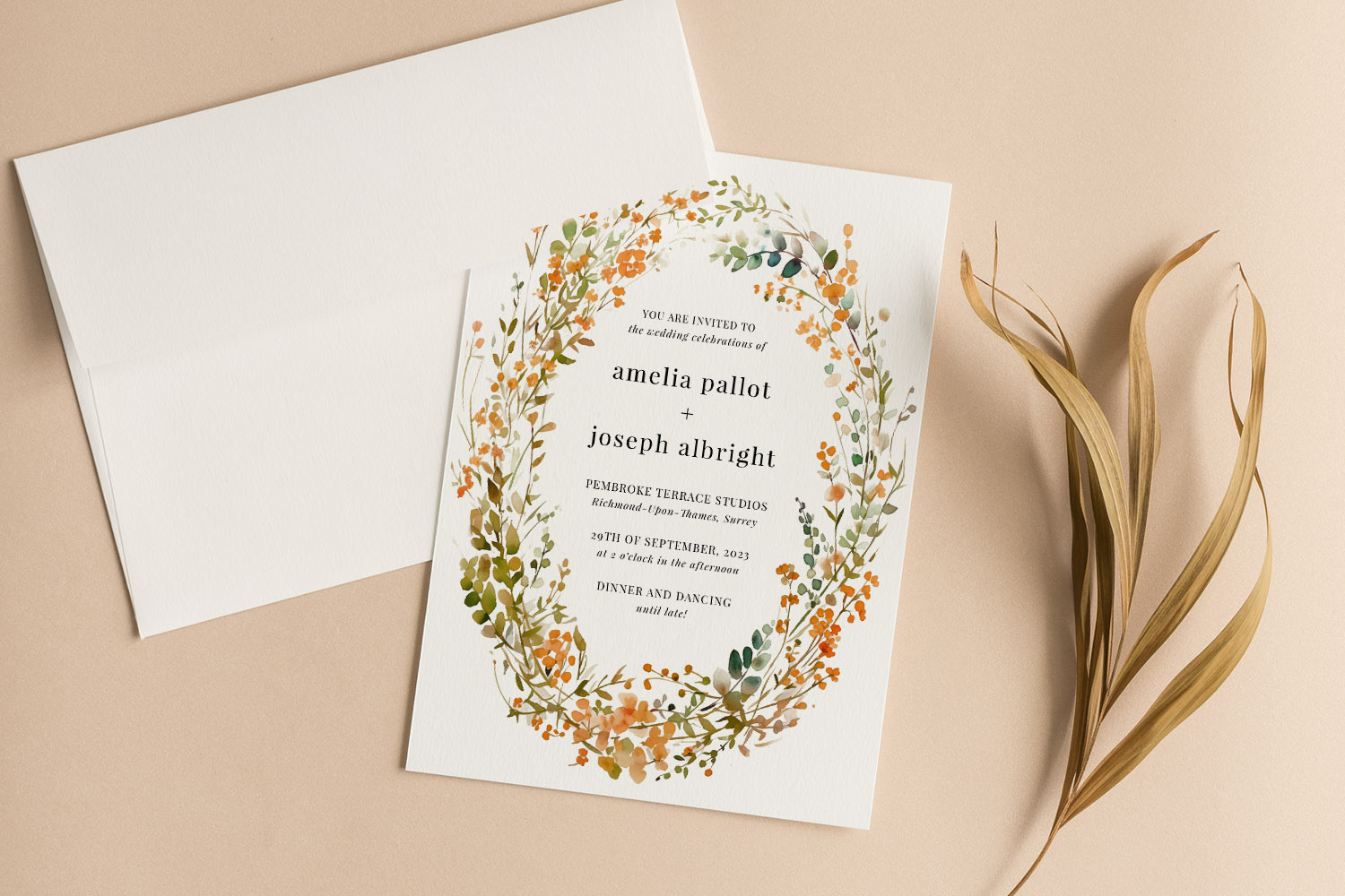
Elegant wedding invitations featuring a simple botanical motif and modern typography, perfect for a contemporary celebration.
3) What to match across the suite (and when to adapt)
Below is a practical checklist of stationery components and how closely they should mirror the invitation.
Save the date
Think of it as a teaser. Match the headline font and one colour from the invitation, but keep layouts simpler—fewer lines, more white space. If you’re using a venue sketch or floral motif later, a minimal version here hints at what’s to come.
Invitation & RSVP
These should feel like siblings. Repeat headline and body fonts, keep margins and line breaks similar, and place the RSVP method consistently. If you’re using online responses, add the same discreet QR code styling here so guests recognise it instantly.
Information details
Maps, travel tips, dress code and timings benefit from clarity. Use the invitation’s body font and a restrained palette so the eye can scan easily. If your motif risks clutter, confine it to a header line or footer icon.
Order of service
For ceremony programmes, continuity counts. Carry over your type pairing and one signature design element; reserve additional ornamentation for chapter breaks or hymns. Explore Utterly Printable’s wedding order of service templates to find layout structures that mirror your invitation style without duplicating it.
Menus
Menus sit close to glassware and florals, so they do best with calm, legible typography. Use your invitation headline for course titles and keep the motif minimal (a single divider, a monogram at the head). If space is tight, switch to a slim format but maintain consistent margins and type sizes.
Place cards & table numbers
These can be slightly punchier. Reuse initials or a small emblem in one corner; keep the guest name in your main headline font at a readable size. If the invitation is on textured stock, match it here for tactile continuity.
Table plan & signage
Scale up the same system: headline font for table names, body font for guest lists. Reuse your divider rule, border or motif at larger size. A print-ready digital file makes last-minute table tweaks painless without upsetting your design system.
Thank-you cards
Circle back to the core palette and typography so the suite ends as it began. A small photo or motif from the invitation creates a satisfying sense of closure.
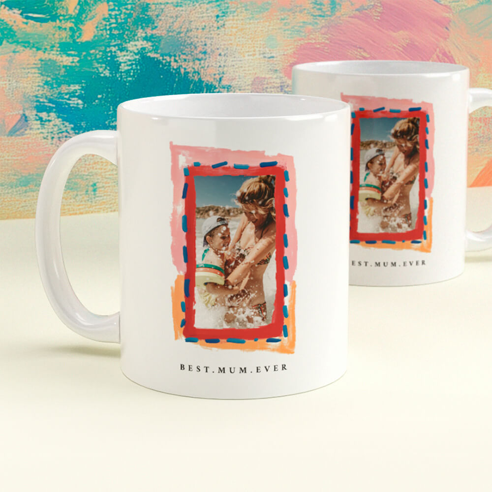
Gifts for the day-of team
While not part of the paper suite, co-ordinated, small tokens can echo your look. For example, personalised mugs for parents or the wedding party are a subtle nod to your palette—see our selection of wedding present mugs.
Finally, remember that coordination doesn’t mean cloning. Replicate the rules (type pairing, colour, spacing), then adapt the layout to the job each piece has to do.
Wedding stationery coordination: FAQs
A few short, practical answers to the most common questions we hear from couples.
No. Keep fonts, colour palette and one motif consistent. Layouts can adapt to the purpose of each item (e.g., a menu can be slimmer than an invitation) without losing cohesion.
Two is ideal: one for names/headings and one for everything else. Add italics or small caps as accents, but avoid introducing a third typeface unless it serves a clear purpose (e.g., script for a monogram).
It helps, but it isn’t mandatory. Many couples reserve the thickest board for the invitation, then use complementary stocks for other items. Choosing FSC-certified, UK-printed cards throughout keeps the look and feel aligned.
Yes. Use a small, consistent QR treatment and place it near the RSVP line or footer. It connects neatly to online responses via RSVP.studio and can be repeated on the RSVP card for clarity.
Keep the neutrals constant (ivory, stone, charcoal) and rotate accent shades (sage to olive; blush to terracotta). Because typography remains stable, the suite will still feel unified.
Common mistakes to avoid when designing wedding invitations online
Designing wedding invitations online is easy, but avoiding common mistakes ensures your invitations look perfect in print. Discover practical tips on text, layout, image quality, proofing, and ordering so your wedding invitations are beautifully clear and memorable from the start.
How and why to add a QR code to your wedding invitations
Enhance your wedding invitations by adding a QR code to easily share RSVP links, maps, and gift lists. Learn practical tips for QR code placement, sizing, and how to use Utterly Printable’s editor for a seamless experience.
Wedding Invitation Paper Explained: Silk, Uncoated & Textured Compared
Discover the differences between silk, uncoated, and textured wedding invitation paper with this helpful guide. Learn how each card stock-smooth, textured, silk, and super-thick-impacts print quality, design style, and the overall feel of your wedding invitations.
Wedding Invitations with RSVP Cards: Do You Need Both?
Choosing between RSVP cards and digital replies for wedding invitations can be challenging. This article explains when to use each RSVP method, how to combine them effectively, and offers tips for ensuring clear, stress-free guest responses.
Wedding invitation wording: what information to include (UK)
Learn how to word UK wedding invitations with confidence, covering key details, layout tips, family considerations, and RSVP options. This guide helps ensure your invitation wording is clear, elegant, and tailored to your special day.
Products related to wedding invitations:


Our Creative Journal
Classic wedding invitations set the tone for timeless celebrations. Get inspired with design tips, customisation ideas, and advice on choosing the perfect style for your big day.