Wedding Invitation Paper Explained: Silk, Uncoated & Textured Compared
Choosing the right paper is the simplest way to transform a good invitation into a memorable one. This guide compares the four card stocks used for wedding invitations at Utterly Printable—350gsm smooth, 324gsm textured, 400gsm silk, and 650gsm super-thick—so you can pick a stock that matches your design, your budget, and the feel you want when guests open the envelope.
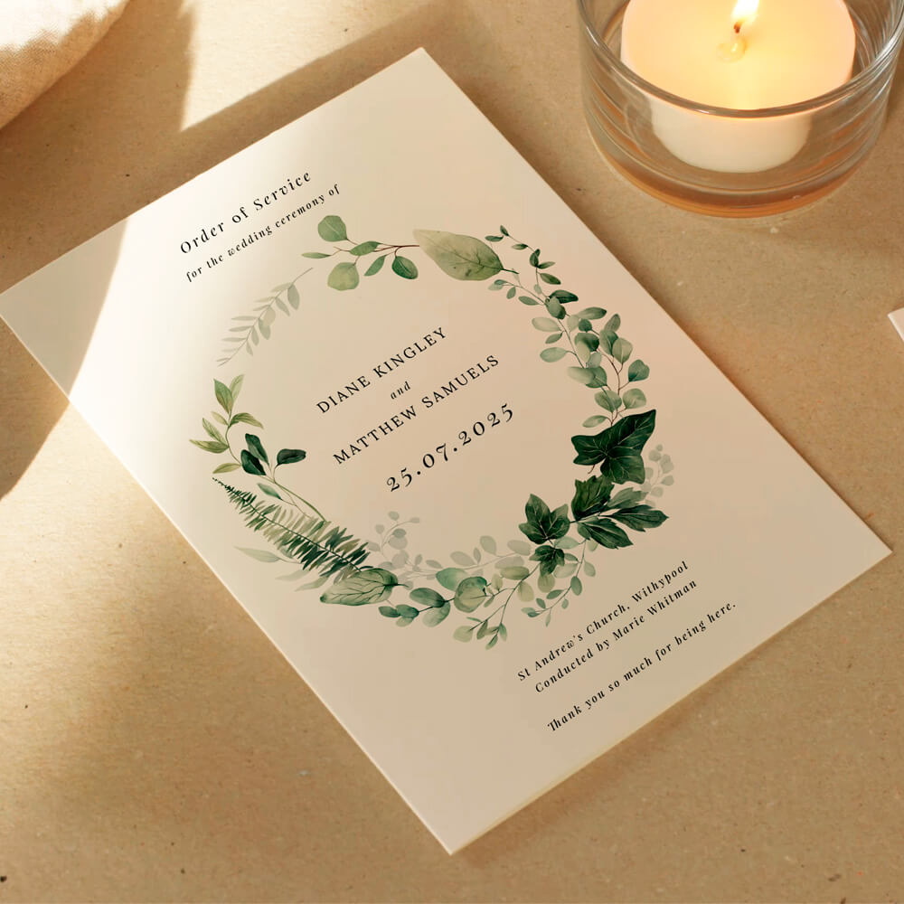
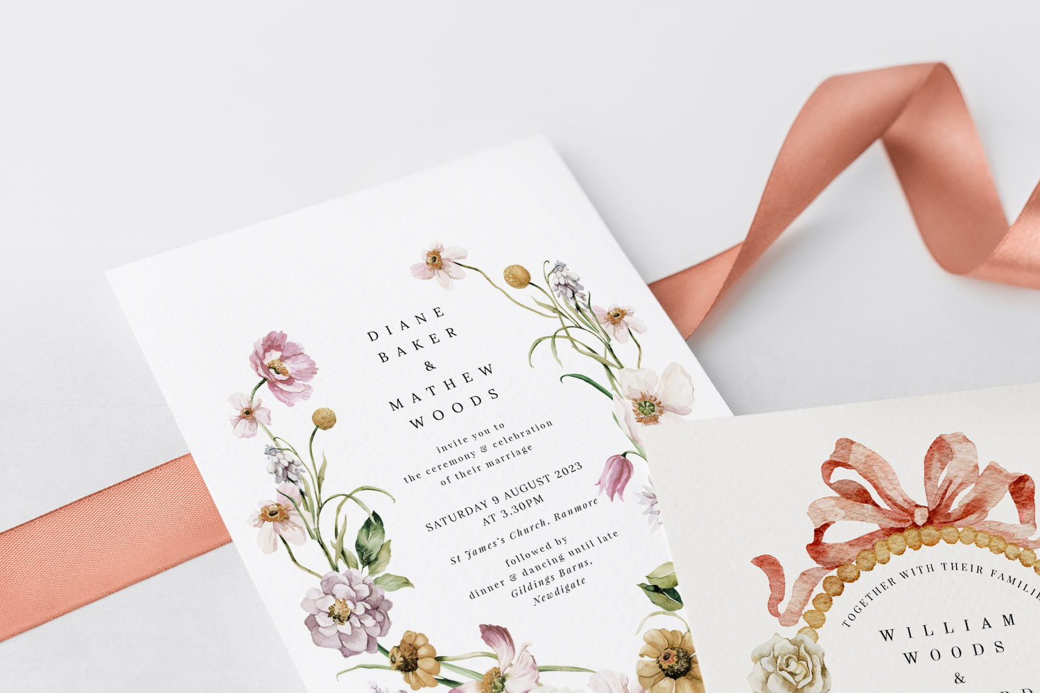
Elegant wedding invitations featuring a delicate floral wreath, perfect for couples seeking a nature-inspired stationery style.
The four Utterly Printable card stocks at a glance
Utterly Printable prints on four premium, FSC-certified card stocks using high-definition Canon iX presses, with UK-based production and optional carbon-offset at checkout. Envelopes are supplied with printed orders. The range is:
350gsm Smooth (House Stock)
- Look & feel: Bright white, smooth-matt; clean and contemporary in the hand.
- Print outcome: Crisp text, solid colours, sharp lines.
- Best for: Modern designs, bold typography, budget-friendly elegance, and designs where ultimate colour saturation isn’t critical.
- Why choose it: A dependable, great-value all-rounder that feels sturdy without the premium price tag.
324gsm Textured (Premium Stock)
- Look & feel: Warm off-white with a light, tactile texture; softly traditional.
- Print outcome: Gentle, slightly softer print definition that suits painterly artwork.
- Best for: Watercolour florals, rustic or vintage themes, heritage crests, and classical layouts.
- Why choose it: Adds character and a handcrafted quality without overwhelming your design.
400gsm Silk (Photo Silk Touch)
- Look & feel: Bright white, silky-smooth with a subtle satin sheen (not glossy).
- Print outcome: Vivid photos, saturated colours, crisp micro-details.
- Best for: Photo invitations, graphic patterns, deep hues, and designs needing punchy contrast.
- Why choose it: When colour accuracy and image clarity matter, silk coatings deliver.
650gsm Super-Thick
- Look & feel: Double-thickness, warm off-white with a light texture; noticeably weighty.
- Print outcome: Similar to the textured stock, with a more substantial, luxurious hand-feel.
- Best for: Minimalist typography, monograms, and statement simplicity where tactile presence is the point.
- Why choose it: A premium, “keepsake” finish that feels special from the first touch.
Details in this section are based on Utterly Printable’s product specification.
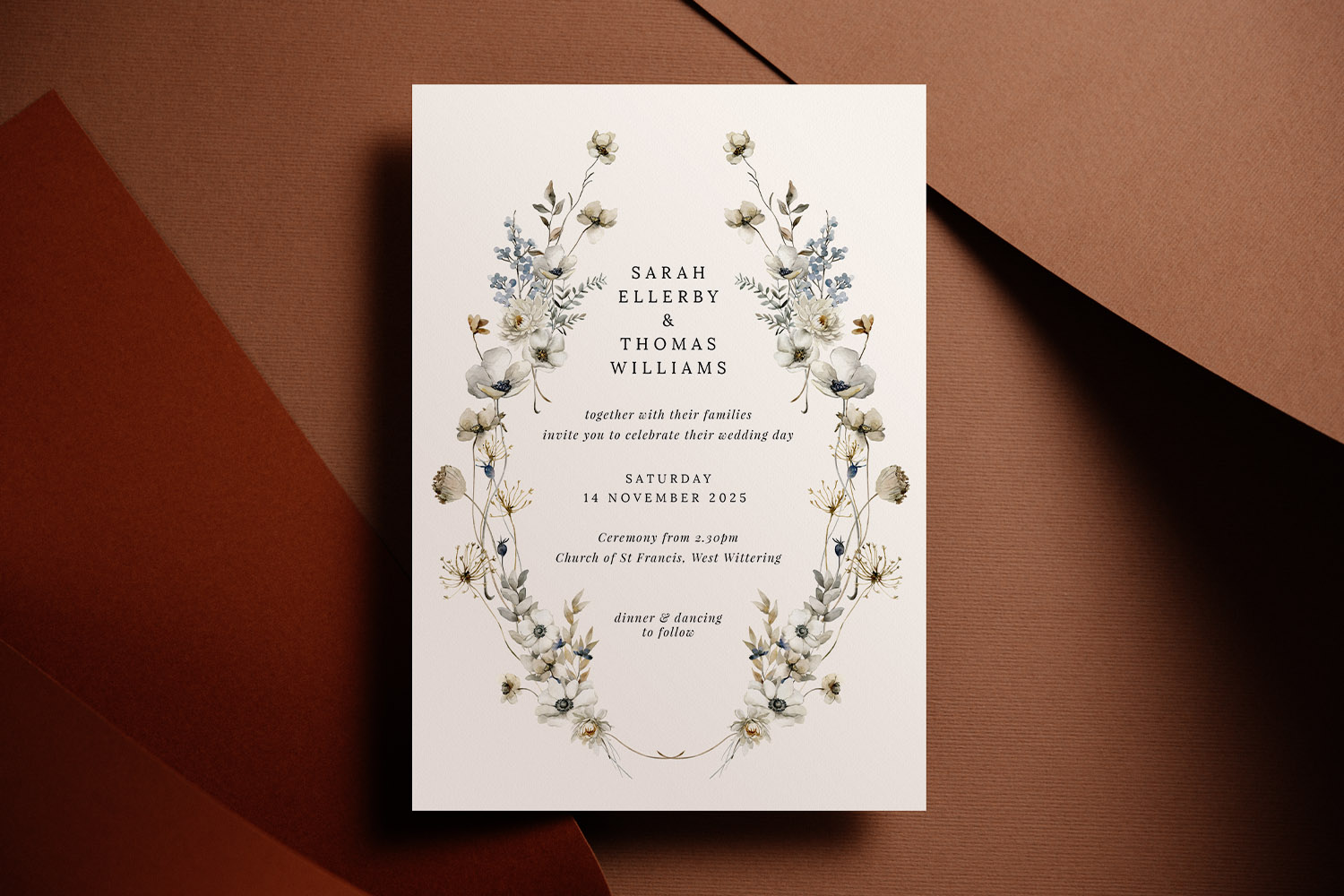
This wedding invitations design features classic black lettering on textured white card, perfect for a modern yet timeless celebration.
What actually prints best on each paper (and myths, debunked)
Photos & saturated colours 400gsm Silk.
If your design uses full-bleed photography or strong colour blocks, the 400gsm silk’s smooth coated surface gives ink a controlled landing for greater density and sharpness. Expect punchier reds, deeper blacks, and cleaner gradients.
Soft artwork & classic typography 324gsm Textured.
Light texture gently scatters light, toning down hard edges and lending warmth. That’s perfect for hand-painted botanicals or heritage scripts. It’s true that heavily textured papers don’t flatter bright, high-detail photography in the same way as silk; colours print beautifully, but photos can appear a touch softer. For image-led layouts, pick silk; for character and tactility, choose textured.
Clean, modern layouts on a budget 350gsm Smooth.
This bright white matt stock gives crisp lines and confident type, ideal for contemporary minimal design. It’s sturdy in the hand and prints solids very well—an excellent value choice without looking “entry level”.
Minimalist showstopper 650gsm Super-Thick.
Heft changes perception. When your design is restrained—ample white space, careful type, perhaps a simple monogram—the extra thickness adds ceremony. Because the surface is lightly textured, it behaves like the 324gsm for print: elegant, softly matt, and refined.
Myths to ignore (so you choose confidently):
- “Silk is shiny like magazine paper.” Not here. The “silk” finish has a subtle satin touch, not high gloss.
- “Textured stock can’t handle bold colour.” It does—solids and vector colour print beautifully. It’s just ultra-fine photographic detail that looks softer on texture.
- “Heavier stock always prints better.” Print quality is about the surface and press; weight changes feel, not colour fidelity.
- “Uncoated whites always look creamy.” The 350gsm smooth is a bright white; the tactile stocks are intentionally warmer for a traditional look.
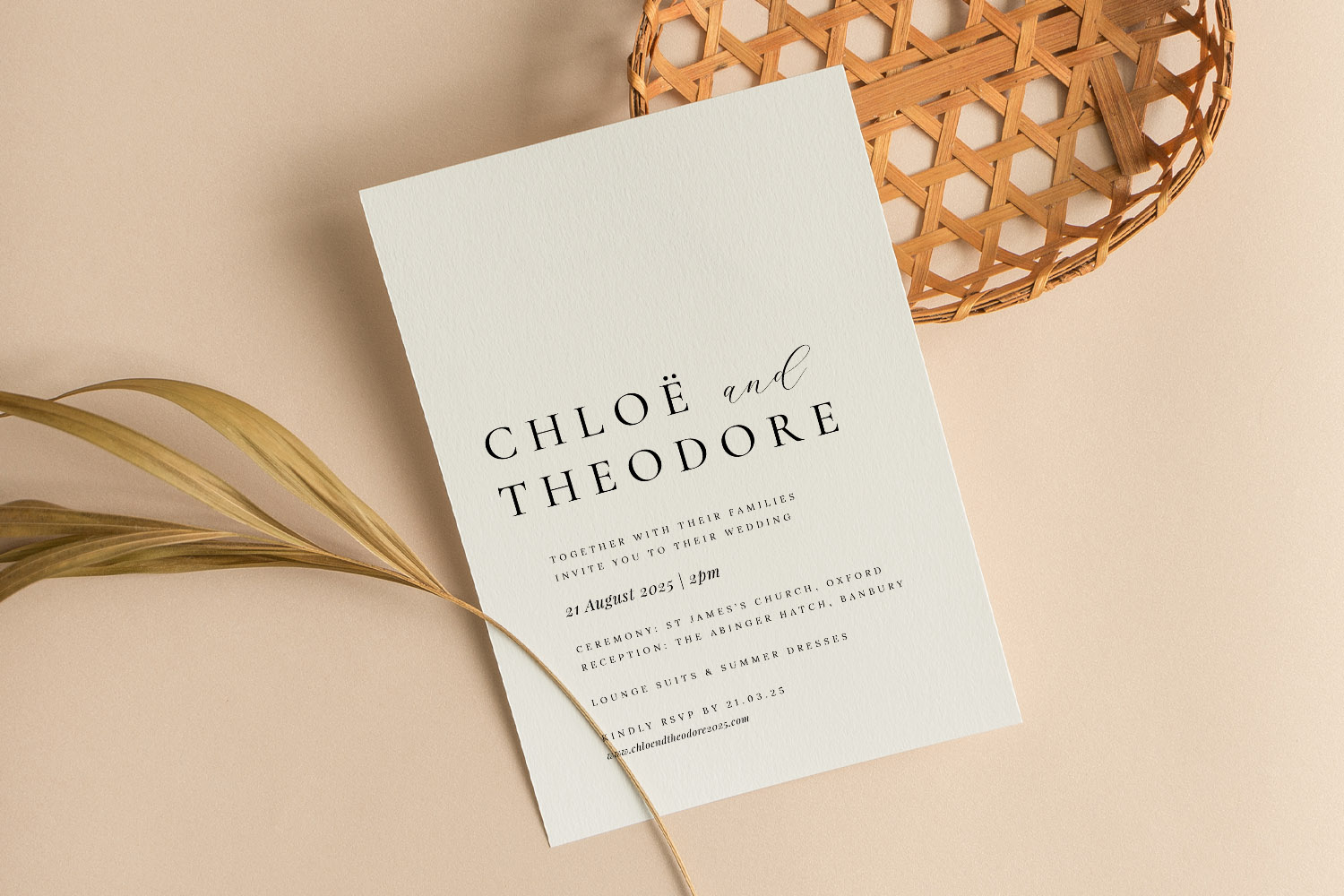
Minimalist wedding invitations with modern fonts, ideal for couples seeking a simple yet elegant stationery style for their special day.
Match your wedding style (and budget) to the right card
Below are common wedding aesthetics and the stocks couples often choose—plus handy links to browse designs that suit each style.
Modern minimal
Pair pared-back layouts with confident materials. For ultra-clean type and micro detail, the 400gsm silk is superb. If you want a luxurious in-hand “thud” when guests pick it up, step up to 650gsm super-thick. Start with our curated edit of minimal wedding invitation designs and personalise the typography and spacing to suit.
Simple and timeless
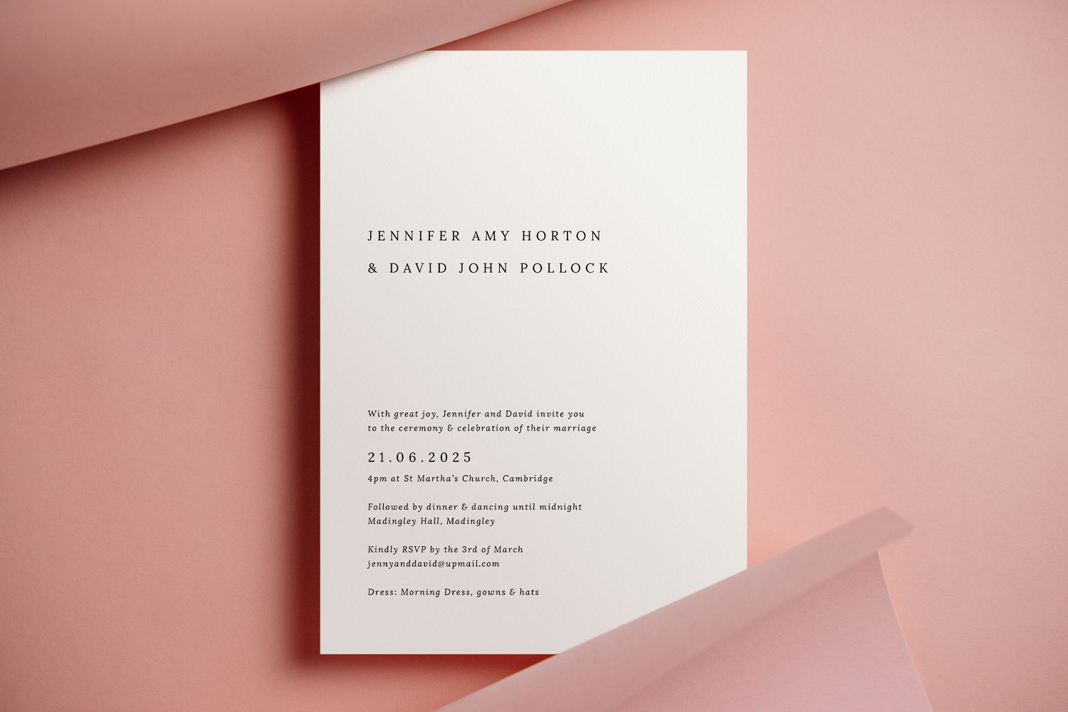
For classic serif fonts, balanced borders and plenty of breathing space, you can’t go wrong with 350gsm smooth (great value, crisp print) or the warmer 324gsm textured (traditional tone). Browse the collection of simple wedding invitation templates to see layouts that shine on both papers.
Romantic blush & painterly florals
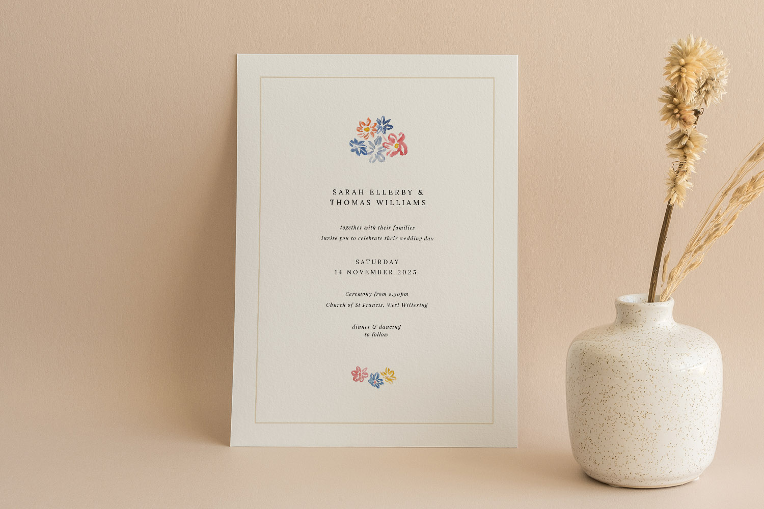
Soft watercolours and pastel palettes sing on uncoated textures. The 324gsm textured gives artwork a gentle, romantic diffusion that feels hand-touched. Explore our blush pink wedding invites for delicate tones that pair beautifully with this stock.
Vintage or rustic
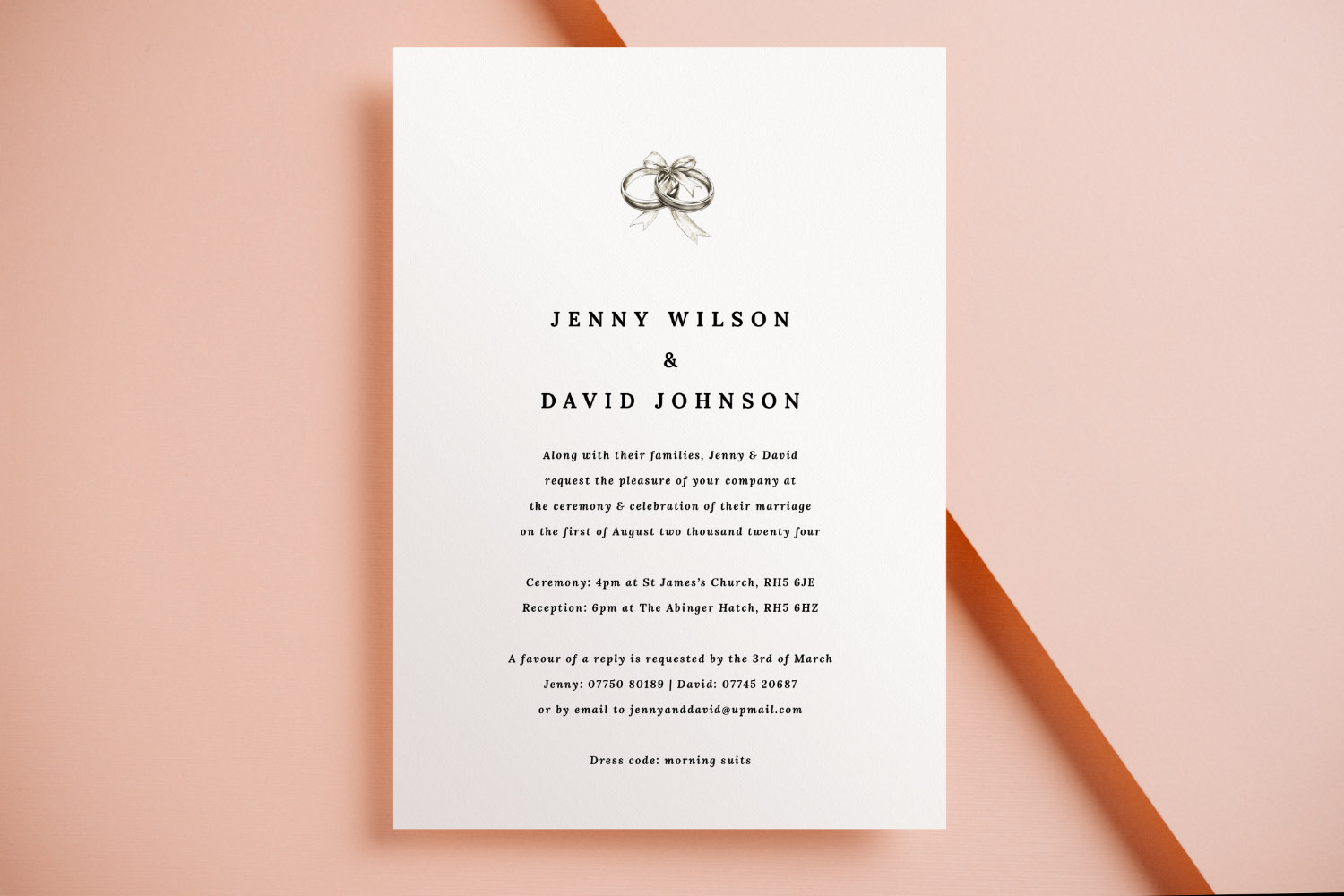
Want that heritage, tactile look? The warm off-white of 324gsm textured and the gravitas of 650gsm super-thick both suit period monograms, filigree borders and retro florals. Begin with our vintage wedding invitation templates and choose the paper that matches the era you’re nodding to.
Photo-led invitations
Candid engagement shots and venue photography benefit from the 400gsm silk’s subtle sheen and smooth surface. Expect crisp edges and lifelike colour—especially helpful for dusk skies, greenery, and black-tie tones.
Design flexibility & suites
Whichever stock you choose, you can personalise fonts, colours, and layout in the online editor, add a scannable QR code to route guests to RSVP.studio, and keep everything co-ordinated across your suite—RSVP cards, information inserts, menus, place cards, orders of service and seating plans—all designed to match. If you’re still picking a look, it’s easy to explore the full library of wedding invitation templates and switch paper at checkout.
Practical notes (sizes, timing, sustainability)
- Sizes: A5, A6, 148×148 mm square, and 5×7 inch, in portrait, landscape, or square.
- Proofing & samples: A free high-resolution, watermarked PDF proof is available before ordering; printed samples can be ordered if you’d like to feel papers in person.
- Turnaround: Standard delivery is ~3 working days, with an express 1–2 working-day option (UK production & dispatch).
- Digital option: Prefer DIY or WhatsApp sharing? Every design is available as an instant, print-ready PDF.
- Sustainability: Papers are responsibly sourced and FSC-certified; production operates to ISO 14001 standards; carbon-offset is available at checkout; local UK printing helps reduce transport miles.
FAQs: choosing the best paper for wedding invitations (UK)
A few quick answers to the questions couples ask most when deciding between silk, uncoated and textured stocks.
A. The 400gsm silk. Its smooth, subtly satin surface delivers vivid colour and crisp detail, ideal for full-bleed images and rich, dark palettes.
A. Small, ultra-fine text can look a touch softer on textured stocks. Use a point size with comfortable contrast, or pick 350gsm smooth/400gsm silk for pin-sharp micro-type.
A. No. “Silk” here means a soft satin sheen—refined and reflective enough to enhance colour, but not a high-gloss magazine finish.
A. Heavier stocks feel more luxurious, but print clarity depends more on the surface. 350gsm smooth prints superbly; 650gsm super-thick is about tactile impact.
A. The 324gsm textured (warm, lightly grained) is the go-to. For a real statement in the hand, try 650gsm super-thick.
Common mistakes to avoid when designing wedding invitations online
Designing wedding invitations online is easy, but avoiding common mistakes ensures your invitations look perfect in print. Discover practical tips on text, layout, image quality, proofing, and ordering so your wedding invitations are beautifully clear and memorable from the start.
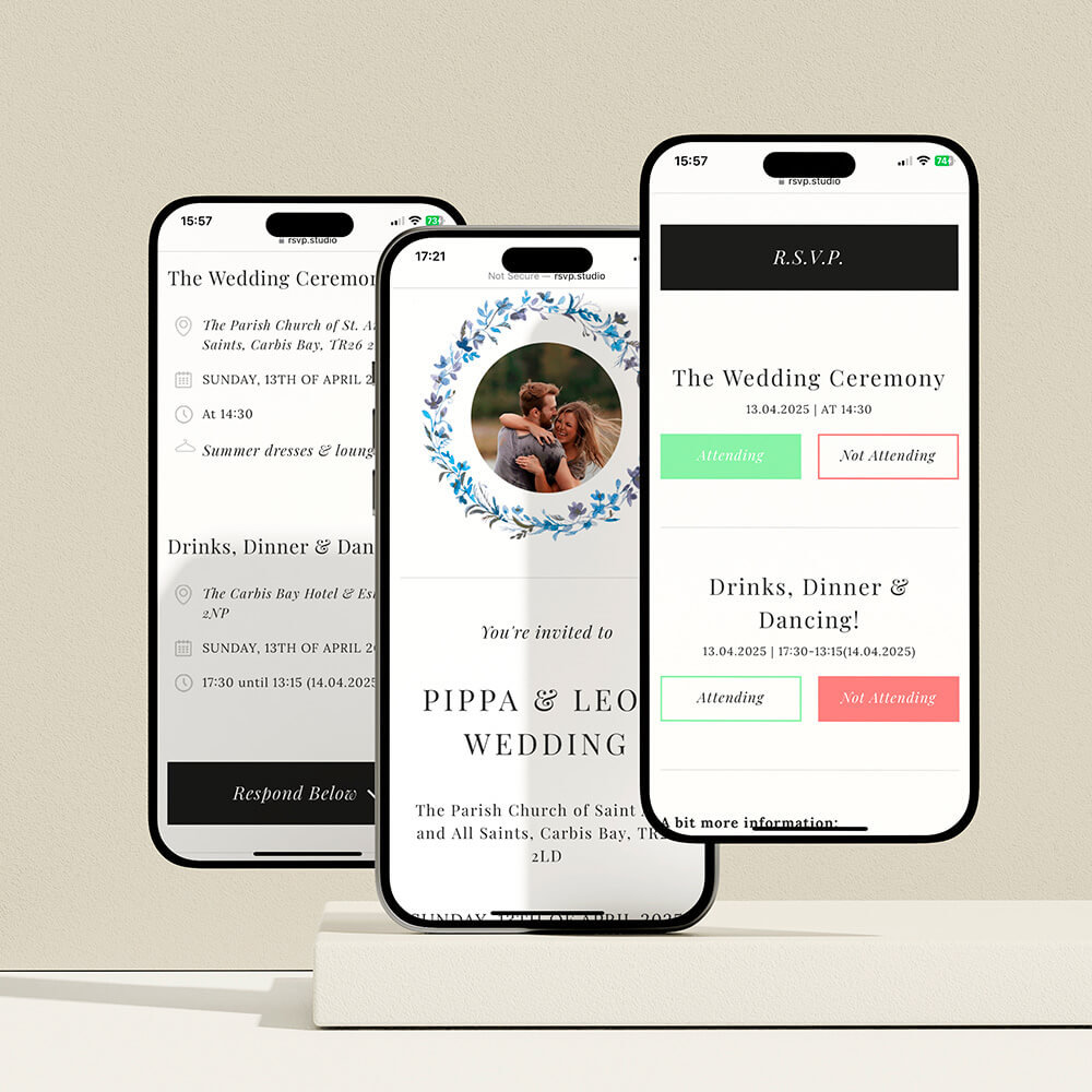
How and why to add a QR code to your wedding invitations
Enhance your wedding invitations by adding a QR code to easily share RSVP links, maps, and gift lists. Learn practical tips for QR code placement, sizing, and how to use Utterly Printable’s editor for a seamless experience.
How to co-ordinate your wedding invitation with the rest of your stationery suite
Learn how to coordinate your wedding invitation with your entire stationery suite by selecting matching fonts, colors, motifs, and materials, ensuring every detail-from RSVP cards to menus-looks beautifully unified and thoughtfully designed for your special day.
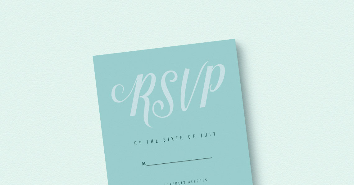
Wedding Invitations with RSVP Cards: Do You Need Both?
Choosing between RSVP cards and digital replies for wedding invitations can be challenging. This article explains when to use each RSVP method, how to combine them effectively, and offers tips for ensuring clear, stress-free guest responses.
Wedding invitation wording: what information to include (UK)
Learn how to word UK wedding invitations with confidence, covering key details, layout tips, family considerations, and RSVP options. This guide helps ensure your invitation wording is clear, elegant, and tailored to your special day.
Products related to wedding invitations:


Our Creative Journal
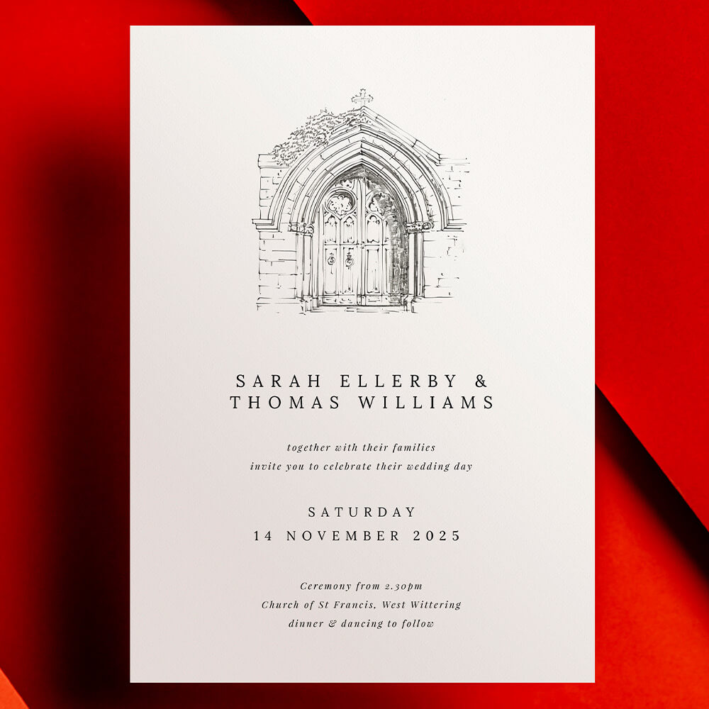
Classic wedding invitations set the tone for timeless celebrations. Get inspired with design tips, customisation ideas, and advice on choosing the perfect style for your big day.