How to Design an Easy-to-Read Wedding Table Plan (Typography, Spacing & Colour)
Designing a beautiful seating chart is one thing; making it instantly readable by guests as they arrive—perhaps in a candlelit barn or a busy hotel lobby—is another. This guide walks through the key decisions that affect legibility: typography, spacing and layout, colour and contrast, plus a few practical print choices so your plan does its job calmly and clearly. Where helpful, we reference how the editable templates in our wedding table plans keep a consistent typographic hierarchy and sensible spacing by default.
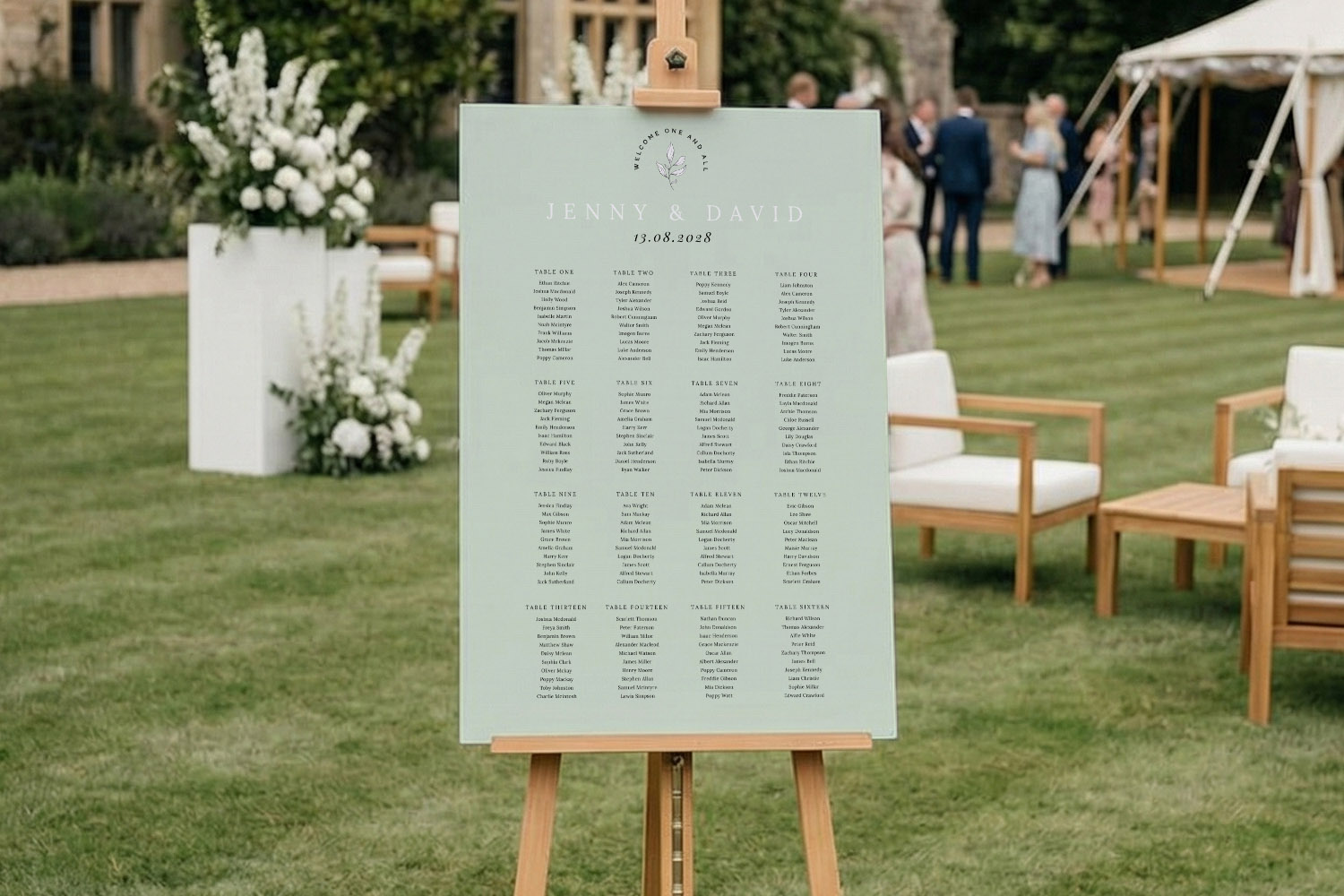
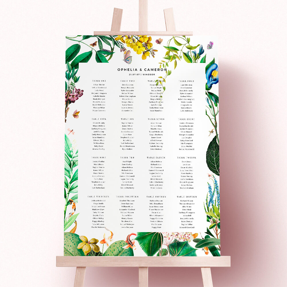
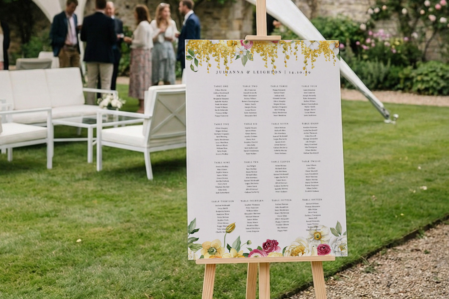
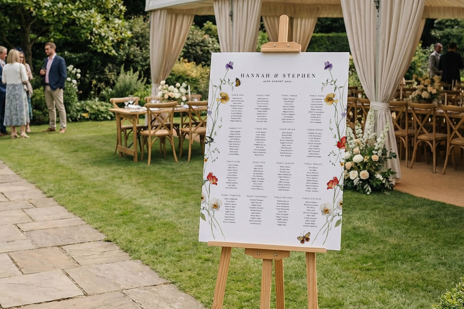
Elegant wedding table plan featuring a clean, minimalist design, perfect for guiding guests at a stylish outdoor wedding celebration.
1) Typography that works at a distance
Good type choices reduce queueing and confusion. Aim for a clear hierarchy (title table names guest names) and keep decorative elements in their place.
Font styles that read well
- Headings & couple names: A confident serif or a clean sans serif. Decorative scripts can appear in small doses (e.g. your names), but avoid setting entire table names or guest lists in script.
- Table names or numbers: A sturdy sans serif or slab serif. If you’ve named tables after places or flowers, keep names short and avoid fussy ligatures.
- Guest names: Humanist sans serifs (e.g. with open letterforms) or book-weight serifs. Avoid ultralight weights and condensed fonts.
Recommended point sizes (guidelines)
These ranges assume typical viewing from 1–3 m and an A-size board:
- A1 board:
• Title: 90–140 pt
• Table names: 48–72 pt
• Guest names: 26–36 pt - A2 board: scale down by roughly 25–30%:
• Title: 70–100 pt
• Table names: 36–50 pt
• Guest names: 20–28 pt
Capitalisation & emphasis
- Avoid ALL-CAPS for guest lists; it slows scanning and reduces shape recognition.
- Use weight (regular, semibold) rather than colour to emphasise table names.
- Keep maximum two typefaces: one for headings, one for everything else. Our templates are built this way, so hierarchy stays consistent without effort.
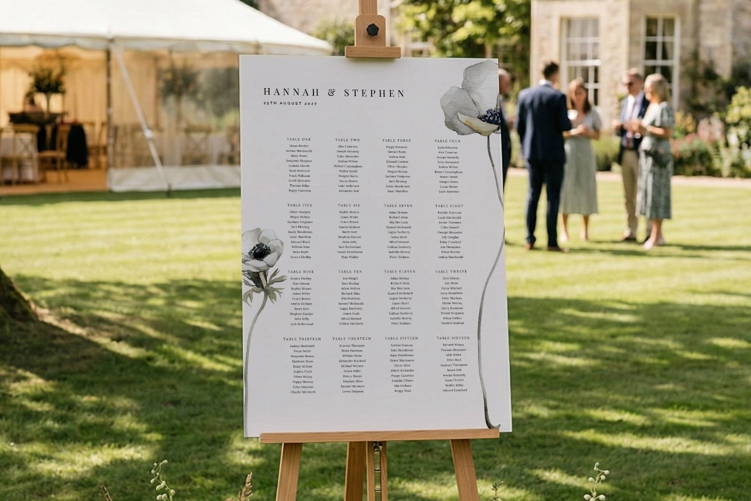
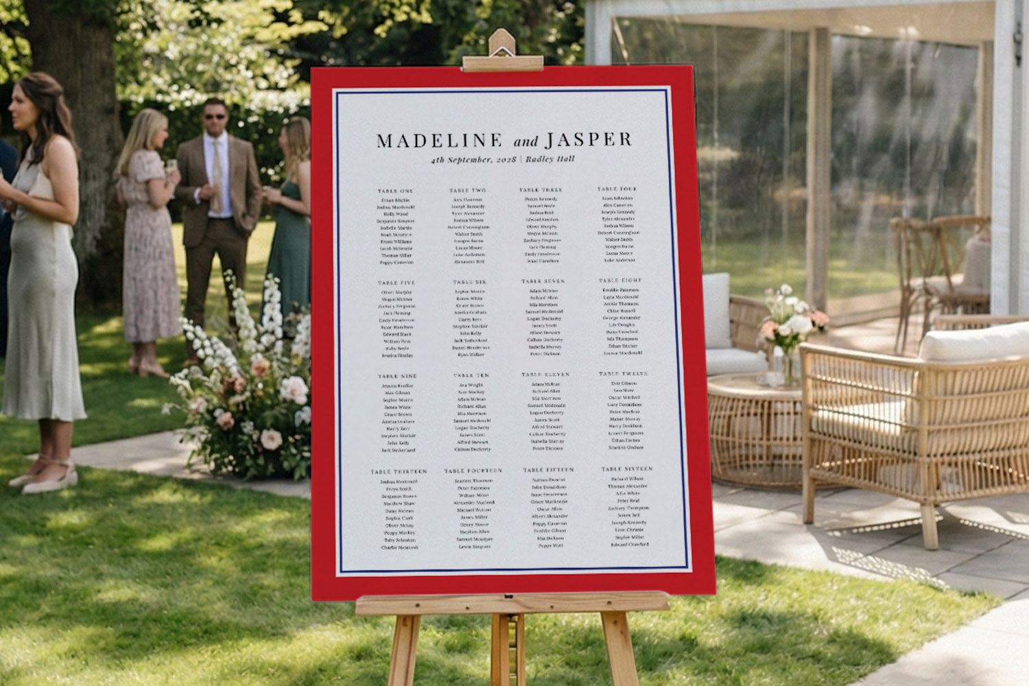
Stylish wedding table plan featuring clear typography and floral details, perfect for guiding guests at an outdoor wedding celebration.
2) Spacing, layout and hierarchy guests can follow
Once the fonts are sorted, spacing is what keeps the plan breathable and scannable—especially when everyone arrives at once.
Grid & margins
- Use a wide top margin so your title isn’t crowded; at A1, 40–60 mm feels balanced.
- Keep even side margins (25–40 mm at A1) so nothing looks cut off when the board is on an easel.
- Arrange tables in neat columns; gutter space (the gap between columns) of 18–25 mm at A1 stops adjacent lists from merging visually.
Line spacing & list structure
- Set guest lists with line height 1.3–1.5× the font size. Tight lines cause name-merging; too loose and lists look bitty.
- Use short lines (30–45 characters) for names; it speeds scanning.
- If you’re using long table names (e.g. “Provence Rosé”), keep them on one line and put the guest list below—don’t wrap the table label across two lines.
Ordering options
- By table is simplest to scan at the board itself.
- Alphabetical index helps very large weddings; if you use one, keep it as a separate panel or a clear left-hand column that points guests to a table number.
Where to place the board
- Position the plan at the entrance to the dining area so guests can read while flowing through. Lean it on a 5ft easel or free-stand against a sturdy surface. This keeps check-in smooth and avoids congestion.
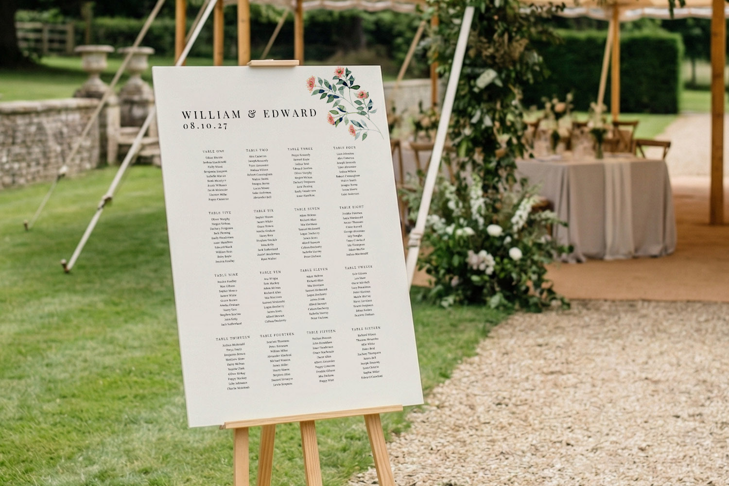
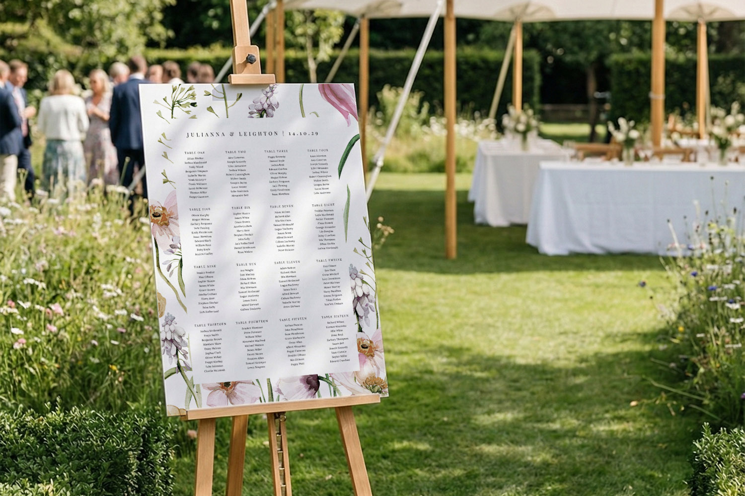
This wedding table plan features a clean design with floral accents, making it easy for guests to find their seats at an outdoor celebration.
3) Colour & contrast that hold up in real venues
Pretty colours are easy; readable colours are wiser. Low light, fairy bulbs and candles all reduce contrast, so design with worst-case lighting in mind.
High-contrast pairings
- Dark on light: charcoal, navy or forest green on white/ivory/pale blush.
- Light on dark: ivory or warm white on deep navy/green/black (ensure the background is truly dark, not mid-tone).
- Pastels and metallic-look hues are lovely for accents; keep the text itself strong.
Contrast rule of thumb
- Aim for a contrast akin to at least 4.5:1 between text and background. If you squint and the text blurs, it isn’t strong enough for a dim barn or marquee.
Backgrounds & imagery
- If you use florals or watercolour textures, fade them back behind text areas so letters sit on a calm, near-solid block.
- Reserve patterns for borders or headings; leave plenty of whitespace around guest lists.
Print considerations that help legibility
- Our table plans are printed on rigid 5 mm foamex boards (A1 or A2), with a smooth satin finish. This reduces glare compared with very glossy surfaces and reads well in mixed lighting.
- The boards are waterproof and scuff-resistant, handy for garden paths, barns and marquees where traffic is heavy.
Keeping the suite coherent
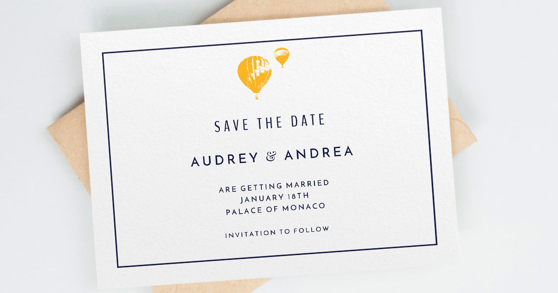
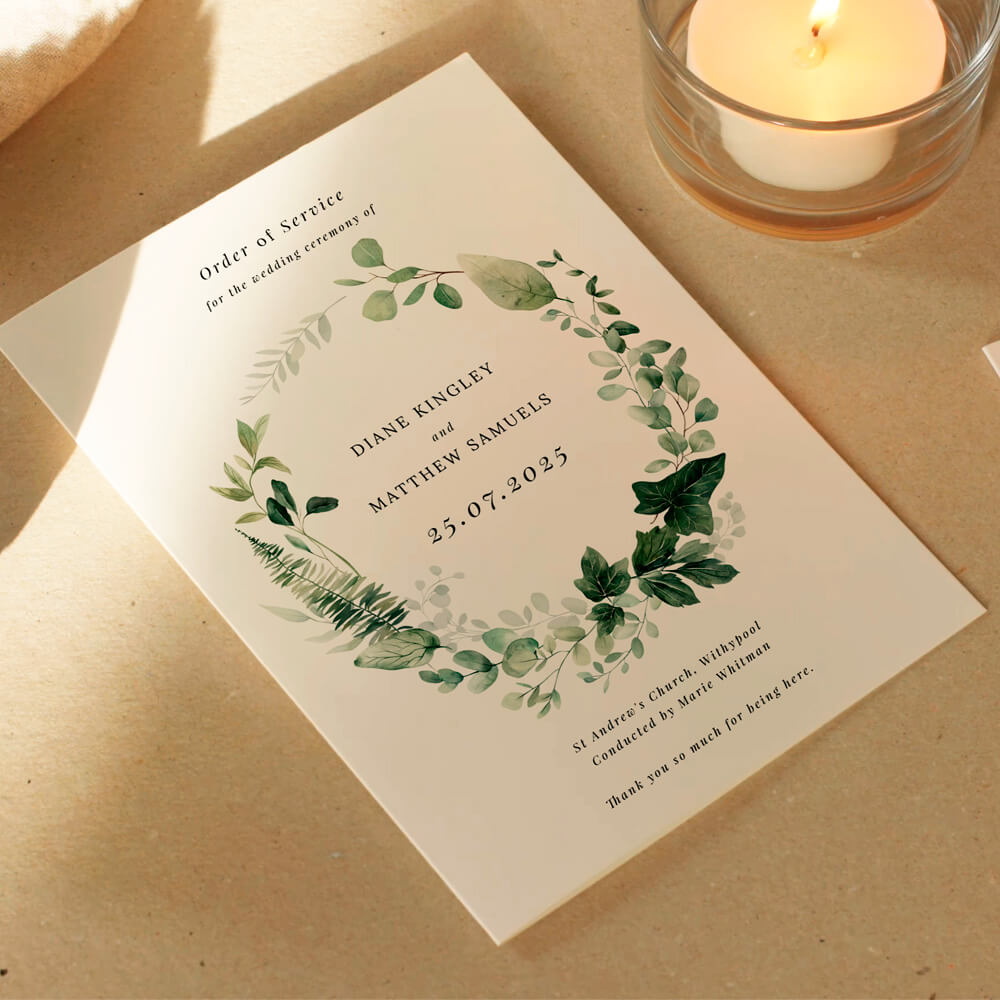
- Consistent colours, fonts and spacing across your stationery helps guests recognise information on sight. Coordinate your plan with matching save the date designs, your ceremony’s order of service, and the reception’s wedding menus. At the tables, finish the set with clearly printed place cards so people recognise their names at a glance.
A practical setup using our editor
- Start with the right size (A1 for larger guest counts or longer viewing distances; A2 for intimate receptions). Choose portrait or landscape to fit your venue.
- Pick one of 18 layout formats to suit how many tables you have, then personalise names and table labels in real time.
- If you’re renaming tables (cities, flowers, cocktails), keep labels short and distinctive.
- Proof slowly and invite a second pair of eyes before you print.
For print specs, sizes, templates and lead times, explore our full collection of editable wedding table plans.
FAQs: making seating charts genuinely easy to read
The questions below cover the details couples ask most when they want a plan that reads clearly in real venues—fonts, sizes, colour, layout and practical printing.
A1 (594 × 841 mm) is the safer choice for 100+ guests or where viewing distance is 2 m+. A2 (420 × 594 mm) works for smaller receptions and tighter spaces. If in doubt, choose A1 for a calmer crowd flow.
For A1, use roughly 90–140 pt for the title, 48–72 pt for table names, 26–36 pt for guest names. For A2, reduce by 25–30%. These are guidelines; always prioritise strong contrast and generous spacing.
Listing by table is quickest at the board. If you expect queues or have 150+ guests, consider an alphabetical index panel that points to table numbers.
High-contrast pairs—navy or charcoal on white/ivory—win every time. Avoid mid-tone text (e.g. pale grey on pastel backgrounds) and keep scripts for headings, not lists.
Yes. Our templates support optional QR codes . Keep them small but clear, and place them away from guest lists so they don’t distract from way-finding.
A1 vs A2: choosing the right size for your wedding table plan
Deciding between A1 and A2 for your wedding table plan depends on your guest list, venue, and style. This guide explores each size’s advantages and drawbacks to help you design a practical, visually appealing seating chart.
Common Wedding Seating Plan Mistakes (and How to Avoid Them)
Creating your wedding seating plan can be challenging, but steering clear of common mistakes makes it easier. Explore helpful tips on design, layout, and printing to ensure your wedding table plan is clear, accessible, and stress-free.
Designing a Table Plan for Small vs Large Weddings (Layout Differences Explained)
Learn how to create the ideal wedding table plan for any guest list size. Explore layout options, board sizes, and practical tips to design a clear, stylish seating chart that ensures your celebration runs smoothly and looks beautiful.
Displaying Your Wedding Table Plan at the Venue (Easels, Walls & Outdoor Setups)
Explore creative ways to display your wedding table plan, from easels to outdoor setups. Get helpful advice on using foamex boards, choosing the best placement, and styling your seating chart to make it clear and inviting for guests.
Waterproof Wedding Table Plans Explained for Outdoor & Barn Venues
Discover how waterproof wedding table plans made from foamex keep your seating chart looking smart and legible at outdoor, barn, garden, or marquee venues. Learn why these durable boards are ideal for unpredictable UK weather and easy guest navigation.
When to Print Your Wedding Table Plan (and handle last-minute RSVPs)
Discover the ideal timing for printing your wedding table plan and how to manage last-minute RSVPs. This guide covers when to order, how to finalize your guest list, and tips for handling changes to ensure a seamless celebration.
Products related to table arrangements


Dive Into Our Blog
Wedding table plans are essential for guiding your guests. Check out the blog for advice on layout designs, customisation options, and practical tips for seamless seating arrangements.